Button property definition
This API is reliable and breaking changes are unlikely.
Fields
The button definition property template can be used to add a custom property of button type. When defining a button property, the following fields can be used:
type
This field is optional for buttons. Can be either String, Integer, Number, Array or Boolean.
label
Used for defining the label that is displayed in the property panel.
component
Used for defining how the property is visualized in the property panel. Used to override the default component that comes with the type setting. This field is mandatory for a button property and should always be "button".
ref
Name or ID used to reference a property.
action
Used for defining the action when clicking the button.
Example:
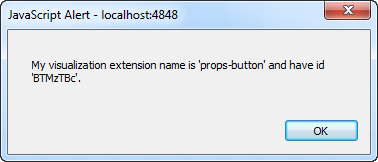
action: function(data){
//add your button action here
alert("My visualization extension name is '"+data.visualization+"' and have id '"+data.qInfo.qId+"'.");
}Example
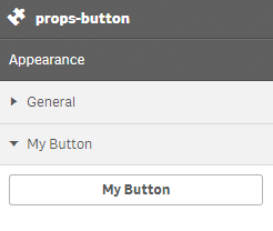
Defining a custom button
Defining a custom property of button type can look like below.
Example:
define( [
],
function ( ) {
return {
initialProperties : {
qHyperCubeDef : {
qDimensions : [],
qMeasures : [],
qInitialDataFetch : [{
qWidth : 10,
qHeight : 50
}]
}
},
definition : {
type : "items",
component : "accordion",
items: {
settings: {
uses: "settings",
items: {
MyButton: {
label:"My Button",
component: "button",
action: function(data){
//add your button action here
alert("My visualization extension name is '"+data.visualization+"' and have id '"+data.qInfo.qId+"'.");
}
}
}
}
}
},
paint: function ($element) {
}
};
} );