Creating scatter plots
This section describes how to create scatter plots with the Visualization API and qlik-visual.
Basic scatter plot with number formatting
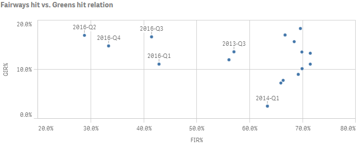
In this example we create a basic scatter plot, containing one dimension and two measures. The measures have basic number formatting applied and a title is added to the scatter plot.
- Create the chart
Create the container for the chart. The visualization type is scatterplot.
Visualization API
app.visualization.create(
  'scatterplot',
  [],
  {}
)
qlik-visual
<qlik-visual appid="Tutorial-Golf.qvf" type="scatterplot" cols='[]' options='{}' > </qlik-visual> - Define dimension
Define the dimension as a column.
{ "qDef": { "qFieldDefs": [ "=[Date.autoCalendar.YearQuarter]" ], "qFieldLabels": [ "Year & Qtr" ] }, "qNullSuppression": true } - Define first measure
Define the first measure as a column.
{ "qDef": { "qFieldDefs": [ "=[Date.autoCalendar.YearQuarter]" ], "qFieldLabels": [ "Year & Qtr" ] }, "qNullSuppression": true }, { "qDef": { "qLabel": "FIR%", "qDef": "Avg(FwHit)", "qNumFormat": { "qType": "F", "qnDec": 2, "qUseThou": 0, "qFmt": "0.0%", "qDec": ".", "qThou": "," } } } - Define second measure
Define the second measure as a column.
{ "qDef": { "qFieldDefs": [ "=[Date.autoCalendar.YearQuarter]" ], "qFieldLabels": [ "Year & Qtr" ] }, "qNullSuppression": true }, { "qDef": { "qLabel": "FIR%", "qDef": "Avg(FwHit)", "qNumFormat": { "qType": "F", "qnDec": 2, "qUseThou": 0, "qFmt": "0.0%", "qDec": ".", "qThou": "," } } }, { "qDef": { "qLabel": "GIR%", "qDef": "Avg(GIR)", "qNumFormat": { "qType": "F", "qnDec": 2, "qUseThou": 0, "qFmt": "0.0%", "qDec": ".", "qThou": "," } } } - Define title
Then define the title in the options.
{ "showTitles": true, "title": "Fairways hit vs. Greens hit relation" }
Result

Code examples
Using calculated bubble size
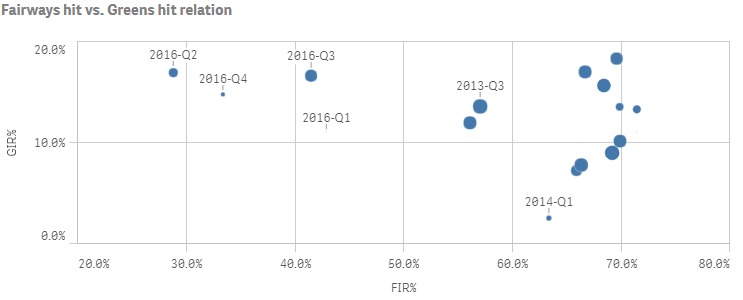
In this example we add a third measure to the scatter plot, which is used to calculate the bubble size.
- Define third measure
Define the third measure as a column.
{ "qDef": { "qLabel": "Holes played", "qDef": "Count(HoID)" } } - Define bubble size range
The bubble size range is defined in the dataPoint object in the options: "dataPoint": { "rangeBubbleSizes": [ 1, 11 ] }.
Tip noterangeBubbleSizes is an array of integers where the first index is the from-size, and the second is the to-size. From-size should always be smaller than the to-size. 1 is the minimum value and 20 is the maximum value.{ "showTitles": true, "title": "Fairways hit vs. Greens hit relation", "dataPoint": { "rangeBubbleSizes": [ 1, 11 ] } }
Result

Code examples
Customizing the bubble colors
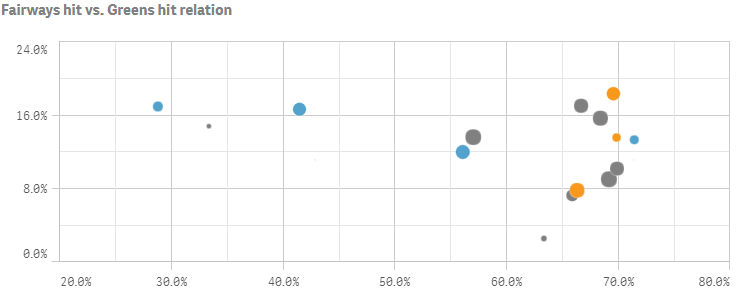
In this example we customize the color of the bubbles by an expression, where three different colors are applied depending on the return value of the expression.
- Enable custom colors
The bubble color is defined in the color object. We enable custom coloring "auto": false and set "mode": "byExpression". Then define the expression to be used for coloring: "colorExpression": "If(Avg(Stableford)>2,rgb(82, 162, 204),If(Avg(Stableford)<1.65,rgb(248, 152, 29),rgb(128, 128, 128)))". Since the expression includes an actual color code, set "expressionIsColor": true.
"color": { "auto": false, "mode": "byExpression" } - Define color expression
We then define the expression to be used for coloring: "colorExpression": "If(Avg(Stableford)>2,rgb(82, 162, 204),If(Avg(Stableford)<1.65,rgb(248, 152, 29),rgb(128, 128, 128)))". Since the expression includes an actual color code, set "expressionIsColor": true.
"color": { "auto": false, "mode": "byExpression", "expressionIsColor": true, "colorExpression": "If(Avg(Stableford)>2,rgb(82, 162, 204),If(Avg(Stableford)<1.65,rgb(248, 152, 29),rgb(128, 128, 128)))" } - Add attribute expression on first measure
Since color expressions must be added as attribute expressions on the first measure, we define this inside the first measure definition in the columns: "qAttributeExpressions": [ { "qExpression": "If(Avg(Stableford)>2,rgb(82, 162, 204),If(Avg(Stableford)<1.65,rgb(248, 152, 29),rgb(128, 128, 128)))", "id": "colorByExpression" } ].
{ "qDef": { "qLabel": "FIR%", "qDef": "Avg(FwHit)", "qNumFormat": { "qType": "F", "qnDec": 2, "qUseThou": 0, "qFmt": "0.0%", "qDec": ".", "qThou": "," } }, "qAttributeExpressions": [ { "qExpression": "If(Avg(Stableford)>2,rgb(82, 162, 204),If(Avg(Stableford)<1.65,rgb(248, 152, 29),rgb(128, 128, 128)))", "id": "colorByExpression" } ] },
Result

