Textarea property definition
This API is reliable and breaking changes are unlikely.
Fields
The text area definition property template can be used to add a custom property of text area type. When defining a text area property, the following fields can be used:
type
Should always be string for textarea properties.
component
Used for defining how the property is visualized in the property panel. Used to override the default component that comes with the type setting.
This field is mandatory for a textarea property and should always be "textarea".
label
Used for defining the label of the item.
rows
The amount of rows in the text area component. Default is 3.
maxlength
Used for defining the maximum number of characters in the text.
If undefined, maxLength will automatically be 512 characters.
ref
Name or ID used to reference a property.
defaultValue
Used for defining the default value of your custom property.
show
Function returning true if property should be displayed.
Example
Defining a custom text
Defining a custom property of text area type can look like below.
Example:
define( [
],
function ( ) {
return {
definition : {
type : "items",
component : "accordion",
items: {
settings: {
uses: "settings",
items: {
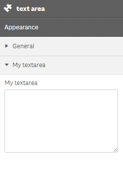
MyTextarea: {
label:"My textarea",
component: "textarea",
rows: 7,//the amount of rows in the textarea component (default is 3)
maxlength: 100,//will not allow more than 100 characters
ref: "myTextarea"
}
}
}
}
},
paint: function ($element, layout) {
//add your rendering code here
$element.html( "props-textarea"+ layout.myTextarea );
}
};
} );