Range-slider property definition
This API is reliable and breaking changes are unlikely.
Fields
The range-slider definition property template can be used to add a custom property of range-slider type. When defining a range-slider property, the following fields can be used:
type
This field is mandatory and should always be "array" for a range-slider property type definition.
component
Used for defining how the property is visualized in the property panel. Used to override the default component that comes with the type setting.
This field is mandatory for a slider property and should always be "slider".
label
Used for defining the label that is displayed in the property panel.
ref
Name or ID used to reference a property.
defaultValue
Used for defining the default value of your custom property.
Since you are defining a range of numbers, two default values need to be defined in the following format:
defaultValue: [n1, n2]
min
Used for defining the minimum value of the property.
max
Used for defining the maximum value of the property.
step
Used for defining the step value of the property.
Examples
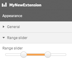
Defining a custom property of range slider type can look like below.
Example: Add custom range slider property to Appearance accordion
	return {
		type: "items",
		component: "accordion",
		items: {
			settings: {
				uses: "settings",
				items: {
					MyRangeSliderProp: {
						type: "array",
						component: "slider",
						label: "Range slider",
						ref: "myproperties.range",
						min: 10,
						max: 20,
						step: 0.5,
						defaultValue: [13, 17]
					}
				}
			}

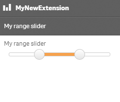
You can also define a new accordion item as a range slider property.
Example: Add custom range slider property as a new accordion item
	return {
		type: "items",
		component: "accordion",
		items: {
			MyAccordion: {
				type: "array",
				component: "slider",
				label: "My range slider",
				ref: "myproperties.range",
				min: 10,
				max: 20,
				step: 0.5,
				defaultValue: [13, 17]
			}

