
The combo chart is suitable for comparing two sets of measure values that are usually hard to compare because of the differences in scale. A typical example is when you have a bar chart with sales figures and want to combine these figures with the margin values (in percent). In a regular bar chart, the bars for sales would be displayed as usual, but the margin values would be almost invisible because of the very large difference between the numeric values for sales and margin.
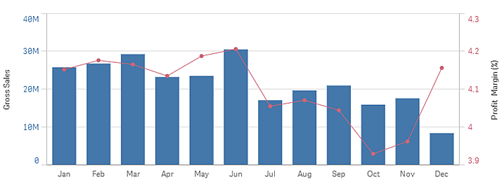
With a combo chart you can combine these values by, for example, using bars for the sales values and a line for the margin values. By default, the bars have the measure axis on the left and the margin values have a separate axis to the right. The two measures use the same dimension (month).
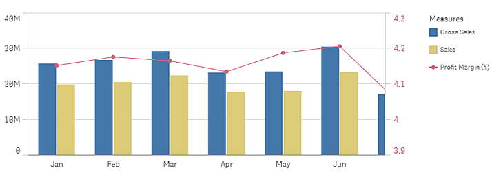
If you have yet another measure, for example, gross sales, with values that are roughly in the same range as the sales values, you can add the third measure as bars and either stack or group the new measure values with the sales values. With grouped bars, you can easily compare two or more items in the same categorical group. Stacked bars combine bars of different groups on top of each other and the total height of the resulting bar represents the combined result.
The combo chart can only be displayed vertically.
Number of dimensions and measures
In a combo chart, you need at least one dimension and one measure. You can only have one dimension but up to 15 measures.
Out of range
In the properties panel, under Appearance, you can set a limit for the measure axis range. Without a limit, the range is automatically set to include the highest positive and lowest negative value, but if you set a limit you may have values that exceed that limit. A bar that exceeds the limit will be cut diagonally to show that it is out of range. For a line data point value that is out of range, an arrow indicates the direction of the value.