
Description
The combo chart combines the features of the bar chart and the line chart. You can use bars and lines to represent different categorical groups in the same visualization.
When to use it
With the possibility to have different measure scales, one to the left and one to the right, the combo chart is ideal when you want to present measure values that are normally hard to combine because of the significant difference in value ranges.
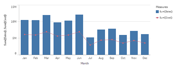
But a combo chart can also be quite useful when comparing values of the same value range. In the image above, the combo chart only has one measure axis, but the relationship between the two categories sales and cost is clear.
Advantages
The combo chart is the best choice when combining several measures of different value ranges.
Disadvantages
The combo chart only supports one dimension, and can therefore not be used when you need to include two or more dimensions in the visualization.