
After you have loaded data into your app, you can start adding visualizations to it to expose the data in a way that is understandable to users.
The following steps will help you to add two different visualizations; a filter pane and a bar chart.
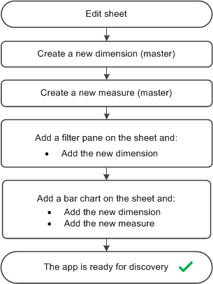
Edit sheet
If the sheet is already open and editable you can skip this step and start by creating a new dimension.
Do the following:
- From the app overview, click to open the sheets area.
- Click on a sheet to open it.
- Click Edit in the toolbar.
A panel with assets is opened on the left side.
Create a new dimension (master)
Do the following:
-
In the left panel, click to open Fields.
Here you will find all the fields in all the tables that you have loaded from your Excel file.
- Click the field Date.
-
In the popup, select Add to master items and As dimension.
The Create new dimension dialog appears with the dimension name already filled in.
-
Click Add dimension.
- Click Done.
The new dimension Date is saved as a master item ().
Create a new measure (master)
Do the following:
-
In the left panel, click to open Master items.
-
Click Measures and Create new to open the Create new measure dialog.
Use the expression editor to enter an expression for the measure.
-
Click in the Expression field.
The Add expression dialog is opened.
-
In the Field list, select Sales.
-
In the aggregation list below Sales, select Sum.
-
Click Insert.
The expression is inserted into the expression editor.
-
Click Apply.
You are back to the measure dialog.
-
Enter Sales as the measure name. Click Create.
The new measure Sales is saved as a master item ().
Add a filter pane
Do the following:
- In the left panel, click to open the Charts section.
- Drag the chart type Filter pane onto the sheet.
- Click Add dimension and select Date from the Dimensions section of the list.
The filter pane is complete and shows all the values from the Date dimension.
Add a bar chart
Do the following:
- Drag a second chart type, Bar chart onto the sheet.
- Click Add dimension and select Date from the Dimensions section of the list.
- Click Add measure and select Sales from the Measures section of the list.
The bar chart is complete and shows the data values from the new dimension and measure as the X-axis and Y-axis of the bar chart.
The app is ready for discoveries
You now have an app with one sheet containing two visualizations and can start using the app.