
Qlik Sense enables you to create and design interactive and clear visualizations, on one or more sheets, using a palette of chart types such as bar charts, pie charts, tables, gauges, and treemaps. The visualizations are simple to add and customize. Interactivity such as drill-down and filtering is built in because Qlik Sense automatically highlights items associated with your selections. You can enhance interactivity further with functionality specific to the different visualizations.
While building visualizations on sheets, consider some rules of thumb:
- Consistency helps the user to navigate and understand the app.
- Keep the sheet tidy and let the data visualization play center stage.
- Focus on a few metrics (KPIs) per sheet and present these in priority order.
- Make sure that the user can drill-down in data. For example, create dimensions for time and date to make it easy to drill down in year, month, week and day.
- Avoid using red and green colors as indicators because these colors can be hard for users with color-vision deficiency to distinguish.
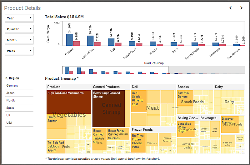
An example of a sheet with four different charts.
You can get a lot of good inspiration by checking out the demo apps: