
What's new in Qlik Sense February 2024
This section provides Qlik Sense business users, analytic creators, and data integrators a summary of the features and improvements available in Qlik Sense Enterprise on Windows.
Qlik Sense administrators should review the What’s New section in the Qlik Sense for Administrators documentation set.
Qlik Sense developers should review the What’s New section in the Qlik Sense for Developers documentation set.
Visualizations and dashboards
Data window functions in engine load script
Customers can now perform complex calculations on their data tables in the Qlik load script to perform aggregation on different partitions without losing the granularity of their data.
This functionality is commonly used in SQL and with many ML data preparation use cases.
New pivot table
The new Pivot table is here with a set of new features:
-
Dimension headers
-
Null value custom symbol, foreground and background color
-
Grid styling with width and color
-
Font styling for size, color and family for headers and cell contents
-
Totals styling and placement options: above or below
-
Column width options, set to auto, in pixels or with percentage
-
Scrollbars outside chart
-
Interactive sort of dimensions
All of the above are designed and added based on feedback from our users. The new Pivot table is launched in the Visualization bundle and will replace native pivot next year when additional features are added.
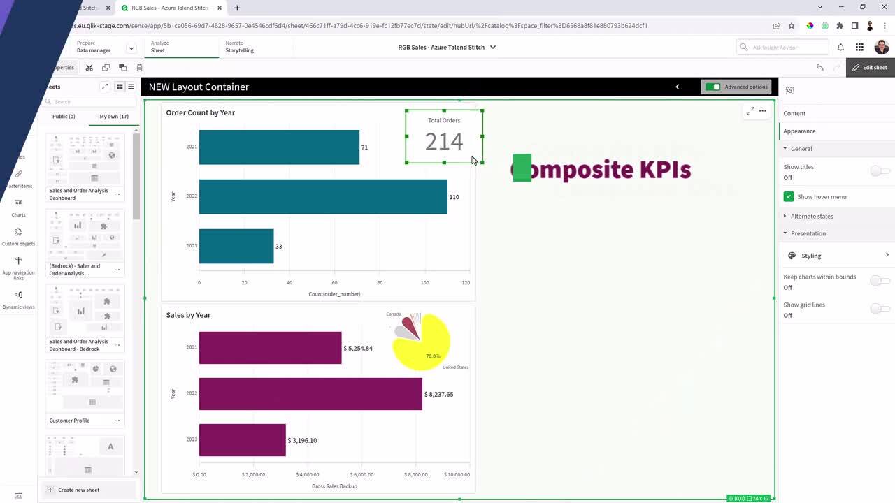
Layout container
The Layout container is a new component in the Dashboard bundle. In the Layout container, charts can be placed in a freeform manner with or without a snapping grid. Charts can overlap, be stacked, and controlled with show conditions. The Layout container is highly versatile but especially useful for:
-
Grouping charts together
-
Combining charts into new visualizations
-
Creating composite KPIs
-
Grouping and reusing user controls and buttons
-
Creating aesthetic pleasing dashboards
To get the most out the layout container, follow best practices, check out Bruno Calver's talk at Techspert Visualization Day on Qlik Community.
Styling Grid, Funnel & Sankey charts
The Grid chart, Funnel chart, and the Sankey chart have been upgraded with the new property panel for styling. The styling includes general settings for title, subtitle, footnote, background, border and shadow and chart specific settings for axis and value labels.
Grid chart (Visualization bundle)
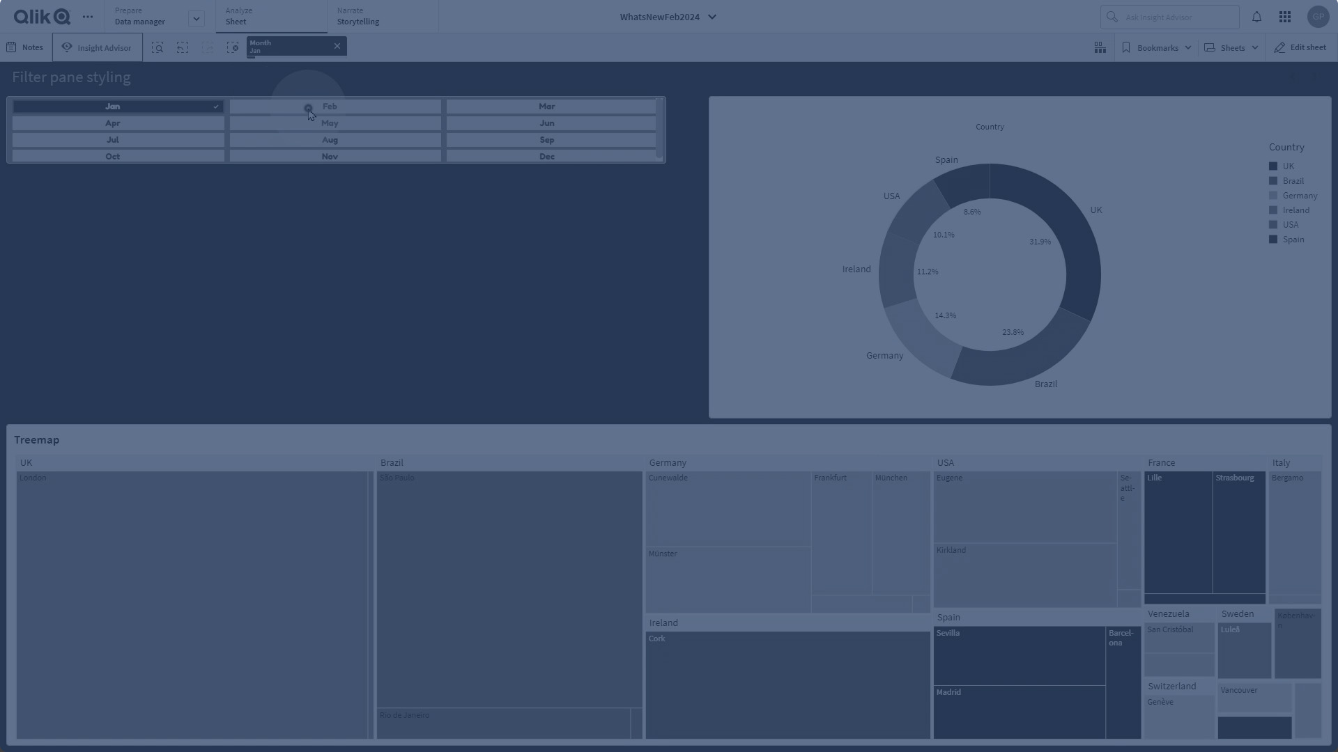
Filter pane styling
The Filter pane now gets more properties for styling: General settings for title font styling, background, border and shadow. Chart specific styling for header and content font styling, color settings for selection state, background color and image.
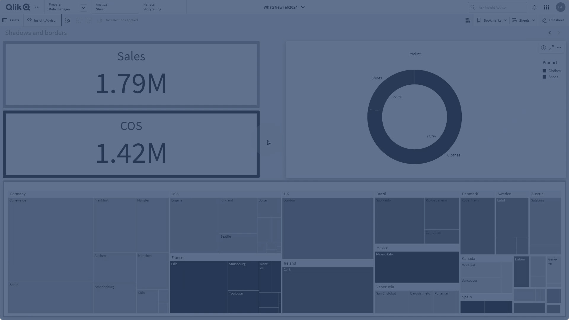
Borders and shadows
As of today, most charts receive settings for borders and shadows. Charts inherit the border setting from the theme but the border width and color setting can now be overridden and customized per chart. The border can play a big role in how your dashboard is perceived, use it wisely to achieve your goals.
Chart shadow is a new property on charts, providing a shadow contour around the chart, with options for size and color. Shadows create a depth effect and can be used to highlight and make certain elements stand out.
Borders and shadows works very well in the Layout container where charts can overlap and be stacked.
Copy and paste style
You now have a new menu choice for copying style settings from one chart to another. This quality of life improvement makes it easier to style and work with charts. Especially now when all charts has many more styling settings.