Styling an app
You can apply styling to customize the app based on your company standards. The selected styling will be applied to all sheets in the app. Once the app has been published, you cannot change the app styling.
Styling an appThe following styling options are available:
- Changing the direction of the characters in strings of text or numbers.
- Changing the default app theme.
- Toggling the hover menu on or off for all visualizations.
- Changing the background color for the sheet titles.
- Changing the sheet title font color.
- Adding and aligning an image, such as a logo.
- Toggling the toolbar and header on or off for all sheets.
More styling can be applied to an app by a developer through custom theme extensions.
Custom styling on individual objects override app styling.
Opening app options
You can open app options from anywhere in an unpublished app.
Do the following:
-
In an unpublished app, click
and then click
to open app options.
-
Click
to close app options.
Changing the reading order
Do the following:
- In an unpublished app, click
and then click
to open app options.
- Under Appearance > Right-to-left, select On or Off.
Changing the default app theme
You can apply one of the default Qlik themes or any custom theme that you have created and installed.
The default Qlik themes are:
-
Sense Horizon - This is the default theme when you create a new app.
- Sense Classic - Provides a more compact view of objects, and limits the space between them.
- Sense Focus - Adjusts the padding and spacing around objects as well as provides designated spaces for titles.
- Sense Breeze - Based on Sense Focus but with different color settings.
Do the following:
- In an unpublished app, click
and then click
to open app options.
- Select the theme to apply from the App Theme drop-down menu.
Custom themes
You can also create custom themes based on your company standards. With themes you can precisely style an app by changing the colors, adding images and backgrounds as well as specifying the fonts, font sizes, font weights and font styles on a global or granular basis throughout your app. You can also define color palettes and customize the specifications for margins, padding and spacing.
For more information, see Sense for Developers: Custom themes.
Custom themes are supported when exporting sheets and charts in PDF format. This applies to manually exported PDFs, as well as to PDFs exported automatically using subscriptions or via Qlik Reporting Service. However, a PDF generated from an app that uses a custom theme may look different than seen in the app. For more information, see Custom theme JSON properties.
When you have created a custom theme, you store it in Qlik Sense as an extension. The JSON file and any additional resources, such as CSS files, are zipped and imported as an extension in the Qlik Management Console (QMC). This enables that security rules can be added in the QMC for controlling which themes specific users have access to.
Custom themes appear under Custom in the App Theme drop-down menu.
App theme drop-down menu

Turning off the hover menu
You can choose to turn off the hover menu that appears on visualizations when users place their cursor over them. This will affect all visualizations in the app.
Do the following:
- In an unpublished app, click
and then click
to open app options.
- Click Turn off hover menu for visualizations.
You can turn off the hover menu for a single visualization in edit mode.
Do the following:
- In edit mode, select the visualization.
- In the properties panel, go to Appearance > General.
- Select Turn off hover menu.
Changing the chart animations
Chart animations are the gradual transitions in a visualization from the old view to the new view when data has been changed, after for example a selection has been made.
Chart animations can be turned off in the app settings. They are available for the following chart types:
-
Bar charts
-
Bullet charts
-
Line charts
-
Pie charts
-
Scatter plots
-
Funnel charts (Visualization bundle)
-
Grid charts (Visualization bundle)
-
Sankey charts (Visualization bundle)
Do the following:
- In an unpublished app, click
and then click
to open app options.
- Under Appearance > Chart animations, select On or Off.
Hiding the toolbar and header in sheets
You can hide the toolbar and sheet header in your app. This means that these areas will not display on any sheet, for any user, regardless of permissions. Any user with Can edit rights in the app can toggle these elements on or off.
Toolbar
The toolbar is the area above the sheet that contains the following buttons:
-
Notes
-
Insight Advisor
-
Selections
-
Bookmarks
-
Sheets
-
Edit sheet
Do the following:
- In the navigation bar, click the app name, and then click
to open app options.
- Under Appearance, toggle off Show toolbar.
Sheet header
The sheet header is the area on the sheet that contains the sheet title, title image, and the sheet navigation arrows.
Do the following:
- In the navigation bar, click the app name, and then click
to open app options.
- Under Sheet title styling , toggle off Show sheet header.
When to use it
Advantages
Hiding the toolbar and sheet headers creates more space for charts, filter panes, and other objects.
Turning off sheet headers means that this area will not appear when you download or share sheets, send subscriptions, or generate Qlik Application Automation reports. This is helpful if you are using your sheets to create PowerPoint presentations or dashboards.
Removing the toolbar means app developers have more control over which features other users can access easily. For example, hiding the Edit sheet button might discourage other app developers from editing the app.
Disadvantages
Hiding the toolbar does not completely remove capabilities such as bookmarks, notes, Insight Advisor, or sheet editing. For example, bookmarks can still be found in the app overview. However, app consumers may think that these features are no longer available.
If you hide the toolbar and sheet header, the only way to navigate between sheets is by using keyboard shortcuts or button objects.
If the selections area is hidden, users may not realize that selections have been applied to the app. You may need to add filter panes to your sheets or filters to individual charts.
Examples
A sheet displaying the toolbar and sheet header. The toolbar shows Notes, Insight Advisor, current selections, and more. The sheet header contains the title image, sheet title, and navigation arrows.

The same sheet as above, but the toolbar is visible and the sheet header is hidden. Users can no longer see the title image, sheet title, or navigation arrows.

The same sheet as above, but the sheet header is visible and the toolbar is hidden. Users cannot see which selections have been applied.

The same sheet as above, but the header and toolbar have both been hidden.

Changing sheet title colors
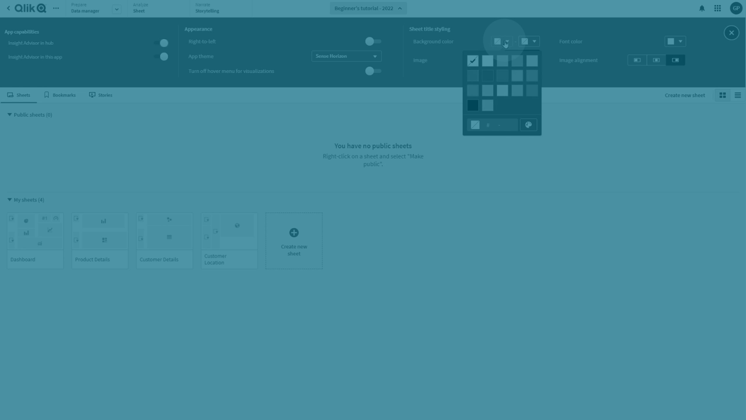
The sheet title background color can be set to a solid color or a gradient of colors by selecting two colors. The sheet title font can only be set to a solid color.
When choosing colors, you have the following options:
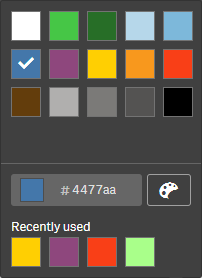
- Choose a color from the default color palette.
- Set a Hex color by typing 6 characters in the # input field.
- Click the palette to show more color options:
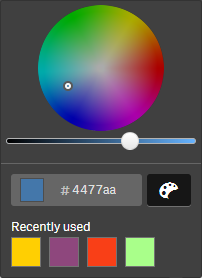
- Click the color wheel to select color.
- Drag the slider to change the color saturation.
Choosing a color from the default color palette
Do the following:
-
Click
in a color drop-down.
The dialog opens and displays the default colors.
-
Click one of the colors in the palette.
The color is selected.
-
Click outside the dialog.
The dialog is closed.
Now you have set a color by selecting in the default color palette.
Color dialog with the default color palette and a blue color selected.

Typing a Hex color
Do the following:
-
Click
in a color drop-down.
The dialog opens and displays the default colors.
-
Type 6 characters in the Hex input field #.
The color is selected in the palette.
-
Click outside the dialog.
The dialog is closed.
Now you have set a color by typing the 6 hexadecimal digits.
Using the advanced color options
Do the following:
-
Click
in a color drop-down.
The dialog opens and displays the default colors.
-
Click
at the bottom of the dialog.
The dialog changes and displays the advanced options.
-
Do one of the following:
-
Click in the color wheel.
The color changes and the Hex color code updates accordingly.
-
Drag the slider.
The saturation changes and the Hex color code updates accordingly.
Either way a color is selected.
-
-
Click outside the dialog.
The dialog is closed.
Now you have set a color by using the color wheel and/or the slider.
Color dialog with the advanced options and a blue color selected.

Adding an image
You can add an image to the sheet title, such as a logo. The following formats are supported: .png, .jpg, .jpeg, and .gif.
Do the following:
-
Click the image placeholder next to Image.
The Media library opens.
- Click on a folder in the media library (for example, In app or Default).
-
Select the image that you want to add to the sheet title.
A preview of the image is shown.
-
Click Insert.
The image is added.
Now you have added an image to the sheet title.

