
Dimensionality() returns the number of dimensions for the current row. In the case of pivot tables, the function returns the total number of dimension columns that have non-aggregation content, that is, do not contain partial sums or collapsed aggregates.
Syntax:
Dimensionality ( )
Return data type: integer
Limitations:
This function is only available in charts. For all chart types, except pivot table, it will return the number of dimensions in all rows except the total, which will be 0.
Example: Chart expression using Dimensionality
The Dimensionality() function can be used with a pivot table as a chart expression where you want to apply different cell formatting depending on the number of dimensions in a row that has non-aggregated data. This example uses the Dimensionality() function to apply a background color to table cells that match a given condition.
Load script
Load the following data as an inline load in the data load editor to create the chart expression example below.
ProductSales:

Load * inline [
Country,Product,Sales,Budget
Sweden,AA,100000,50000
Germany,AA,125000,175000
Canada,AA,105000,98000
Norway,AA,74850,68500
Ireland,AA,49000,48000
Sweden,BB,98000,99000
Germany,BB,115000,175000
Norway,BB,71850,68500
Ireland,BB,31000,48000
] (delimiter is ',');
For more information about using inline loads, see Inline loads.
Chart expression
Create a pivot table visualization in a Qlik Sense sheet with Country and Product as dimensions. Add Sum(Sales), Sum(Budget), and Dimensionality() as measures.
In the Properties panel, enter the following expression as the Background color expression for the Sum(Sales) measure:
If(Dimensionality()=1 and Sum(Sales)<Sum(Budget),RGB(255,156,156),
If(Dimensionality()=2 and Sum(Sales)<Sum(Budget),RGB(178,29,29)
))
Result:
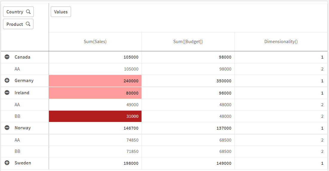
Explanation
The expression If(Dimensionality()=1 and Sum(Sales)<Sum(Budget),RGB(255,156,156), If(Dimensionality()=2 and Sum(Sales)<Sum(Budget),RGB(178,29,29))) contains conditional statements that check the dimensionality value and the Sum(Sales) and Sum(Budget) for each product. If the conditions are met, a background color is applied to the Sum(Sales) value.