
Creating waterfall charts
This section describes how to create waterfall charts with the Visualization API and qlik-visual.
Creating a basic waterfall chart
In this example we create a basic waterfall chart, containing of three measures, with a custom title and color legend switched off.
- Create the chart
Create the container for the chart. The visualization type is waterfallchart.
Visualization API
app.visualization.create(
  'waterfallchart',
  [],
  {}
)
qlik-visual
<qlik-visual appid="Tutorial-Golf.qvf" type="waterfallchart" cols='[]' options='{}' > </qlik-visual> - Define the first measure
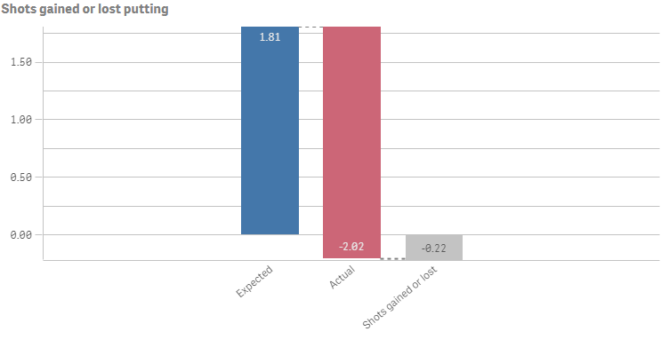
Define the first measure as a column. The first measure is using the measure operation Add: "valueType": "NORMAL".
[ { "qDef": { "qLabel": "Expected", "qDef": "Avg(ExpPutts)", "valueType": "NORMAL" } } ] - Define the second measure
Define the second measure as a column. It is using the measure operation Subtract: "valueType": "INVERSE".
[ { "qDef": { "qLabel": "Expected", "qDef": "Avg(ExpPutts)", "valueType": "NORMAL" } }, { "qDef": { "qLabel": "Actual", "qDef": "Avg(Putts)", "valueType": "INVERSE" } } ] - Define the third measure
Define the third measure as a column. The first measure is using the measure operation Subtotals: "valueType": "SUBTOTAL".
[ { "qDef": { "qLabel": "Expected", "qDef": "Avg(ExpPutts)", "valueType": "NORMAL" } }, { "qDef": { "qLabel": "Actual", "qDef": "Avg(Putts)", "valueType": "INVERSE" } }, { "qDef": { "qLabel": "Shots gained or lost", "qDef": "Avg(ExpPutts-Putts)", "valueType": "SUBTOTAL" } } ] - Define title
Then add a custom title and switch off the legend in the options.
{ "showTitles": true, "title": "Shots gained or lost putting", "legend": { "show": false } }
Result

Code examples
Defining number formatting and grid line spacing
In this example the number formatting is changed to always display two decimals and the grid line spacing has been set to narrow.
- Number formatting
We change the number formatting for all three measures in the columns:
"qNumFormat": { "qType": "F", "qnDec": 2, "qUseThou": 0, "qFmt": "#,##0.00", "qDec": ".", "qThou": "," } - Grid line spacing
Then specify the grid line spacing in the options: "gridlines": { "auto": false, "spacing": 3 }, where 3 means narrow.
{ "showTitles": true, "title": "Shots gained or lost putting", "gridlines": { "auto": false, "spacing": 3 }, "legend": { "show": false } }
Result
Code examples
Using custom colors
You can set the presentation color for the different measure operations: Positive value color, Negative value color, and Subtotal color.
The following colors are being used in this example:
- Positive value color: #91c26a
- Negative value color: #f8981d
- Subtotal color: #52a2cc
- Defining the colors
The colors are defined in the color object. Switch off auto coloring: "auto": false. Then add a definition for the positive value color: "positiveValue": { "paletteColor": { "index": -1, "color": "#91c26a" }. Add the definition for the negative value color: "negativeValue": { "paletteColor": { "index": 9, "color": "#f8981d" } }. Finally, define the subtotal color: "subtotal": { "paletteColor": { "index": -1, "color": "#52a2cc" } }.
"color": { "auto": false, "positiveValue": { "paletteColor": { "index": -1, "color": "#91c26a" } }, "negativeValue": { "paletteColor": { "index": 9, "color": "#f8981d" } }, "subtotal": { "paletteColor": { "index": -1, "color": "#52a2cc" } } }
Result

Code examples
Dimension and measure axis settings
In this example we make changes to how the X and Y axes are presented.
- X axis
X-axis settings are set in the dimensionAxis object.
Set to display labels only on the X-axis: "show": "labels". State that the labels should always be horizontally displayed: "label": "horizontal", and positioned at the top of the visualization: "dock": "far".
"dimensionAxis": { "show": "labels", "label": "horizontal", "dock": "far" } - Y axis
Y-axis settings are set in the measureAxis object.
For the Y-axis, also set to display labels only: "show": "labels". Then set narrow scaling of the axis: "spacing": 0.5, where 0.5 means narrow. Disable auto range to define a custom value range for the Y-axis: "autoMinMax": false. Then set the range mode: "minMax": "minMax", and define the minimum and maximum values: "min": -0.5, "max": 2.
"measureAxis": { "show": "labels", "spacing": 0.5, "autoMinMax": false, "minMax": "minMax", "min": -0.5, "max": 2 }
Result
