Creating line charts
This section describes how to create line charts with the Visualization API and qlik-visual.
Creating a basic line chart
In this example we create a basic line chart, containing one dimension and one measure, and with a custom title.
- Create the chart
Create the container for the chart. The visualization type is linechart.
Visualization API
app.visualization.create(
  'linechart',
  [],
  {}
)
qlik-visual
<qlik-visual appid="Tutorial-Golf.qvf" type="linechart" cols='[]' options='{}' > </qlik-visual> - Define dimension
Define the dimension as a column. Note the Dual function used in the dimension definition: "qFieldDefs": [ "=Dual([Date.autoCalendar.Date],ID)" ]. It is used to separate values that belong to separate ranges (ID) but has the same date ([Date.autoCalendar.Date]).
For more information about the Dual function, see Dual - script and chart function.
[ { "qDef": { "qGrouping": "N", "qFieldDefs": [ "=Dual([Date.autoCalendar.Date],ID)" ], "qFieldLabels": [ "Date" ] }, "qNullSuppression": true } ] - Define measure
Define the measure as a column.
[ { "qDef": { "qGrouping": "N", "qFieldDefs": [ "=Dual([Date.autoCalendar.Date],ID)" ], "qFieldLabels": [ "Date" ] }, "qNullSuppression": true }, { "qDef": { "qLabel": "Pts", "qGrouping": "N", "qDef": "Avg(Stableford)", "qNumFormat": { "qType": "U", "qnDec": 10, "qUseThou": 0 } } } ] - Define title
Then define the title in the options.
{ "showTitles": true, "title": "Stableford point trend" }
Result

Code examples
Number formatting and presentation
In this example, the number formatting has changed, show data points is enabled, grid line spacing is narrow, and missing values are shown as connections.
- Change number formatting
We change the number formatting of the measure to show two decimals. Set "qType": "F" to indicate that a fixed number of decimals is used. Then set "qnDec": 2 to indicate that two decimals is used.
{ "qDef": { "qLabel": "Pts", "qGrouping": "N", "qDef": "Avg(Stableford)", "qNumFormat": { "qType": "F", "qnDec": 2, "qUseThou": 0, "qFmt": "#,##0.00", "qDec": ".", "qThou": "," } } } - Show data points
In the options, enable data points: "dataPoint": { "show": true, "showLabels": false }. We do not show value labels on the data points in this example.
{ "showTitles": true, "title": "Stableford point trend", "dataPoint": { "show": true, "showLabels": false } } - Narrow grid line spacing
Then set grid line spacing to narrow: "gridLine": { "auto": false, "spacing": 3 }, where 3 means narrow.
{ "showTitles": true, "title": "Stableford point trend", "dataPoint": { "show": true, "showLabels": false }, "gridLine": { "auto": false, "spacing": 3 } } - Connect missing values
Finally, define that missing values should be shown as connections: "nullMode": "connect".
{ "showTitles": true, "title": "Stableford point trend", "nullMode": "connect", "dataPoint": { "show": true, "showLabels": false }, "gridLine": { "auto": false, "spacing": 3 } }
Result

Code examples
Area chart with two measures and numerous settings
In this example we display the chart as an area chart. We also add a second measure and some presentation settings are defined.
- Add second measure
We define the second measure as a column.
{ "qDef": { "qLabel": "Putts", "qGrouping": "N", "qDef": "Avg(Putts)", "qNumFormat": { "qType": "F", "qnDec": 2, "qUseThou": 0, "qFmt": "#,##0.00", "qDec": ".", "qThou": "," } } } - Area chart
In this example we want to present the chart as an area chart. This is defined in the options: "lineType": "area".
{ "showTitles": true, "title": "Stableford point and putt average relation", "lineType": "area", "nullMode": "connect", "dataPoint": { "show": true, "showLabels": false }, "gridLine": { "auto": false, "spacing": 3 } } - Scroll alignment
Define the scroll alignment to be at the end: "scrollStartPos": 1.
{ "showTitles": true, "title": "Stableford point and putt average relation", "lineType": "area", "scrollStartPos": 1, "nullMode": "connect", "dataPoint": { "show": true, "showLabels": false }, "gridLine": { "auto": false, "spacing": 3 } } - Dimension axis
Axis settings are set in the dimensionAxis and measureAxis objects. On the dimension axis, set to display labels only that are tilted: "dimensionAxis": { "continuousAuto": true, "show": "labels", "label": "tilted" }.
{ "showTitles": true, "title": "Stableford point and putt average relation", "lineType": "area", "scrollStartPos": 1, "nullMode": "connect", "dataPoint": { "show": true, "showLabels": false }, "gridLine": { "auto": false, "spacing": 3 }, "dimensionAxis": { "continuousAuto": true, "show": "labels", "label": "tilted" } } - Measure axis
On the measure axis, also set to display labels only and then set the measure axis scale to narrow: "measureAxis": { "show": "labels", "dock": "near", "spacing": 0.5 }.
{ "showTitles": true, "title": "Stableford point and putt average relation", "lineType": "area", "scrollStartPos": 1, "nullMode": "connect", "dataPoint": { "show": true, "showLabels": false }, "gridLine": { "auto": false, "spacing": 3 }, "dimensionAxis": { "continuousAuto": true, "show": "labels", "label": "tilted" }, "measureAxis": { "show": "labels", "dock": "near", "spacing": 0.5 } }
Result

Code examples
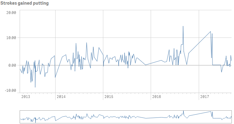
Creating a time-aware line chart
In this example we create a time-aware line chart, containing one dimension and one measure.
- Define dimension
Define the dimension as a column.
{ "qDef": { "qGrouping": "N", "qFieldDefs": [ "Date.autoCalendar.Date" ], "qFieldLabels": [ "Date" ] } } - Define measure
Define the measure as a column.
{ "qDef": { "qGrouping": "N", "qFieldDefs": [ "Date.autoCalendar.Date" ], "qFieldLabels": [ "Date" ] } }, { "qDef": { "qLabel": "Strokes gained putting", "qDef": "Sum(ExpPutts-Putts)", "qNumFormat": { "qType": "F", "qnDec": 2, "qUseThou": 0, "qFmt": "#,##0.00", "qDec": ".", "qThou": "," }, "autoSort": true } } - Set title
Define a title in the options: "title": "Strokes gained putting".
{ "showTitles": true, "title": "Strokes gained putting" } - Dimension axis
We want to show labels only on the dimension axis. We also set "continuousAuto": false to indicate that we want to customize the scaling of the dimensional axis. This is then done by setting "preferContinuousAxis": true, which means that the scale along the dimensional axis is continuous if supported by the data.
{ "showTitles": true, "title": "Strokes gained putting", "dimensionAxis": { "continuousAuto": false, "show": "labels" }, "preferContinuousAxis": true } - Measure axis
We want to show labels only on the measure axis: "measureAxis": { "show": "labels" }.
{ "showTitles": true, "title": "Strokes gained putting", "dimensionAxis": { "continuousAuto": false, "show": "labels" }, "preferContinuousAxis": true, "measureAxis": { "show": "labels" } }
Result