
Analyze App Adoption
Cadence Quarterly
Sites production
| Initial | Recurring | |
|---|---|---|
| Estimated Time | 25 Min | 10 min |
Benefits:
- Understand adoption
- Better understand user-base
- Identify top and bottom applications by adoption
Goal
At its simplest, the goal of this page is to identify the top five and bottom five applications by two metrics:
- Total sessions by application
- Total distinct users by application
It is also important to identify any visible trends of usage — is usage trending up or down, or are there consistent spikes? In addition, it is helpful to characterize these applications, e.g. highly used yet only by a few individuals, widely used but infrequently accessed, etc. To visualize these areas, two additional charts will be built.
Suggested Prerequisites
Operations Monitor
This page leverages the Operations Monitor. Please refer to the Operations Monitor page for an overview and relevant documentation links.
Confirm Operations Monitor is Operational
Navigate to the Monitoring apps and select the Details button (info icon) on the Operations Monitor application. Confirm that the application's data is up-to-date.
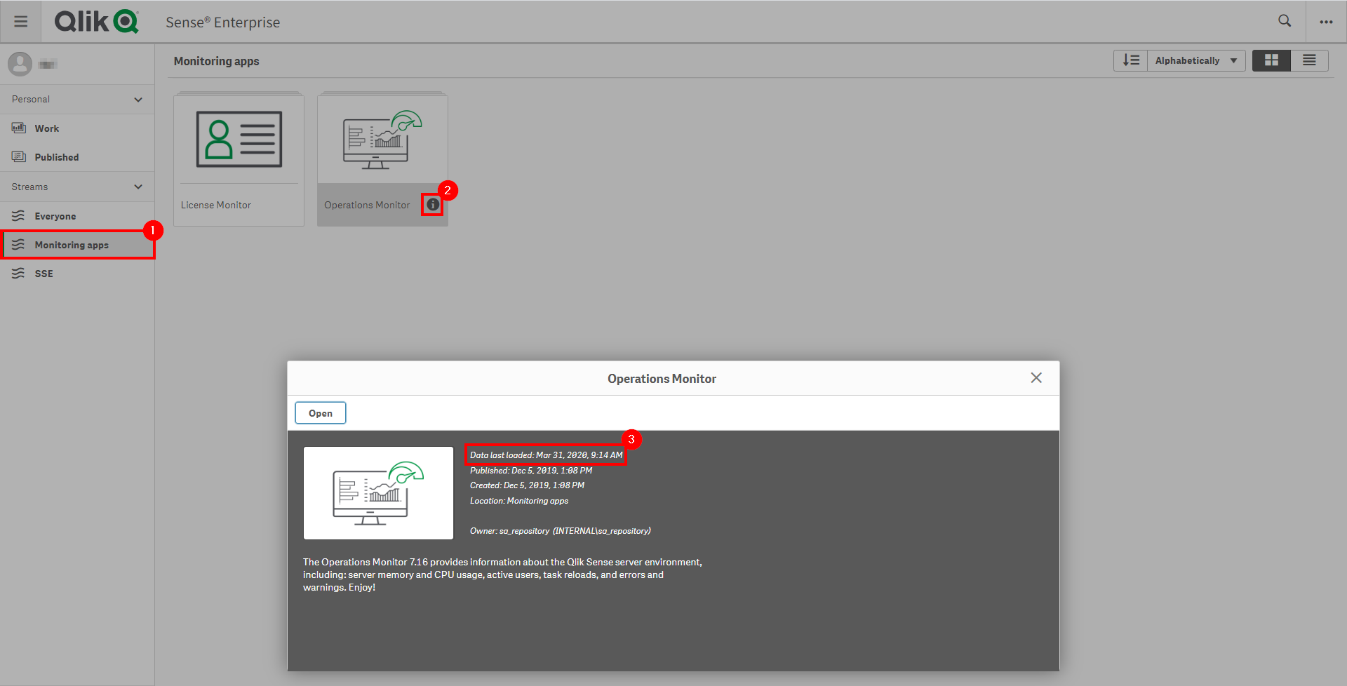
If the Operations Monitor is not up-to-date, please refer to the Operations Monitor Documentation for configuration details and troubleshooting steps.
User & Session Metrics
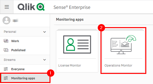
Navigate to the Monitoring apps stream and open up the Operations Monitor application.
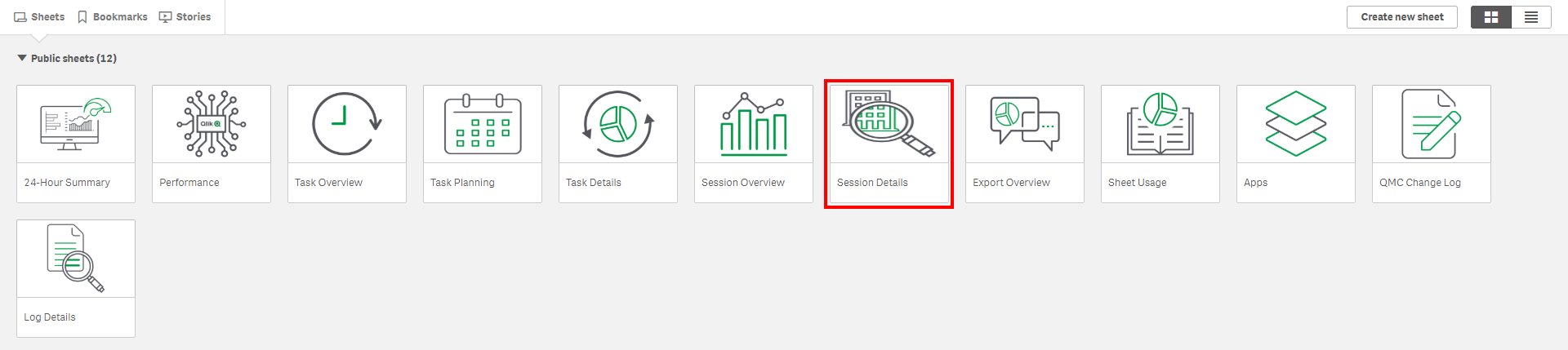
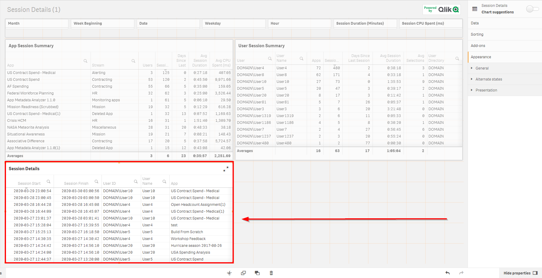
Select the Session Details sheet.
Assuming this process is taking place quarterly, select the latest three full months.

Sort the Sessions column of the App Session Summary table descending to view the applications with the greatest number of sessions.
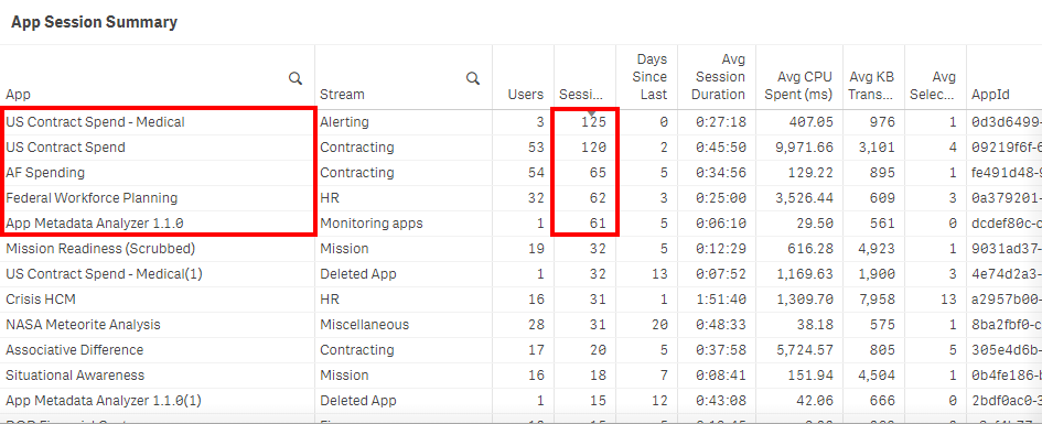
To see the applications with the greatest number of distinct users, sort the Users column descending.
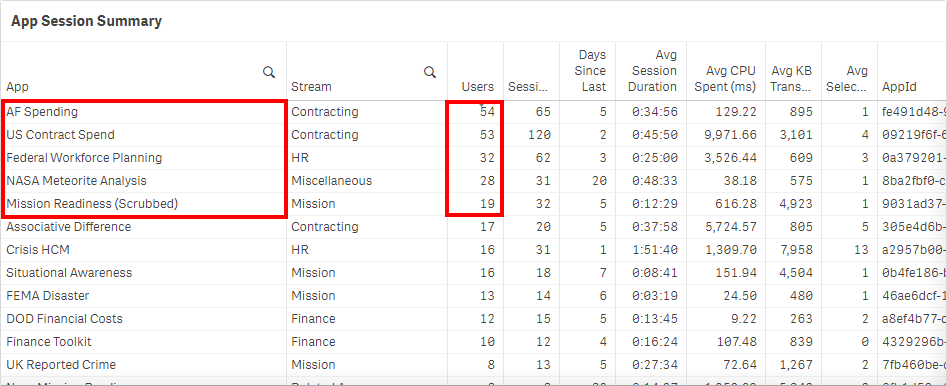
Analyze the results. In this example, three of the applications overlap, but notice that one was heavily used by only a single user. It is important to recognize and weigh an application's importance by considering both metrics. Ask: Is it relevant only to one person? Is it known only to that person? Or is that person unaware of a newer application?
Repeat the process above for the bottom five applications, sorting both the Sessions and Users columns descending and recording results for comparison.
Application/Session Activity Breakdown
The metrics above are valuable for discerning which applications are used the most. Consider the following questions:
- What is the breakdown of each user's usage within each app?
- Is the session usage relatively evenly distributed, or is it condensed to only a few users?
- What is the percentage of an application's usage against other applications? For instance, what percentage do the top five applications take up of the entire environment?
A new chart can be created to easily visualize session usage and users and answer these questions.
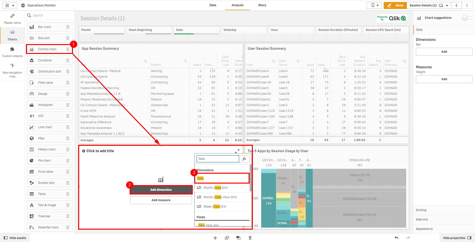
Duplicate the Session Details sheet and clear space on the dashboard to make room for a new chart object.
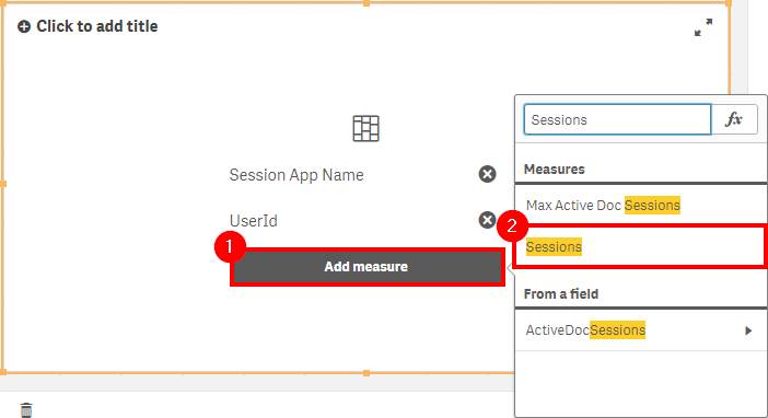
Drag and drop the Mekko chart (available as of the November 2019 release) and select Add dimension. Then select the Session App Name field.
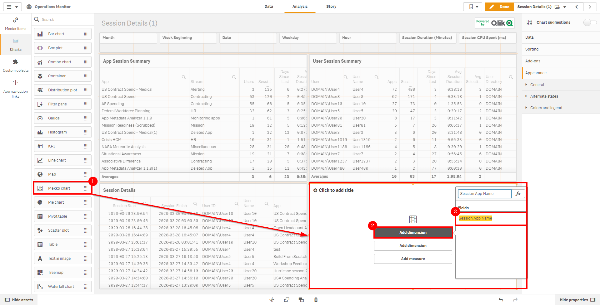
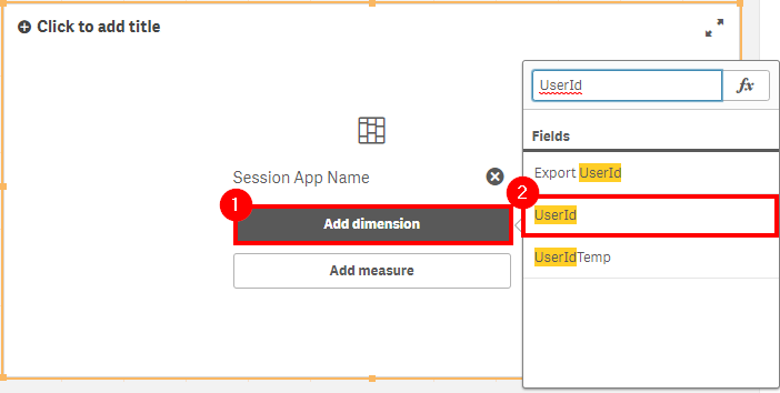
Add the second dimension of UserId.
Select Add measure and add Sessions.
In the properties panel, expand the Session App Name panel and set the Limitation to Fixed number. Set the Top to
6(which allows the top five applications to show, along with the Others faux dimension). Ensure that Show others is toggled on.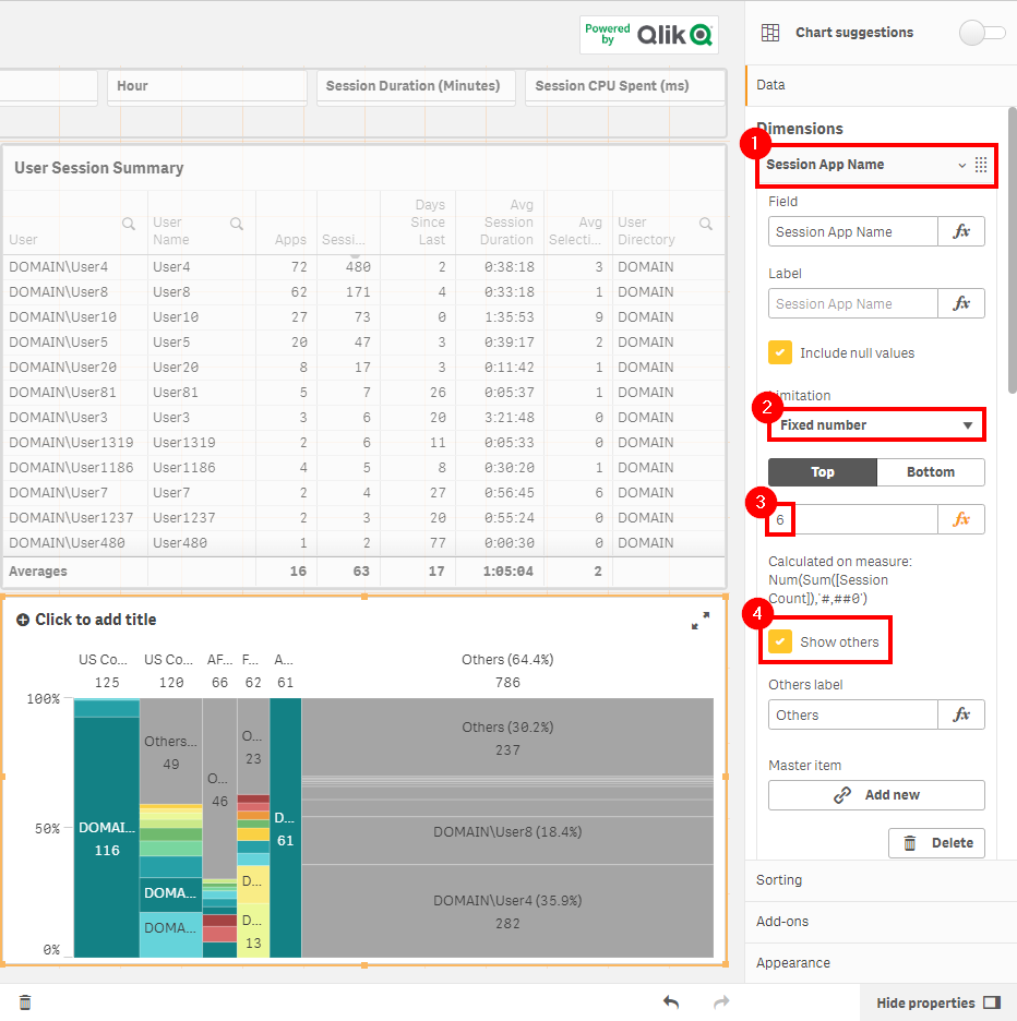
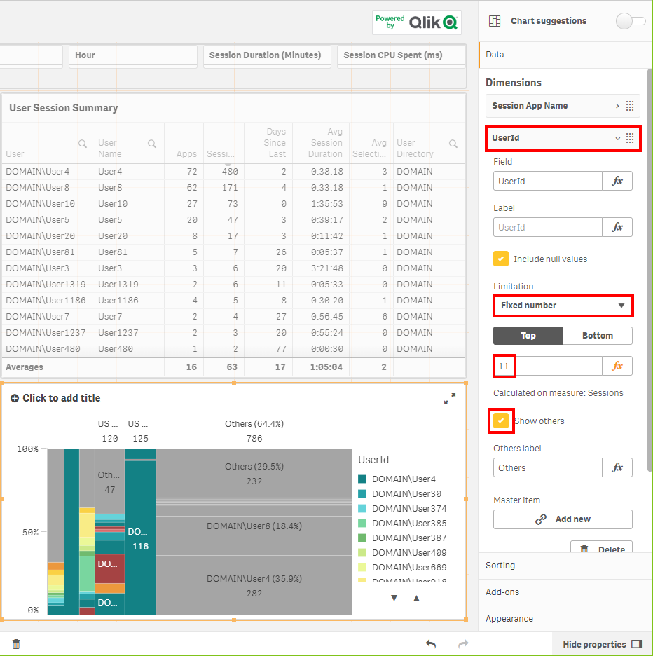
Select the UserId dimension and do the same, setting the Top to
11.
Navigate to the sorting section and expand Session App Name. Untoggle the default sorting (Auto), toggle on Sort by expression, select Descending, and enter
Sum([Session Count])as the expression value.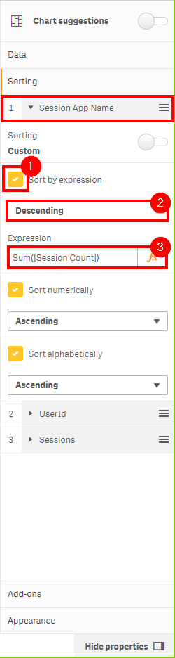
Repeat the same sorting process for the UserId dimension.
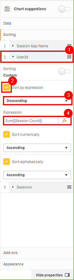
Ensure the sort order is:
- Session App Name
- UserId
- Sessions
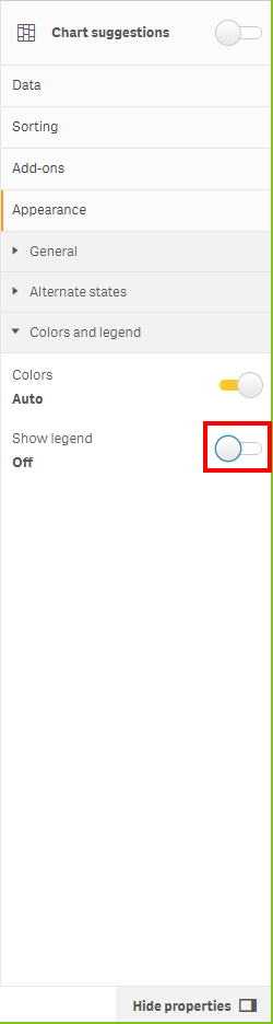
Move to the Colors and legend section under Appearance. Toggle off Show legend to give the chart more space.
View the completed chart. You can now quickly spot:
- Who the predominant consumers of the top five applications are (if the distribution is uneven)
- The distribution of sessions by user (even or condensed to several)
- The percentage distribution of sessions relative to others
- The percentage of all sessions of the top five applications against all others
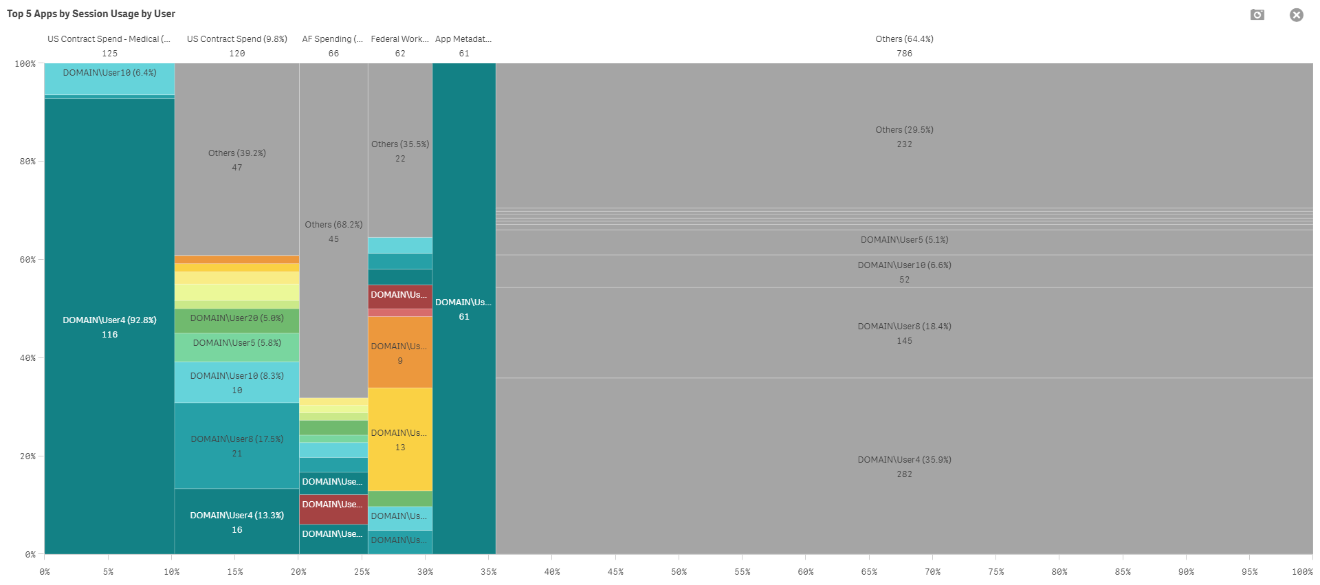
Click on the top five applications specifically (after noting the higher-level metric regarding overall usage) to make the detail easier to consume.

Application Usage Trending
After identifying the top five applications, it is important to see in which direction their usage is trending. To do this, create a new chart.
Create some room on the duplicated Session Details sheet. (In this example, the details table has been removed as it is not relevant to this analysis.)
First, select the Combo chart and insert it. Then select the Date as the dimension.
Select Add measure and insert the Sessions measure.
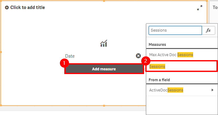
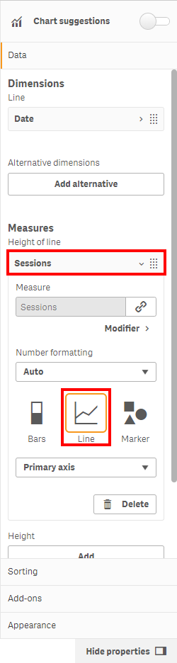
Under Measures, select Sessions and change the type to Line.
In the editing pane, under Height, select Add. Then click the fx button.
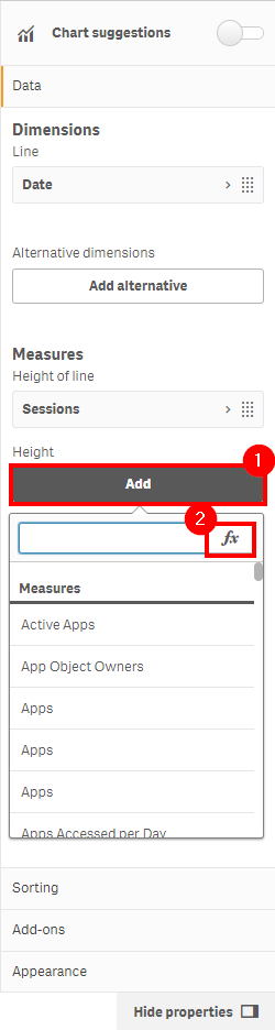
Insert the expression
count({<[Session Count]={1}>} DISTINCT UserId). Name the measure Users and ensure it is of type Line.
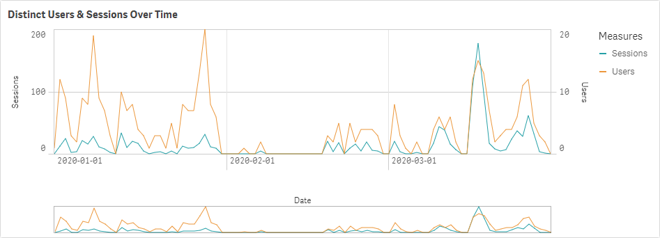
View the completed chart. It is easy to spot when there are many distinct users with few sessions each, or when there are only a few users with many sessions. Select each of the top five applications one by one (as well as the bottom five) to view the trends individually.
Tags
#quarterly
#asset_management
#apps
#operations_monitor