
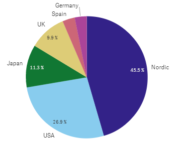
The pie chart displays the relation between values as well as the relation of a single value to the total. You can use a pie chart when you have a single data series with only positive values.
In the pie chart, the dimensions form sectors of the measure value. You can include one measure and one dimension in a pie chart.
When to use it
The primary use of a pie chart is to compare a certain sector to the total. The pie chart is particularly useful when there are only two sectors, for example yes/no or queued/finished.
We do not recommend that you compare the results of two pie charts with each other.
| Advantages | Disadvantages |
|---|---|
| The pie chart provides an instant understanding of proportions when few sectors are used as dimensions. When you use 10 sectors, or less, the pie chart keeps its visual efficiency. |
It may be difficult to compare different sectors of a pie chart, especially a chart with many sectors. The pie chart takes up a lot of space in relation to the values it visualizes. |
Creating a pie chart
You can create a pie chart on the sheet you are editing.
Do the following:
- From the assets panel, drag an empty pie chart to the sheet.
- Click Add dimension and select a dimension or a field.
- Click Add measure and select a measure or create a measure from a field.
The following settings are used by default in a pie chart:
- The top 10 sectors are presented in descending size order, clockwise.
- Colors are presented by dimension.
- Value labels are presented in percent.
When you have created the pie chart, you may want to adjust its appearance and other settings in the properties panel.