
Some Qlik DataMarket data sets contain dimensions that include an aggregate field. For example, the following World population by country data set contains a Sex dimension with an aggregate total and totals for females and males separately. If you select the entire dimension--the check box at the top--then all the fields in the dimension are selected. You can, however, select individual fields at the lower levels.
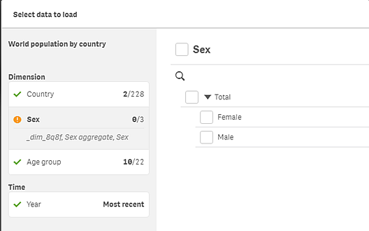
When the Sex aggregate only is selected, the total of all males and females are included in the data. But the totals for males and females are not included. So you would not be able to create visualizations with separate data for males and females.
To include data broken down by male and female, you would select Sex. Then you could create visualizations that show male and female population totals separately. And if you are interested in the total for only one gender, then you could select Male or Female.
The aggregate field is included even if you do not select it explicitly. And the value in the aggregate field is equal to the value of the individual fields selected. In the case of the Sex data, Sex aggregate is equal to the total of females if the Female field is the only Sex field selected.
When you build a visualization using the Sex dimension, the data displays the sums of male and female separately. For example, the total male and female population for Argentina is displayed as two separate bars in a bar chart.
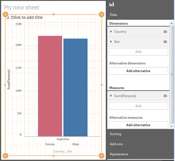
Conversely, if you use the Sex aggregate dimension instead of the Sex dimension in the bar chart, you would get a single bar for the combined total of males and females.
If you select only the Sex aggregate data and not Sex or either of the gender selections separately, then you cannot display the data by gender in a visualization. The bar chart above would have a single bar for the total of males and females instead of the separate bars for Female and Male as in the screen above.