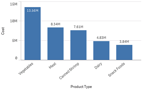
Dimensions determine how the data in a visualization is grouped - for example total sales per country or number of products per supplier. You typically find a dimension as the slices in a pie chart or on the x-axis of a bar chart with vertical bars.
Dimensions are created from fields in the data model tables.
Example:
Product Type is a field in the Product table that is loaded into the app. The values of this field are the different types that products are grouped into.
You can, for example, create a bar chart to visualize the cost of each type, by adding the Product Type dimension to the chart. To complete the visualization, you must add a measure (in this case Cost), which is grouped by the Product Type dimension.

