Examples of visualization color settings
Although Qlik Sense sets colors in visualizations automatically, you can use a number of different methods to control the use of colors in your visualizations. You can manually apply colors to your visualizations using the following methods:
- Color by single color
- Color by multiple colors
- Color by dimension
- Color by measure
- Color by expression
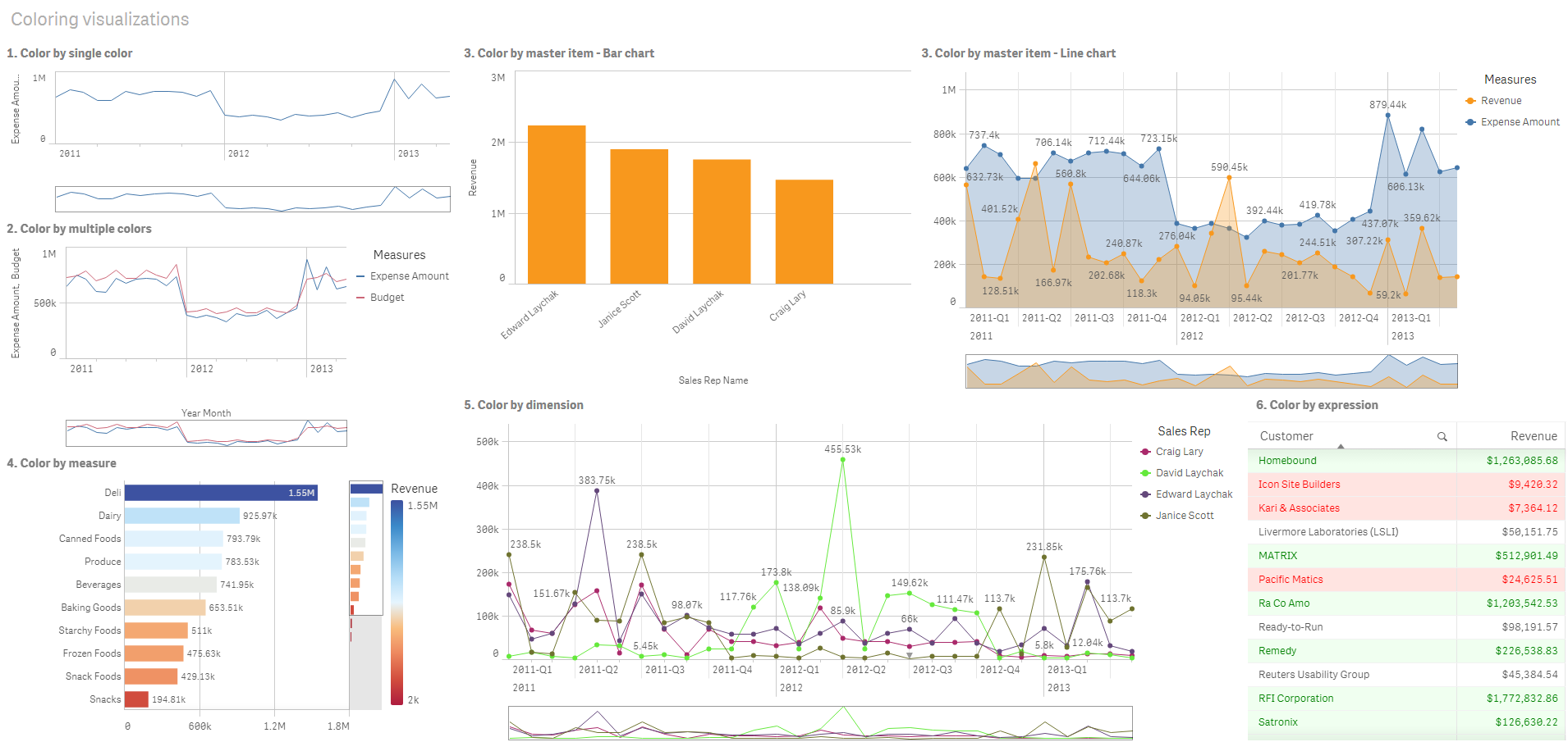
In the example dashboard below, each method of setting colors has a corresponding visualization. This section outlines each example as well as the specific settings used in the properties panel.
Example dashboard
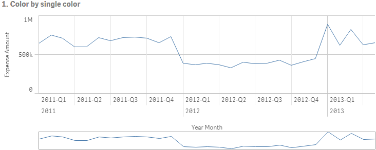
Color by single color
Visualizations can be colored with a single user-defined color. Colors can be selected from a palette or color wheel or by entering a hex color code.
In this example visualization, a single color has been applied to the line chart.
Properties panel settings
For this visualization, the following properties were set in the properties panel under Appearance > Colors and Legends:
- Colors: Set to Custom and Single color. Color set as hex value 4477aa.
Color by multiple colors
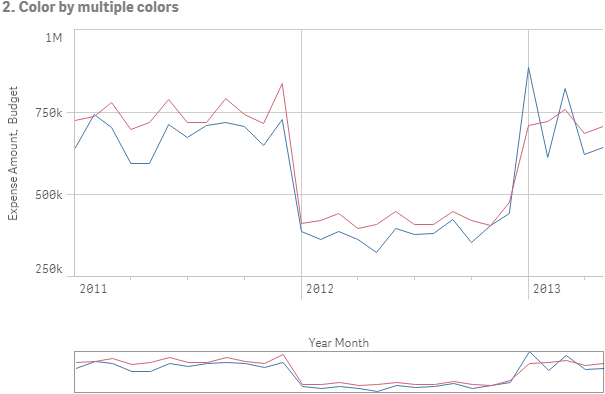
Visualizations with multiple measures can have different colors applied to each measure. When a visualization is colored using Multicolor, colors are automatically applied from a default color scheme of 12 colors or 100 colors.
In this example visualization, multiple colors have been applied to the measures of Expense Amount and Budget in the line chart.
Line chart colored by multiple colors
Properties panel settings
For this visualization, the following properties were set in the properties panel under Appearance > Colors and Legends:
- Colors: Set to Custom and Multicolored.
- Color scheme: Set to 12 colors.
Color by master item
Colors can be kept consistent across visualizations for dimensions or measures through setting colors in master items. When set to use master item colors, visualizations will use all colors associated to the master items in the visualization. Master item colors can be used when Color is set to Single color or Multicolor.
In these example visualizations, both the bar chart and line chart share a master measure, Revenue, that is colored orange. In each visualization, the same assigned color is used for each instance of Revenue. The line chart is colored by a second master measure, Expense Amount, which is colored blue.
Charts colored by master items

Master measure settings
For this visualization, the following settings were applied to the master measures in Edit measure:
- Color: Hex color set as f8981d for Revenue and 4477aa for Expense Amount.
See: Assigning colors to master items
Properties panel settings
For the bar chart, the following properties were set in the properties panel under Appearance > Colors and Legends:
- Colors: Set to Custom and Single color.
- Use library colors: Set to enabled.
For the line chart, the following properties were set in the properties panel under Appearance > Colors and Legends:
- Colors: Set to Custom and Multicolor.
- Use library colors: Set to enabled.
See: Bar chart properties and Line chart properties
Color by measure
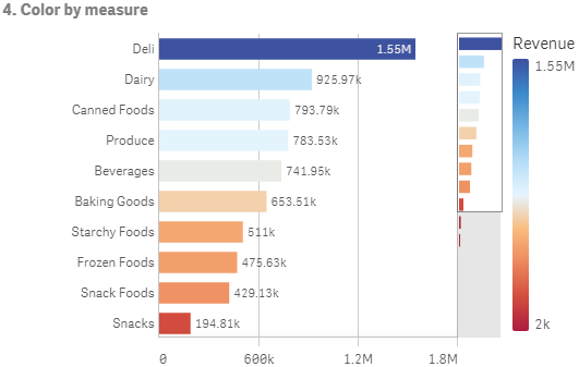
When a visualization colored by measure, sequential or diverging gradients or classes are applied to values in the chart based on the values of the selected measure. Visualizations can be colored by measures within the visualization or they can be colored with measures associated to values in the visualization.
In this example, this bar chart is colored by the measure used in the visualization, Revenue. A diverging gradient has been applied to the values in the chart based on the Revenue value for each dimension value.
Bar chart colored by measure
Properties panel settings
For this visualization, the following properties were set in the properties panel under Appearance > Colors and Legends:
- Colors: Set to Custom and By measure. The measure selected is Revenue.
- Color scheme: Set to Diverging gradient.
- Reverse colors: Set to enabled.
- Range: Set to Auto.
See: Bar chart properties
Color by dimension
When a visualization is colored by dimension, each value within the visualization is assigned a color based on an associated value from the coloring dimension. When colored by dimension, colors are automatically applied from a default palette set of 12 or 100 colors.
Example 1: Coloring by a dimension in the visualization
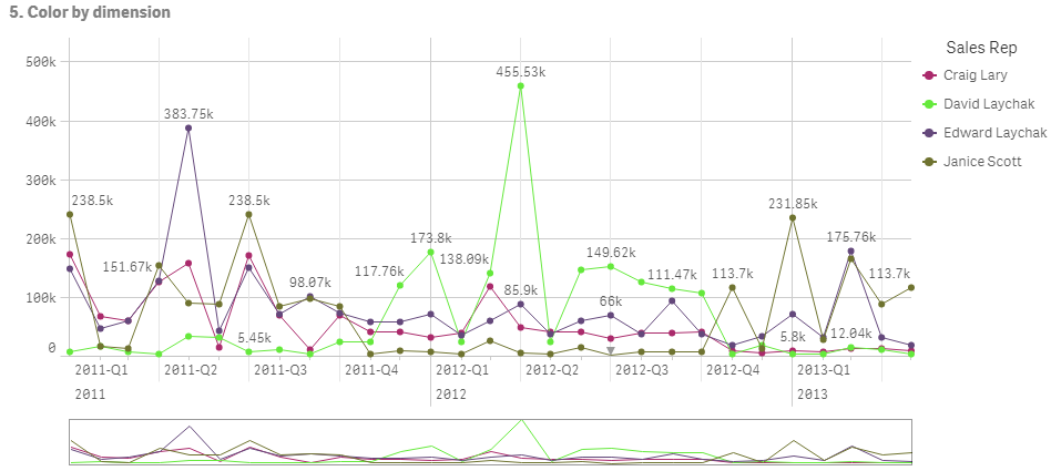
In this example, the line chart is colored by the dimension of the different sales representatives, using the 100 colors scheme. Each sales representative has their own distinct color in the visualization.
Line chart colored by dimension
Properties panel settings
For this visualization, the following properties were set in the properties panel under Appearance > Colors and Legends:
- Colors: Set to Custom and By dimension. The dimension Sales Rep Name is selected.
- Persistent colors: Set to enabled.
- Color scheme: Set to 100 colors.
Example 2: Coloring by a dimension not included in the visualization
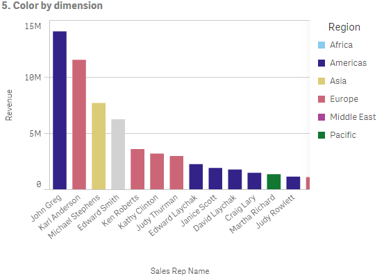
In this example, the bar chart is colored by the dimension of Region, using the 12 colors scheme. The bar for each sales representative is colored by the region in which they work.
Bar chart colored by dimension
Properties panel settings
For this visualization, the following properties were set in the properties panel under Appearance > Colors and Legends:
- Colors: Set to Custom and By dimension. The dimension Region is selected.
- Persistent colors: Set to enabled.
- Color scheme: Set to 12 colors.
Color by expression
You can use expressions to set specific colors to appear with specific values, enabling conditional coloring of values in your visualizations. When a visualization is colored by expression, you define the colors and how the colors are applied to values within the expression.
Example 1: Color by expression in a table
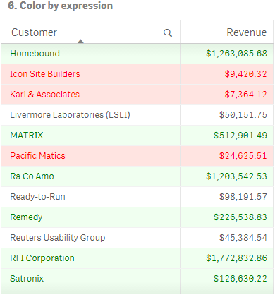
In this example, the table visualization uses two expressions, one for the background color and one for the text. These expressions apply conditional colors to the background and text based on which rows contain the top 10 and bottom 10 values for Revenue.
Table colored by expression
Properties panel settings
For this visualization, the following properties were set in the properties panel under Data > Columns:
- Background color expression: if(Rank(Sum([Sales Quantity]*[Sales Price])) <= 10, 'honeydew', if(Rank(-Sum([Sales Quantity]*[Sales Price])) <= 10, 'mistyrose', ))
- Text color expression: if(Rank(Sum([Sales Quantity]*[Sales Price])) <= 10, 'green', if(Rank(-Sum([Sales Quantity]*[Sales Price])) <= 10, 'red', ))
See: Table properties
Example 2: Color by expression in a chart
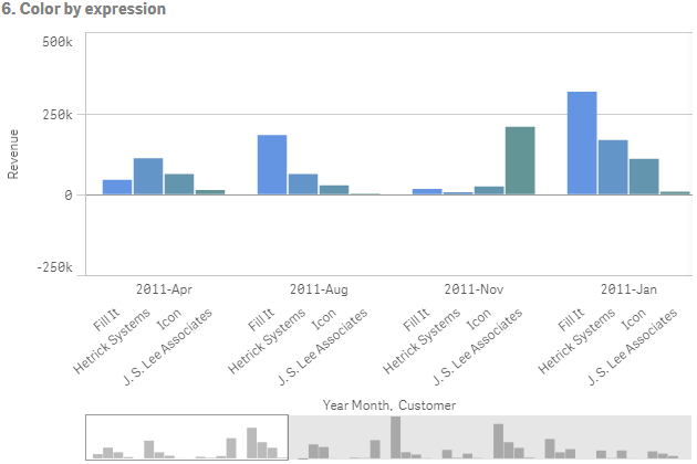
In this example, the bar chart uses an expression to assign specific colors to different values in the Customer field.
Bar chart colored by expression
Properties panel settings
For this visualization, the following properties were set in the properties panel under Appearance > Colors and Legends:
- Colors: Set to Custom and By expression.
- Expression: Set to if([Customer]= 'Fill It', rgb(100, 149, 227), if([Customer]= 'Hetrick Systems', rgb(100, 149, 200), if([Customer]= 'Icon', rgb(100, 149, 175), if([Customer]= 'J. S. Lee Associates', rgb(100, 149, 150), 'grey')))).
- This expression is a color code: Set to enabled.
