
Description
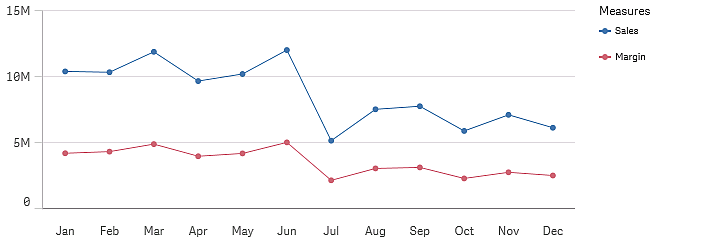
You can include one dimension and several measures in a line chart.
Data can be presented in different ways in a line chart: as lines, as an area, or as a stacked area, when you have more than one measure.
When to use it
The line chart is primarily suitable when you want to visualize trends and movements over time, where the dimension values are evenly spaced, such as months, quarters, or fiscal years.
Your data set must consist of at least two data points to draw a line. A data set with a single value is displayed as a point.
If, you have a data set where data is missing for a certain month, you have the following options for showing the missing values:
- As gaps
- As connections
- As zeros
When a month is not present at all in the data source, it is also excluded from the presentation.
Advantages
The line chart is easy to understand and gives an instant perception of trends.
Disadvantages
Using more than a few lines in a line chart makes the line chart cluttered and hard to interpret. For this reason, avoid using more than two or three measures.