
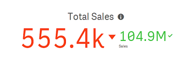
The KPI shows one or two measure values, and is used to track performance.
Default settings for a KPI
The following settings are used by default in a KPI:
- Centered alignment.
- Black text color.
- Medium font size.
- No titles.
- Measure label displayed.
- Conditional colors off.
- No link to sheet.
Conditional colors
With conditional colors, you get the following additional options:
- Set range limits.
- Add limits to create subsections with different colors to indicate performance, for example, good (green), below expectations (yellow), or critical (red).
- Add glyphs to the values.
- Use gradient coloring between color sections.
You can use expressions for the limits.
Link to sheet
You can link from the KPI visualization to a sheet in the app. When making data analysis and clicking the visualization, you can click a second time to go to a predefined sheet. The sheet is opened in a new tab. When hovering over , the name of the sheet is displayed. The icon is only displayed when Show title is selected, under Presentation.
Number of dimensions and measures
In a KPI, you can have one or two measures and no dimensions.
With two measures, the second value automatically becomes a complementary value with smaller font size.