Adding trendlines to line and bar charts
In this video, you’ll learn how to add trend lines to bar charts and line charts in Qlik Sense.
We’ll cover:
- What trend lines are and why they’re useful
- How to add and customize trend lines in your charts
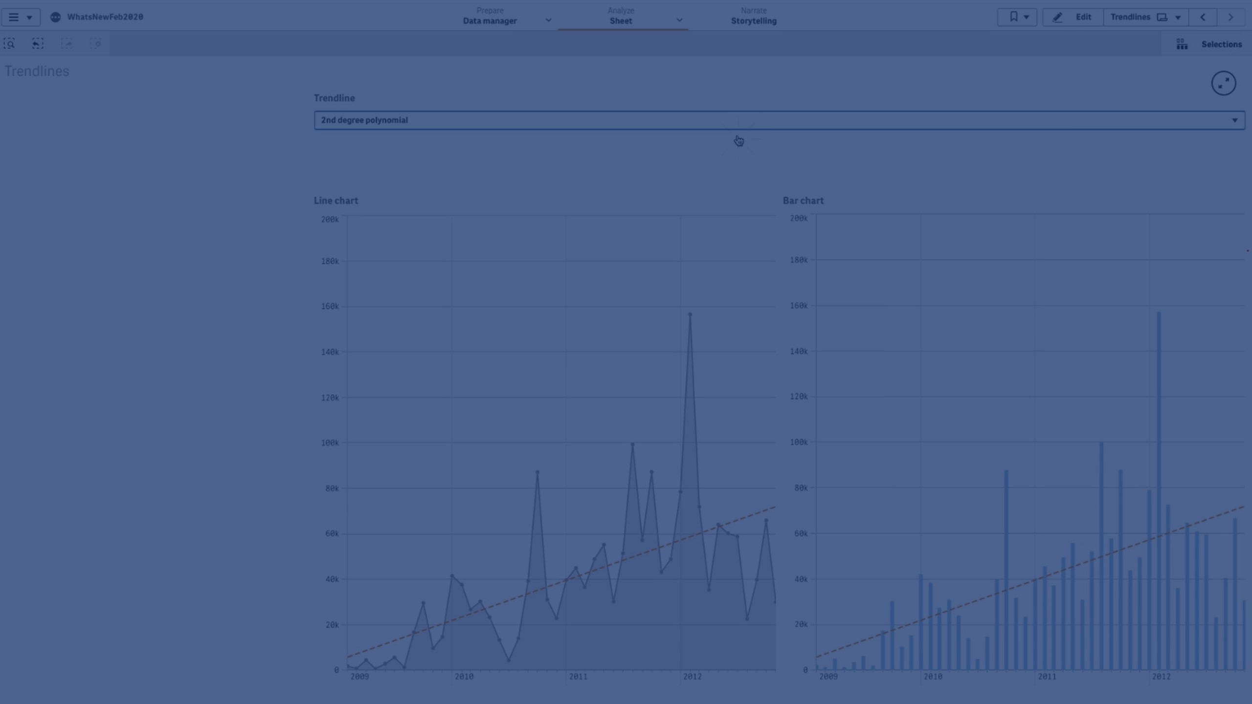
- Different trend line types (Average, Linear, Polynomial, Exponential, Logarithmic, Power)
- Practical use cases for each trend line to better analyze data patterns
By the end, you’ll know how to use trend lines to smooth fluctuations, highlight insights, and visualize trends clearly in your dashboards.
⏱️ Chapters
👋 00:04 – Introduction: Adding Trend Lines in Qlik Sense
📈 00:17 – What is a Trend Line? (Definition & Purpose)
➕ 00:41 – Adding a Trend Line to a Chart
🎨 00:47 – Customizing Trend Line Color & Style
📊 00:58 – Types of Trend Lines Overview
⚖️ 01:01 – Average Trend Line
📉 01:04 – Linear Trend Line
🔄 01:13 – Polynomial Trend Line (2nd, 3rd, 4th Degree)
📈 01:40 – Exponential Trend Line
📊 01:47 – Logarithmic Trend Line
⚡ 02:00 – Power Trend Line
🔁 02:04 – Using Trend Lines in Bar & Line Charts
✅ 02:12 – Conclusion