Network Chart
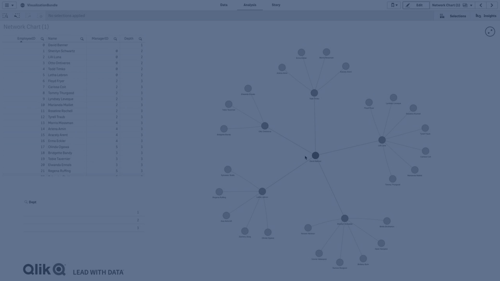
Learn how to create and customize a Network Chart in Qlik Sense using the Visualization Bundle. A Network Chart lets you visualize relationships between nodes and edges, making it ideal for showing flows, hierarchies, and connections across complex datasets.
In this tutorial, you’ll discover how to:
- Format your dataset for network visualization (node ID, labels, parents, and groups)
- Add and configure dimensions in Qlik Sense
- Enhance your chart with measures for volume and styling
- Customize node shapes, edge types, and colors
- Visualize real-world network data (airport connections example)
Perfect for analysts and developers who want to explore connections and dependencies in their data using Qlik Sense advanced visualizations.
🌐 00:08 – Introduction to Network Chart
🔗 00:12 – What a Network Chart Shows (Nodes & Edges)
📊 00:45 – Data Requirements (4 Dimensions)
🛠️ 01:36 – Creating a Network Chart (Visualization Bundle)
🔗 02:04 – Adding Parent Node & Group Dimension
👀 02:11 – Viewing the Network Layout
⚙️ 02:43 – Customizing Chart Properties
🔵 03:01 – Modifying Node Shapes
🏁 03:19 – Conclusion
#Network #chart #visualization #dataliteracy #datavisualizations #charts #Graphs NetworkChart #Qlik