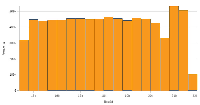
The histogram is suitable for visualizing distribution of numerical data over a continuous interval, or a certain time period. The data is divided into bins, and each bar in a histogram represents the tabulated frequency at each bin.

When to use it
The histogram is suitable for visualizing distribution of numerical data over a continuous interval, or a certain time period.
Advantages
The histogram organizes large amounts of data, and produces a visualization quickly, using a single dimension.
Disadvantages
The histogram is not relevant for detailed analysis of the data as it deals with a summary of the data distribution.
Creating a histogram
You can create a histogram on the sheet you are editing. You can only apply a single dimension to a histogram. Histograms do not need a measure, as the frequency of the binned data is automatically calculated.
Do the following:
- From the assets panel, drag an empty histogram to the sheet.
-
Add the dimension to calculate the frequency on.
When you have created the histogram, you may want to adjust its appearance and other settings in the properties panel. For more information, see Histogram properties.
Dimension limitations
There are some limitations to the dimension used in a histogram.
- The dimension must be a numerical field.
- You cannot use a master dimension that was created using the expression editor, even if the resulting field is numeric.
- The dimension cannot be based on an aggregation function.
