
Comparing straight tables and pivot tables
You can see the efficiency of a pivot table if you compare it to a regular table that has the same data.
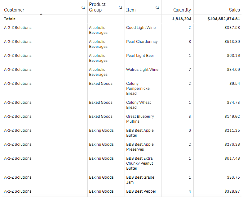
Straight table
In the following table, you have:
- Three dimensions: Customer, Product Group, and Item Desc
- Two measures: Quantity and Sales
The table shows food product sales. If you want to rearrange the data to simplify analysis, your options are limited. You can change the order of the columns, but that does not improve the overview. You can also set the sorting order, either in the sorting section in the properties panel, or by clicking the dimension columns. However, the problem persists. The customers, product groups, and items are all displayed more than once. It is not possible to get a good summary of the data.
Pivot table
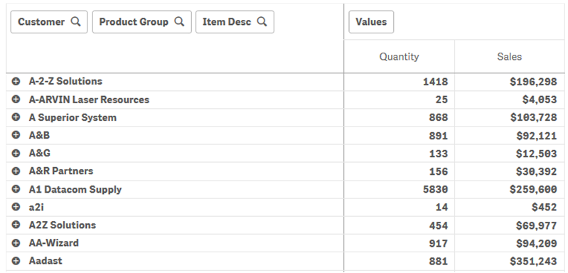
We add a pivot table to the sheet and use the same info:
- Three dimensions: Customer, Product Group, and Item Desc
- Two measures: Quantity and Sales
Discovery
As you can see, the pivot table presents the data in a much more condensed way. Compared to the regular table, the number of rows has been halved and the number of columns is three instead of five.
One of the advantages of a pivot table is the interchangeability: the ability to move row items to columns and column items to rows. You can rearrange the data and have several different views of the same data set. You can move dimensions and measures to bring forward data of interest and hide data that is either too detailed, or irrelevant to the analysis.
The pivot table shows the dimensions Customer, Product Group, and Item Desc, and the measures Quantity and Sales. In this view, you have a summary of quantity and sales for each customer. If you want to know which items and product groups that the customers bought, you can expand the customer fields by clicking ![]() . A
. A ![]() icon indicates that a field can be further expanded and present more details, while a
icon indicates that a field can be further expanded and present more details, while a ![]() icon indicates that the field can be collapsed, to reduce the number of fields and details.
icon indicates that the field can be collapsed, to reduce the number of fields and details.