Color-picker property definition
This API is under development. Do not rely on it. It may change or be removed in future versions.
Fields
The color-picker definition property template can be used to add a custom color-picker property. When defining a color-picker property, the following fields can be used:
type
This field is mandatory and should always be "integer" or "object" for a color-picker property type definition.
Defining type: "object" allows usage of custom colors from outside the standard palette and it also supports custom theme palettes.
label
Used for defining the label of the item.
component
Used for defining how the property is visualized in the property panel. Used to override the default component that comes with the type setting.
This field is mandatory for a color-picker property and should always be "color-picker".
ref
Name or ID used to reference a property.
defaultValue
Used for defining the default value of your custom property.
Examples
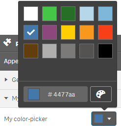
Defining a color-picker as an integer
Defining a custom property of color-picker type can look like below when defined as an integer.
Example:
define( [
],
function ( ) {
	var palette = [
        "#b0afae",
        "#7b7a78",
        "#545352",
        "#4477aa",
        "#7db8da",
        "#b6d7ea",
        "#46c646",
        "#f93f17",
        "#ffcf02",
        "#276e27",
        "#ffffff",
        "#000000"
    ];
	return {
		definition : {
			type : "items",
			component : "accordion",
			items: {
				settings: {
					uses: "settings",
					items: {
						MyColorPicker: {
							label:"My color-picker",
							component: "color-picker",
							ref: "myColor",
							type: "integer",
							defaultValue: 3
						}
					}
				}
			}
		},
		paint: function ($element, layout) {
			//add your rendering code here
			$element.css("background-color", palette[layout.myColor]);
		}
	};

} );
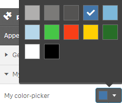
Defining a color-picker as an object
Defining a custom property of color-picker type can look like below when defined as an object.
define( [
],
function ( ) {
  return {
    definition : {
      type : "items",
      component : "accordion",
      items: {
        settings: {
          uses: "settings",
          items: {
            MyColorPicker: {
              label:"My color-picker",
              component: "color-picker",
              ref: "myColor",
              type: "object",
              defaultValue: {
                color: "ff5866",
                index: "-1"
              }
            }
          }
        }
      }
    },
    paint: function ($element, layout) {
      //add your rendering code here
      $element.css("background-color", layout.myColor.color);
    }
  };
} );