
This section describes the Angular leonardo-ui components that are delivered with this version of Qlik Sense.
Overview
leonardo-ui is a UI component framework, designed to be used as a complement to other frameworks. It is non-obtrusive in the sense that it contains no global styling but will use your page defaults. You can also use it standalone with a CSS reset to get consistent styling of your components.
Most components are exposing a single element directive (like the checkbox which exposes <lui-checkbox ...>) but may also expose services and/or sub-directives like the dialog.
Limitations
These limitations apply both for the example page and inside the client:
- Variant will not update on most components
- x-change events fires before x-model has changed its value (this is because of isolate scope)
Dialog component
Use the lui-dialog component to create custom dialogs.
| Name | Type | Description | Parameters |
|---|---|---|---|
| luiDialog | Service |
Modal dialog service. |
|
| lui-dialog | Element directive |
Dialog content. Use any of the header, body and footer directives as content or none to control the appearance manually. |
|
| lui-dialog-header | Element directive |
Dialog header. |
- |
| lui-dialog-body | Element directive |
Dialog body with default scroll behavior. |
- |
| lui-dialog-footer | Element directive |
Dialog footer. |
- |
| lui-dialog-trigger | Attribute directive |
Helper directive that shows a dialog when clicking on the element with this directive. Restores focus to the opening element after the dialog has been closed. |
|
Examples
<div>
<div>
<button class="lui-button" lui-dialog-trigger x-template="$ctrl.dialogTemplate">
Open dialog (trigger)
</button>
</div>
<div>
<button class="lui-button" lui-dialog-trigger x-template="$ctrl.dialogTemplate" x-variant="inverse">
Open dialog (trigger, inverse)
</button>
</div>
<div>
<button class="lui-button" ng-click="$ctrl.openDialog()">Open dialog (service)</button>
</div>
<div>
<button class="lui-button" ng-click="$ctrl.openDialog('inverse')">Open dialog (service, inverse)</button>
</div>
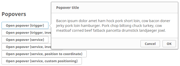
</div>Popover component
Use the lui-popover component to create custom popovers.
| Name | Type | Description | Parameters |
|---|---|---|---|
| luiPopover.show | Service |
Popover service - show function. |
|
| luiPopover.showToPosition | Service |
Popover service - showToPosition function. |
|
| luiPopover.showCustom | Service |
Popover service - showCustom function. |
|
| lui-popover | Element directive |
Popover content. Use any of the header, body and footer directives as content or none to control the appearance manually. |
|
| lui-popover-header | Element directive |
Popover header. |
- |
| lui-popover-body | Element directive |
Popover body with default scroll behavior. |
- |
| lui-popover-footer | Element directive | Popover footer. | - |
| lui-popover-trigger | Attribute directive |
Helper directive that shows a popover when clicking on the element with this directive. Restores focus to the opening element after the popover has been closed. |
|
Examples
<div>
<div>
<button class="lui-button" lui-popover-trigger x-dock="right" x-template="$ctrl.popoverTemplate">Open popover (trigger)</button>
</div>
<div>
<button class="lui-button" lui-popover-trigger x-dock="right" x-template="$ctrl.popoverTemplate" x-variant="inverse">Open popover (trigger, inverse)</button>
</div>
<div>
<button class="lui-button" ng-click="$ctrl.openPopover($event)">Open popover (service)</button>
</div>
<div>
<button class="lui-button" ng-click="$ctrl.openPopover($event, 'inverse')">Open popover (service, inverse)</button>
</div>
<div>
<button class="lui-button" ng-click="$ctrl.openToPosition($event)">Open popover (service, position to coordinate)</button>
</div>
<div>
<button class="lui-button" ng-click="$ctrl.openCustom($event)">Open popover (service, custom positioning)</button>
</div>
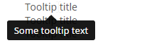
</div>Tooltip component
Use the lui-tooltip component to create custom tooltips.
| Name | Type | Description | Parameters |
|---|---|---|---|
| luiTooltip.show | Service | Tooltip service - show function. |
|
| luiTooltip.showToPosition | Service | Tooltip service - showToPosition function. |
|
| luiTooltip.showCustom | Service | Tooltip service - showCustom function. |
|
| lui-tooltip | Element directive | Tooltip content. |
|
| lui-tooltip-trigger | Attribute directive | Helper directive that shows a tooltip when hovering on the element with this directive. |
|
| lui-title-tooltip | Attribute directive | Helper directive that shows a tooltip when hovering on the element with this directive, using the value of its title attribute as tooltip content. |
|
Examples
<div>
	<div>
		<span title="S" lui-title-tooltip>Tooltip title</span>
	</div>
	<div>
		<span title="Some tooltip text" lui-title-tooltip>Tooltip title</span>
	</div>
	<div>
		<span title="Some tooltip text" lui-title-tooltip>Tooltip title</span>
	</div>
	<div>
		<span title="Some tooltip text" lui-title-tooltip>Tooltip title</span>
	</div>
	<div>
		<span title="Some tooltip text" lui-title-tooltip>Tooltip title</span>
	</div>
	<div>
		<span title="Some <b>tooltip</b> text" lui-title-tooltip>Tooltip title (injection test)</span>
	</div>
	<div>
		<span title="Some tooltip text" lui-title-tooltip x-dock="top">Tooltip title - top</span>
	</div>
	<div>
		<span title="Some tooltip text" lui-title-tooltip x-dock="right">Tooltip title - right</span>
	</div>
	<div>
		<span title="Some tooltip text" lui-title-tooltip x-dock="bottom">Tooltip title - bottom</span>
	</div>
	<div>
		<span title="Some tooltip text" lui-title-tooltip x-dock="left">Tooltip title - left</span>
	</div>
	<div>
		<span lui-tooltip-trigger x-dock="left" x-template="$ctrl.tooltipTemplate">Tooltip (trigger)</span>
	</div>
	<div>
		<span ng-mouseenter="$ctrl.openTooltip($event)" ng-mouseleave="$ctrl.closeTooltip()">Tooltip (service)</span>
	</div>
	<div>
		<span ng-mouseenter="$ctrl.openToPosition($event)" ng-mouseleave="$ctrl.closeTooltip()">Tooltip (service, position to coordinate)</span>
	</div>
	<div>
		<span ng-mouseenter="$ctrl.openCustom($event)" ng-mouseleave="$ctrl.closeTooltip()">Tooltip (service, custom positioning)</span>
	</div>
</div>
Tab-view component
Use the lui-tab-view component to create custom tabs or tab-sets.

| Name | Type | Description | Parameters |
|---|---|---|---|
| lui-tab-view | Element directive | Root directive for lui-tabset and lui-tab-content directives. | - |
| lui-tabset | Element directive |
Container directive for tabs. Requires lui-tab-view as parent directive. |
|
| lui-tab | Element directive |
A single tab element. Requires lui-tabset as parent directive. Setting the attribute ref will automatically toggle any lui-tab-content element with an equal ref attribute upon activation. |
|
| lui-tab-content | Element directive |
Content of a tab. Requires lui-tab-view as parent directive. Set attribute ref for automatic toggling of content when a tab with same ref attribute is activated. |
|
| lui-tab-aside | Element directive |
Tab aside element. A click-able element for adding additional custom functionality to each tab. |
|
Examples
Basic tab-view
<lui-tab-view>
	<lui-tabset>
		<lui-tab ref="tab1">Tab1</lui-tab>
		<lui-tab ref="tab2">Tab2</lui-tab>
		<lui-tab ref="tab3" disabled="true">Tab3</lui-tab>
	</lui-tabset>
	<lui-tab-content ref="tab1">Tab1 content</lui-tab-content>
	<lui-tab-content ref="tab2">Tab2 content</lui-tab-content>
	<lui-tab-content ref="tab3">Tab3 content</lui-tab-content>
</lui-tab-view>
Inverse tab-view
<lui-tab-view>
	<lui-tabset>
		<lui-tab variant="inverse" ref="tab1">Tab1</lui-tab>
		<lui-tab variant="inverse" ref="tab2">Tab2</lui-tab>
		<lui-tab variant="inverse" ref="tab3" disabled="true">Tab3</lui-tab>
	</lui-tabset>
	<lui-tab-content ref="tab1">Tab1 content</lui-tab-content>
	<lui-tab-content ref="tab2">Tab2 content</lui-tab-content>
	<lui-tab-content ref="tab3">Tab3 content</lui-tab-content>
</lui-tab-view>
Filled tab-view
<lui-tab-view>
	<lui-tabset fill="true">
		<lui-tab ref="tab1">Tab1</lui-tab>
		<lui-tab ref="tab2">Tab2</lui-tab>
		<lui-tab ref="tab3" disabled="true">Tab3</lui-tab>
	</lui-tabset>
	<lui-tab-content ref="tab1">Tab1 content</lui-tab-content>
	<lui-tab-content ref="tab2">Tab2 content</lui-tab-content>
	<lui-tab-content ref="tab3">Tab3 content</lui-tab-content>
</lui-tab-view>
Inverse filled tab-view
<lui-tab-view>
	<lui-tabset fill="true">
		<lui-tab variant="inverse" ref="tab1">Tab1</lui-tab>
		<lui-tab variant="inverse" ref="tab2">Tab2</lui-tab>
		<lui-tab variant="inverse" ref="tab3" disabled="true">Tab3</lui-tab>
	</lui-tabset>
	<lui-tab-content ref="tab1">Tab1 content</lui-tab-content>
	<lui-tab-content ref="tab2">Tab2 content</lui-tab-content>
	<lui-tab-content ref="tab3">Tab3 content</lui-tab-content>
</lui-tab-view>
Dynamic tab-view
tabviews.js
/**
 * Leonardo UI examples. This is how the client uses the leonardo UI library and contains all config and overrides
 * provided by the client. Note that maintenance on this module might be lagging behind.
 */
import angular from "angular";

import template from "./tabviews.ng.html";

const module = angular.module( "docs.tabview-examples", [] );

module.component( "tabviewExamples", {
	template: template,
	controller: ["$scope", function ( $scope ) {

		$scope.tabview = {
			tabs: [{name: "Add Tabs", content: "Add more tabs", disabled: false, aside: false},
				{name: "Tab1", content: "Tab 1 content", disabled: false, aside: true},
				{name: "Tab2", content: "Tab 2 content", disabled: false, aside: true},
				{name: "Tab3", content: "Tab 3 content", disabled: false, aside: true}
			],
			activeTab: "Add Tabs"
		};

		$scope.asideActivated = function ( index ) {
			$scope.tabview.tabs.splice( index, 1 );
		};

		$scope.addTab = function ( index ) {
			$scope.tabview.tabs.push( {
				name: "Tab" + index,
				content: "Tab " + index + " content",
				disabled: false,
				aside: true
			} );
		};
	}],
	bindings: {
		variant: "="
	}
} );
tabviews.ng.html
<div>
	<!-- Example 1, Dynamic tabs -->
	<lui-tab-view>
		<lui-tabset active-tab="tabview.activeTab">
			<lui-tab ng-repeat="tab in tabview.tabs" x-ref="{{tab.name}}" x-disabled="tab.disabled">
				<span class="lui-tab__text">{{tab.name}}</span>
				<lui-tab-aside ng-if="tab.aside" x-icon="close" on-activated="asideActivated($index)"></lui-tab-aside>
			</lui-tab>
		</lui-tabset>
		<lui-tab-content style="margin-top: 20px;margin-bottom:10px;" ng-repeat="tab in tabview.tabs" x-ref="{{tab.name}}">{{tab.content}}</lui-tab-content>
		<lui-tab-content x-ref="Add Tabs" ng-init="tabIndex = 4"><lui-button x-variant="success" ng-click="addTab(tabIndex); tabIndex = tabIndex +1">Add a tab</lui-button></lui-tab-content>
	</lui-tab-view>
</div>
Button component
Use the lui-button component to create custom buttons.

| Name | Type | Description | Parameters |
|---|---|---|---|
| lui-button | Element directive | Button content. |
|
Examples
Standard buttons
<lui-button>Default</lui-button>
<lui-button x-variant="toolbar">Toolbar</lui-button>
<lui-button x-variant="info">Info</lui-button>
<lui-button x-variant="danger">Danger</lui-button>
<lui-button x-variant="warning">Warning</lui-button>
<lui-button x-variant="success">Success</lui-button>
Inverse buttons
<lui-button x-variant="inverse">Inverse</lui-button>
<lui-button x-variant="toolbar-inverse">Toolbar inverse</lui-button>
<lui-button x-variant="info">Info</lui-button>
<lui-button x-variant="danger">Danger</lui-button>
<lui-button x-variant="warning">Warning</lui-button>
<lui-button x-variant="success">Success</lui-button>
More buttons
<lui-button active="true">Active</lui-button>
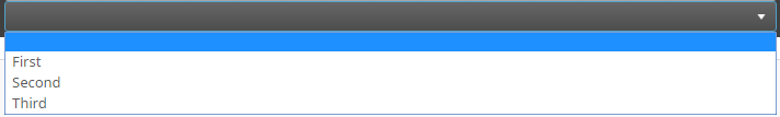
<lui-button full-width="true">Full width</lui-button>Select component
Use the lui-select component to create custom drop-down lists.
| Name | Type | Description | Parameters |
|---|---|---|---|
| lui-select | Element directive | Select content. |
|
Examples
Select
<lui-select x-model="value">
	<option value="1">First</option>
	<option value="2">Second</option>
	<option value="3">Third</option>
</lui-select>
Inverse select
<lui-select x-variant="toolbar" x-model="value">
	<option value="1">First</option>
	<option value="2">Second</option>
	<option value="3">Third</option>
</lui-select>
Select toolbar style
<lui-select x-variant="inverse" x-model="value">
	<option value="1">First</option>
	<option value="2">Second</option>
	<option value="3">Third</option>
</lui-select>
Select inverse toolbar style
<lui-select x-variant="toolbar-inverse" x-model="value">
	<option value="1">First</option>
	<option value="2">Second</option>
	<option value="3">Third</option>
</lui-select>
Search component
Use the lui-search component to add custom search dialogs.

| Name | Type | Description | Parameters |
|---|---|---|---|
| lui-search | Element directive | Search content. |
|
Examples
Basic search
<lui-search x-query="search"></lui-search>Inverse search
<lui-search x-query="search" x-variant="inverse"></lui-search>Checkbox component
Use the lui-checkbox component to add custom check-boxes.

| Name | Type | Description | Parameters |
|---|---|---|---|
| lui-checkbox | Element directive | Checkbox content. |
|
Examples
Basic check-box
<lui-checkbox x-model="checkbox">Label</lui-checkbox>
<lui-checkbox x-model="checkbox" x-disabled="true" "="">Label</lui-checkbox>
Inverse check-box
<lui-checkbox x-model="checkbox" x-variant="inverse">Label</lui-checkbox>
<lui-checkbox x-model="checkbox" x-variant="inverse" x-disabled="true">Label</lui-checkbox>
Switch component
Use the lui-switch component to add switches.

| Name | Type | Description | Parameters |
|---|---|---|---|
| lui-switch | Element directive | Switch content. |
|
Examples
Basic switch
<lui-switch x-model="switch"></lui-switch>
<lui-switch x-model="switch" x-disabled="true"></lui-switch>
Inverse switch
<lui-switch x-variant="inverse" x-model="switch"></lui-switch>
<lui-switch x-variant="inverse" x-model="switch" x-disabled="true"></lui-switch>
Radiobutton component
Use the lui-radiobutton component to add radio-buttons.

| Name | Type | Description | Parameters |
|---|---|---|---|
| lui-radiobutton | Element directive | Radiobutton content. |
|
Examples
Basic radiobutton
<lui-radiobutton x-model="radio1">A</lui-radiobutton>
<lui-radiobutton x-model="radio1" x-disabled="true">B</lui-radiobutton>
Inverse radiobutton
<lui-radiobutton x-variant="inverse" x-model="radio2">A</lui-radiobutton>
<lui-radiobutton x-variant="inverse" x-model="radio2" x-disabled="true">B</lui-radiobutton>