
Displaying data in a pivot table
This section explains how you can use Compose to view the data in your star schema.
To view the data in a star schema:
-
Click the Manage button at the bottom of the Data Marts panel.
-
In the Manage Data Marts window, either:
Switch to Monitor view (by clicking the monitor icon) in the top right corner.
OR
Remain in Design view and select a star schema.
-
Click the Pivot toolbar button. If you clicked the Pivot toolbar button in Monitor view and your data mart contains several star schemas, you will be prompted to selected a star schema. The Select columns for Pivot table window opens. The drop-down list at the top of the window contains the Fact table and the Dimensions tables that were used to create the star schema.
The Fact table name is prefixed with "Fct_" while dimension table names are prefixed with "Dim_".
- Make sure that "Fct_<FactName>" is selected in the drop-down list and then select which fact column to add to the pivot table.
-
From the drop-down list, select a dimension and then select which dimension columns to add to the pivot table.
Information noteIf you added the Date and Time dimension tables to your data mart, you will be able to select.
-
Optionally, repeat Step 5 to add columns from different dimensions to the pivot table.
Information noteWhen the same column is included in two different dimensions, the pivot table may show incorrect data.
-
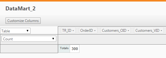
Click OK. The pivot table window opens.
The names of columns that you can use to generate the data will be displayed at the top of the window.
-
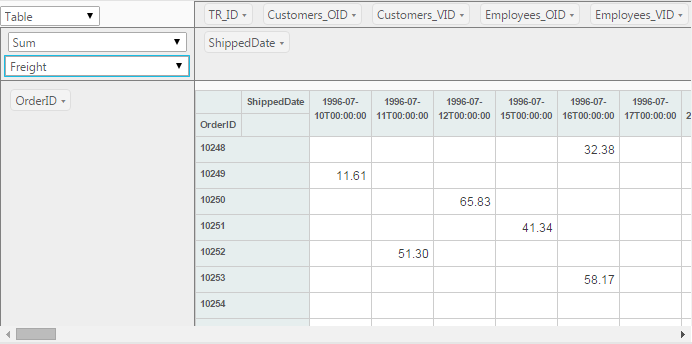
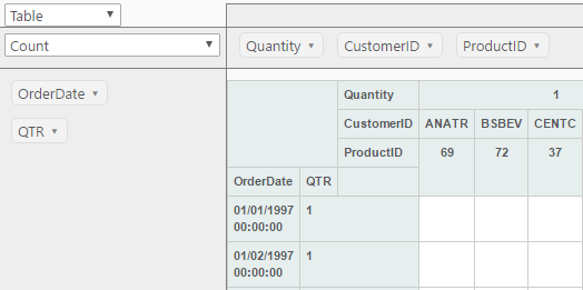
To form the actual table, drag columns to the gray area below the column names (the X-axis) and to the gray area on the left of the window (the Y-axis). In the following example, the ShippedDate column has been dragged to the X-axis while the OrderID column has been dragged to the Y-axis.
In this example, the QTR column was selected from the Date dimension, allowing orders to be grouped by quarter.
-
Change the table format, set aggregation, or perform additional actions as described in the table below.
Additional actions To Do this Set the table format
From the upper drop-down list in the left of the pivot table window, choose one of the following:
- Table
- Table bar chart
- Heatmap
- Row heatmap
- Col heatmap
- Treemap
Aggregation options
From the lower drop-down list in the left of the pivot table window, choose one of the available options.
Note that additional drop-down lists may be displayed depending on the selected aggregation option. For example, when Sum over Sum is selected, two additional drop-down lists (containing column names) will appear below the aggregation options. The Sum over Sum aggregate is calculated by selecting one column from each of the drop-down lists.
Change the columns
Click the Customize Columns button and continue from Step 3 above.
-
Click OK to close the window.