Box Plot
In this tutorial, you’ll learn how to create and interpret Box Plots in Qlik Sense. From understanding quartiles, whiskers, and outliers, to working with measures, dimensions, and customization options, this video guides you through everything you need to effectively visualize the range and distribution of your data. Ideal for analysts and developers looking to summarize large datasets and highlight variations across categories.
📊 00:00 – Introduction to Box Plots
📦 00:15 – Range & Distribution Explained
📐 00:21 – Whiskers: Quartiles, Percentiles & Std. Deviation
⚠️ 00:28 – Identifying Outliers
📏 00:34 – Quartiles & Median in a Box Plot
🔍 00:47 – Why Use a Box Plot?
📊 01:00 – Dimensions & Measures in Box Plots
📅 01:14 – Single vs Multiple Dimensions
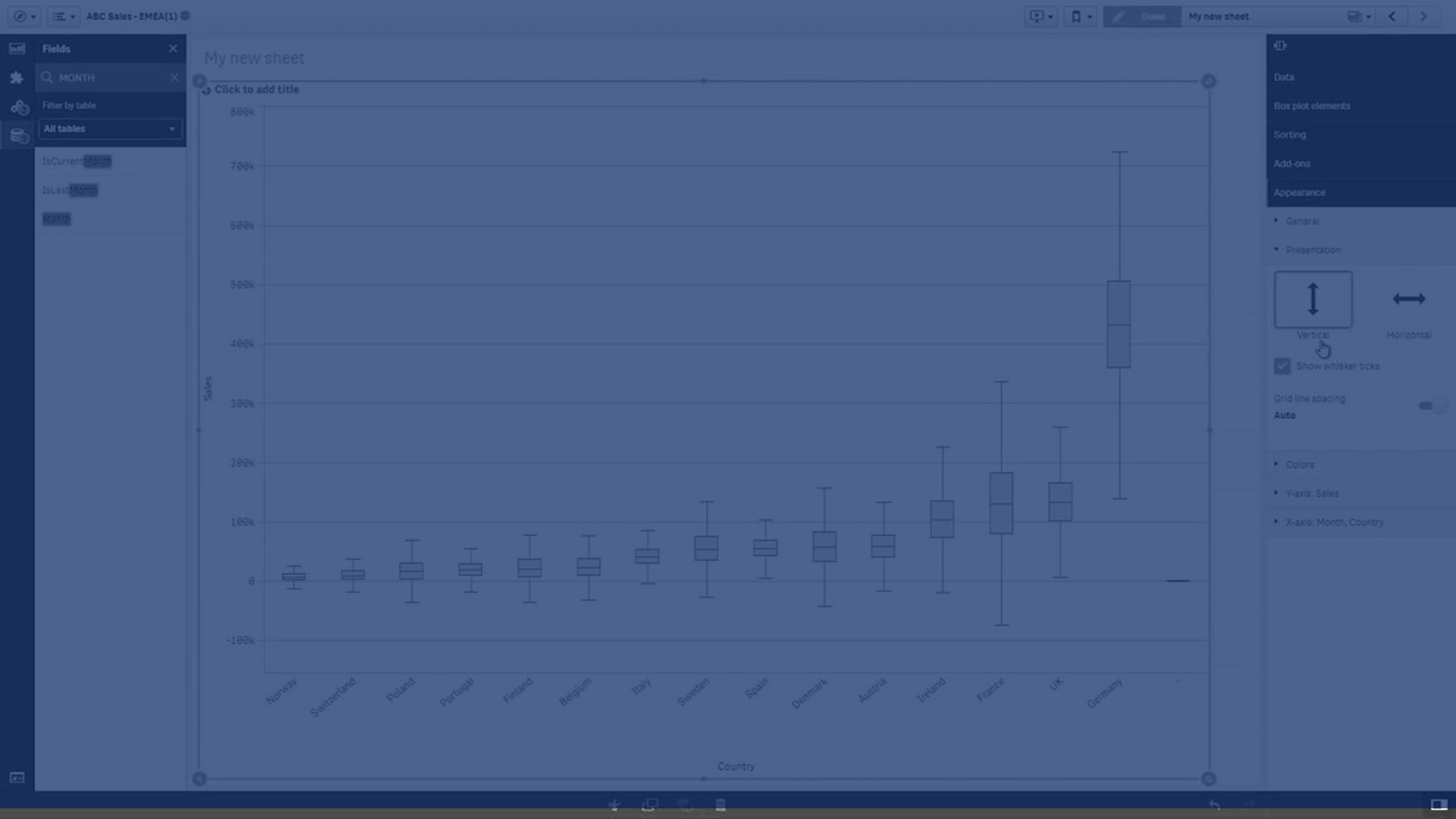
💡 01:27 – Example: Sales by Month & Country
📈 01:48 – Interpreting Box Size & Whisker Length
⚙️ 02:06 – Box Plot Setup & Presets
📊 02:12 – Standard Tukey Box Plot
📉 02:25 – Percentile-Based Box Plot
📏 02:50 – Standard Deviation-Based Box Plot
🎨 03:04 – Customizing Box Plots (Conditions, Reference Lines & Colors)
✅ 03:26 – Conclusion
To learn more about Qlik Sense visit the http://help.qlik.com/
#Qlik #BoxPlot #dataliteracy #datavisualizations #charts #Graphs