Bullet Chart
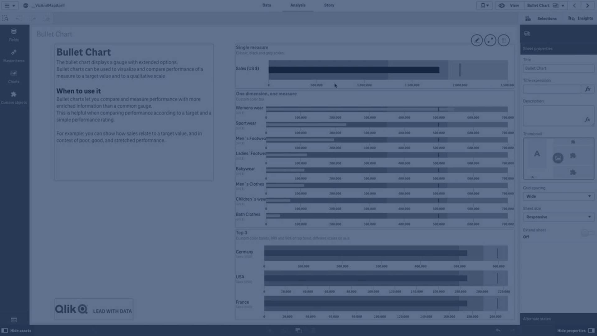
Learn how to create bullet charts in Qlik to visualize and compare performance against targets and qualitative scales. This tutorial covers adding measures, setting target values, defining performance ranges, using dimensions, customizing colors, and working with multiple measures for independent axes.
⏱ 0:00 – Introduction to bullet charts: purpose and benefits
📊 0:44 – Adding a bullet chart and defining a measure
🎯 0:54 – Setting target values: fixed or dynamic
📏 1:04 – Adding performance ranges and limits
🌈 1:33 – Customizing range colors
➕ 1:41 – Creating bullet charts with dimensions
📈 1:54 – Defining measure, target, and range per dimension
🎨 2:19 – Modifying chart appearance: bar and target colors
📦 2:36 – Bullet charts with gauges per product
📊 2:49 – Multiple measures with independent axes: sum of quantity, sales, cost of sales
🎨 3:38 – Customizing range colors for multiple measures
➕ 4:00 – Adding an additional measure without a target and using expressions for ranges
🌈 4:45 – Using gradient options for range visualization
🎨 4:58 – Applying color changes to all measures
✅ 5:11 – Conclusion and summary