Word Cloud Chart
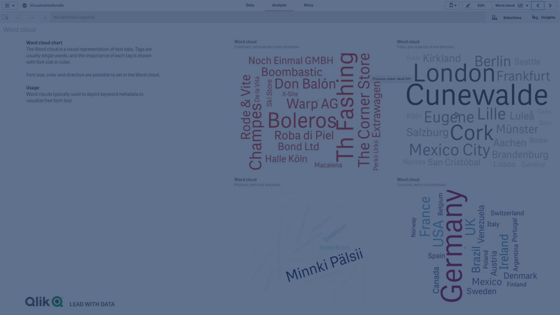
Learn how to create and customize a Word Cloud Chart in Qlik Sense using the Visualization Bundle. The Word Cloud Chart lets you visualize text data by sizing words according to their importance against a measure — making it easy to spot trends, top values, and patterns in unstructured or free-form data.
In this tutorial, you’ll learn how to:
- Add dimensions and measures to a Word Cloud
- Adjust angles, orientations, and font sizes
- Apply color scales or set custom color ranges
- Highlight differences by customizing text display
- Create engaging and insightful text-based visualizations
☁️ 00:08 – Introduction to Word Cloud Chart
📖 00:15 – Visualizing Text Importance with Measures
🔍 00:22 – How Word Size Reflects Importance
🛠️ 00:29 – Creating a Word Cloud (Visualization Bundle)
👤 00:39 – Adding Dimension & Measure (Customer + Sales)
🎨 00:50 – Customizing Appearance & Design Options
↔️ 00:53 – Adjusting Word Angles (Start & End Angle)
🔠 01:02 – Setting Font Size Range (Min & Max)
🌈 01:08 – Choosing Predefined or Custom Colors
🖌️ 01:17 – Modifying Text Orientation & Layout
🎯 01:28 – Designing Visualizations with Angles & Styles
🎨 01:38 – Setting Custom Colors from Palette or Code
🔡 01:57 – Highlighting Differences with Font Size
🏁 02:11 – Conclusion
Perfect for analysts who want to visualize customer, product, or keyword importance in Qlik Sense.
#WordCloud #chart #visualization #Qlik #datasciencetutorial #datavisualization #graphs #diagrams #dataliteracy