Variance Waterfall Chart
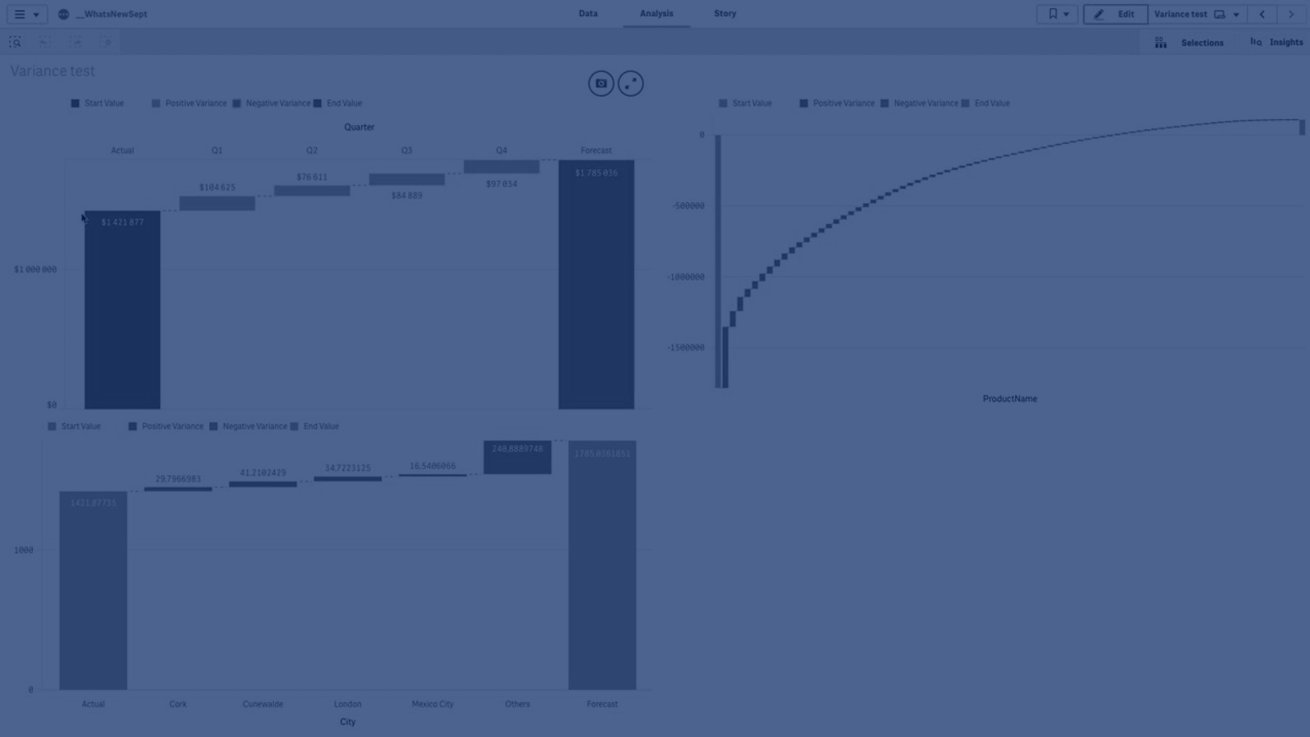
In this tutorial, you’ll learn how to create and customize a Variance Waterfall Chart in Qlik Sense using the Visualization Bundle (introduced in September 2019). This extension allows you to compare two measures (such as Actual vs Forecast) across a chosen dimension and visualize their variance. We’ll cover step-by-step how to add dimensions and measures, format values, exclude nulls, customize colors, and manage large datasets. Perfect for analysts and developers working with Qlik Sense to perform variance analysis and explain business performance visually.
💧 00:08 – Introduction to Variance Waterfall Chart
📊 00:21 – What Variance Waterfall Charts Show
🛠️ 00:25 – Creating a Variance Waterfall Chart (Custom Objects)
🚫 01:25 – Handling Null Values in Dimensions
🎨 01:37 – Customizing Colors for Positive/Negative Values
🔠 02:09 – Adding Value Labels on X-Axis
📦 02:19 – Example with Many Values (Product Name)
↕️ 02:50 – Sorting Values Numerically
🔍 03:01 – Selecting Specific Values in Chart
📉 03:14 – Limiting Number of Displayed Values
📊 03:40 – Actual vs Forecast with City Data
🌎 03:54 – Limiting Data to Top 5 Countries
To learn more about Qlik Sense visit the http://help.qlik.com/sense