Distribution Plot
Learn how to create distribution plots in Qlik Sense to visualize the range and distribution of numerical data. This tutorial explains how to use one or two dimensions, set measures, compare groups, identify outliers, and customize your visualization for better insight.
⏱ 0:00 – Introduction: What is a distribution plot and when to use it
📊 0:08 – Comparing ranges and distributions for groups of numerical data
📈 0:27 – Understanding value points and bounding boxes
➕ 0:59 – Requirements: one or two dimensions and one measure
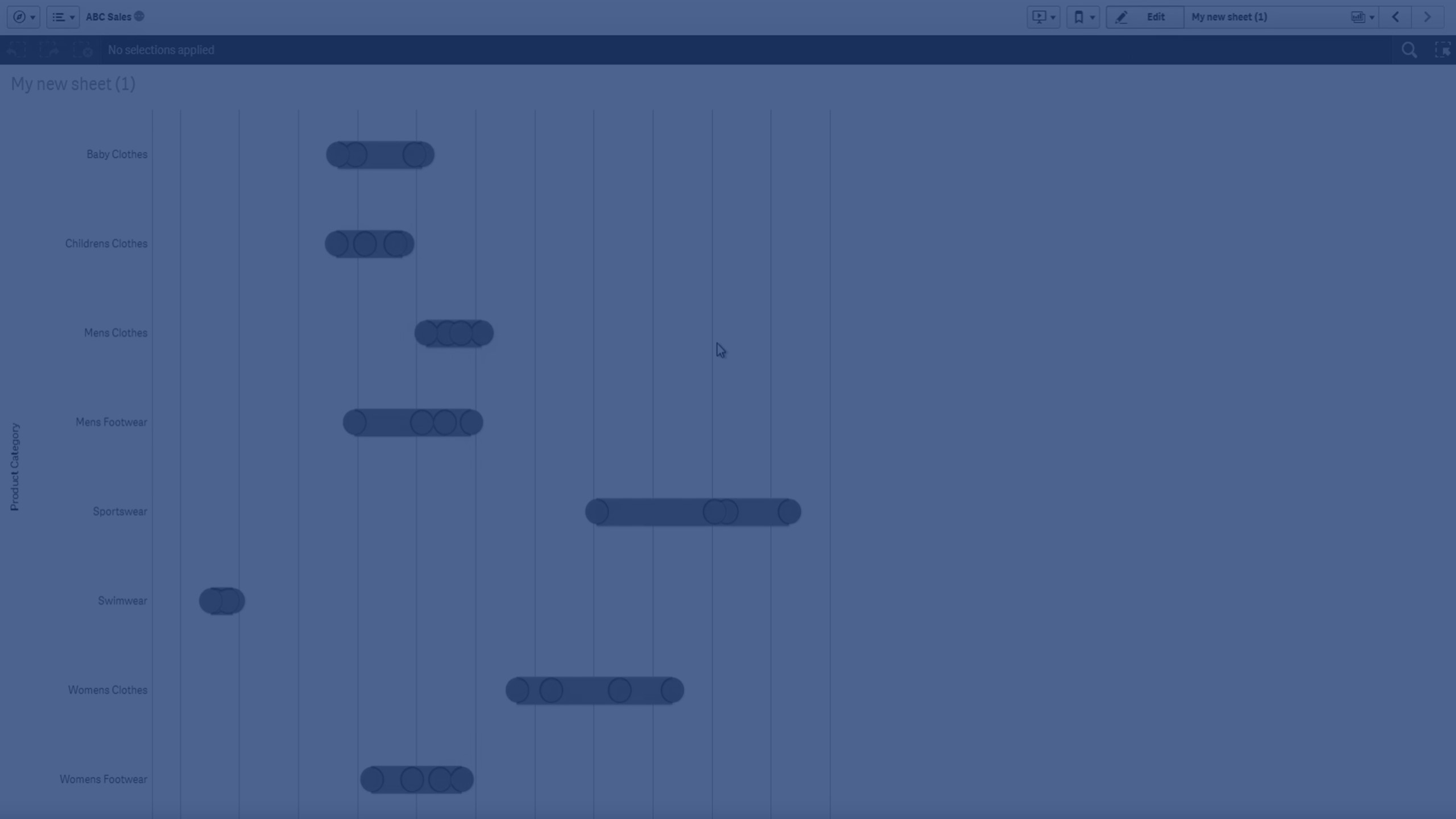
📊 1:08 – Single-dimension distribution plot example (Product Category vs Sales)
📈 1:16 – Two-dimension distribution plot example (adding Quarter)
📊 1:28 – How the first and second dimensions define points and groups
📏 1:44 – Interpreting stretch and compressed boxes
🔄 1:57 – Orientation: horizontal vs vertical
🎨 2:01 – Customizing colors for boxes and points
✅ 2:16 – Final result after customization
To learn more about Qlik Sense visit the http://help.qlik.com/
#Qlik #dataliteracy #datavisualizations #charts #Graphs #DistributionPlot #qlikcloud #qliksense #dataanalysis