Creating a PixelPerfect chart with user-defined series
You can create a native PixelPerfect chart with manually added series. This method is simpler than using a series template.
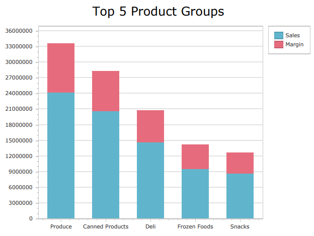
Native PixelPerfect stacked bar chart
Requirements
Before you start creating a native PixelPerfect chart, you need to have a chart in your Qlik Sense app with a source table that adapts well to what you want to visualize. In the Qlik Sense chart, select the appropriate dimensions and measures to filter the data sufficiently from the app's data model.
The data you use for a native PixelPerfect chart has to be added as a table data binding. To create this type of data binding, use the Field List menu and add an item under Tables.
Creating a simple PixelPerfect chart
This is the general workflow for creating a native PixelPerfect chart. Parts of it might not apply to every chart available. Each of the charts is different, serving a range of visualization needs ranging from simple to complex. Depending on what you need to visualize, some additional configurations might also be required.
다음과 같이 하십시오.
-
Open the
Field List menu available from the right-side panel in the designer.
-
Click the plus icon next to Tables.
-
From the available sheets, select the Qlik Sense chart you want to add as a table. Click the
icon next to it.
The data binding is added.
-
From the toolbox panel on the left side of the designer, drag a
Chart onto the design surface.
-
Select the blank chart and then open the
Properties menu from the right side of the designer.
-
Under Chart Tasks > Data Member in the menu, select the table you added as a data binding.
-
Inside the chart, click Run Designer....
-
In the left panel in the Chart Designer, hover over Series and click the plus icon.
-
In the menu, select a chart type. For a list of available charts, see Available chart types.
The Properties for the new series are shown on the right side.
-
Under Name, add a name for the series. This is recommended, for example, if your chart requires more than one series.
-
For Argument Data Member, use the drop down menu to select a field containing independent categories that group the data.
팁 메모In this context, selecting the Argument Data Member is similar to selecting a dimension in Qlik Sense. -
Expand Value Data Members. For Value, select a field containing the variable metrics you want to visualize. For certain advanced chart types (for example, Candle Stick chart), you might need to select more than one Value field.
팁 메모In this context, selecting the Value is similar to selecting a measure in Qlik Sense. -
If needed, add additional series. In the left panel in the Chart Designer, hover over Series and click the plus icon. Complete the remaining configuration steps as outlined above.
Additional tips for configuring the chart
The above workflow shows you how to create a simple native chart and connect it to Qlik Sense data sources. Here are some extra tips to help you make the most out of native PixelPerfect charts.
Labels and legends
You might need to configure labels and legends so that they appear correctly.
Changing the text
You can change the text shown in the labels and legend. You can do this by entering specific placeholders in the following properties:
-
Labels: Open the Properties for the series, and add a placeholder to Label > Text Pattern.
-
Legend: Open the Properties for the series, and add a placeholder to Legend Text Pattern.
The placeholders instruct PixelPerfect to generate dynamic text with commonly needed values. For example, to use the name of the series, enter {S}. To enter the name of specific field values, enter {A}.
For a full list of placeholders you can use, see Text definition placeholders for native PixelPerfect charts.
Turning labels and legends off
If your chart has a lot of data, it is often preferred to turn labels off (they are turned on by default). To turn off labels in a series, change the Labels Visibility setting in the Properties to False.
To turn the legend off, you need to return to the chart's global Properties in the Chart Designer. In the left-side panel, click Chart. In the Properties menu on the right side, expand Legend and set Visibility to False.
Charts with more than one series
Some native PixelPerfect charts will require you to add more than one series to the chart to visualize all the data. Common examples are grouped or stacked bar charts, stacked line charts, and nested pie charts. You might also need to add multiple series if you want to create a chart that, in Qlik Sense, would require more than one dimension or measure.
For example, to create a stacked bar chart with one independent grouping (Product Group) and two variable metrics (Sales and Margin), you would need to create two series:
-
Sales, with an Argument Data Member of Product Group and a Value of Sales
-
Margin, with an Argument Data Member of Product Group and a Value of Margin
Editing a chart with a user-defined series
Some additional steps are required to edit an existing PixelPerfect chart that is configured with a user-defined series. When you open the Chart Designer, the Properties that are initially shown are the global properties for the chart. To edit the elements that are defined in the visualization, you need to first select the series in the left-side panel.
다음과 같이 하십시오.
-
In the Chart Designer, double-click Series in the left-side panel.
-
Select the series you want to edit.
-
Edit the Properties on the right side.
Refreshing source data for data bindings
시간이 지남에 따라 소스 차트 구성이 변경될 수 있으며, 이에 따라 PixelPerfect 보고서 템플릿에서 작업이 필요할 수 있습니다. 기본 PixelPerfect 차트를 정의하는 데이터 바인딩에서 소스 앱 데이터를 새로 고칠 수 있습니다. 다음과 같은 경우 유용합니다.
-
데이터 바인딩을 만든 이후 소스 차트에 차원과 측정값이 추가되거나 제거되었습니다.
-
데이터 바인딩을 만든 이후 소스 차트에서 차원과 측정값의 정의가 변경되었습니다.
데이터 바인딩 소스를 새로 고치면 차트 구성이 변경될 때 새 개체를 만들지 않고도 필드 목록 메뉴에 동일한 개체를 유지할 수 있습니다.
다음과 같이 하십시오.
-
디자이너의 오른쪽 패널에서
필드 목록 메뉴를 엽니다.
-
테이블을 두 번 클릭하여 확장합니다.
-
새로 고치려는 항목 위에 커서를 올려놓으십시오.
-
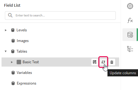
새로 고침(열 업데이트) 아이콘을 클릭합니다.
필드 목록 메뉴에서 테이블 데이터 바인딩 새로 고침
-
사용 사례에 맞게 계속하여 템플릿을 개발합니다. 여기에는 기존 콘텐츠를 재구성하거나 새 콘텐츠를 추가하는 작업이 포함될 수 있습니다. 이제 데이터 바인딩을 새로 고친 후 새로 추가된 차트 열을
필드 목록 메뉴에서 사용할 수 있습니다.
Available chart types
The following charts are shown as options when creating a PixelPerfect chart with manual series splitting.
Example - Creating a simple native bar chart
여기 자료 예 - 앱 내 보고의 앱 소스 예시를 참조하십시오. 앱과 데이터 파일을 공간에 업로드한 다음 앱을 다시 로드하십시오. 예제를 완료할 준비가 되었습니다.
In this example, we walk through a simple example of adding a native PixelPerfect bar chart to a report template.
다음과 같이 하십시오.
-
Create a new PixelPerfect template.
-
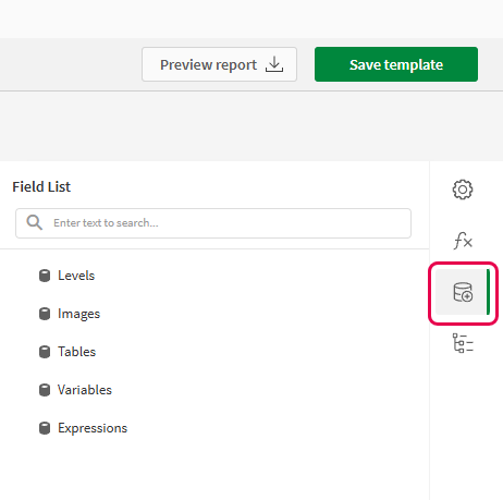
Open the
Field List menu available from the right-side panel in the designer.
Field List menu in the PixelPerfect designer
-
Click the plus icon next to Tables.
-
Expand the Dashboard sheet, and click the
icon next to the Sales per Region chart.
The data binding is added.
-
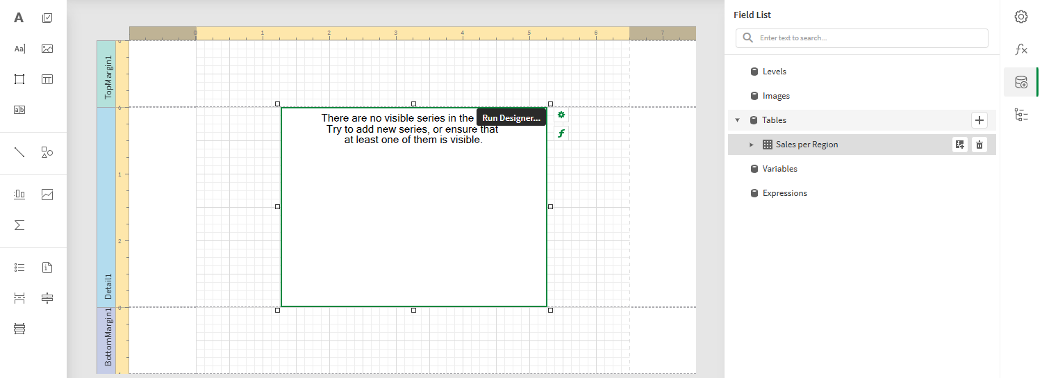
From the toolbox panel on the left side of the designer, drag a
Chart onto the Detail1 band.
Blank chart added to template. The image also shows the data source that will be used to bind to the chart.
-
Select the blank chart and then open the
Properties menu from the right side of the designer.
-
Under Chart Tasks > Data Member in the menu, select the Sales per Region table.
-
Inside the chart, click Run Designer....
-
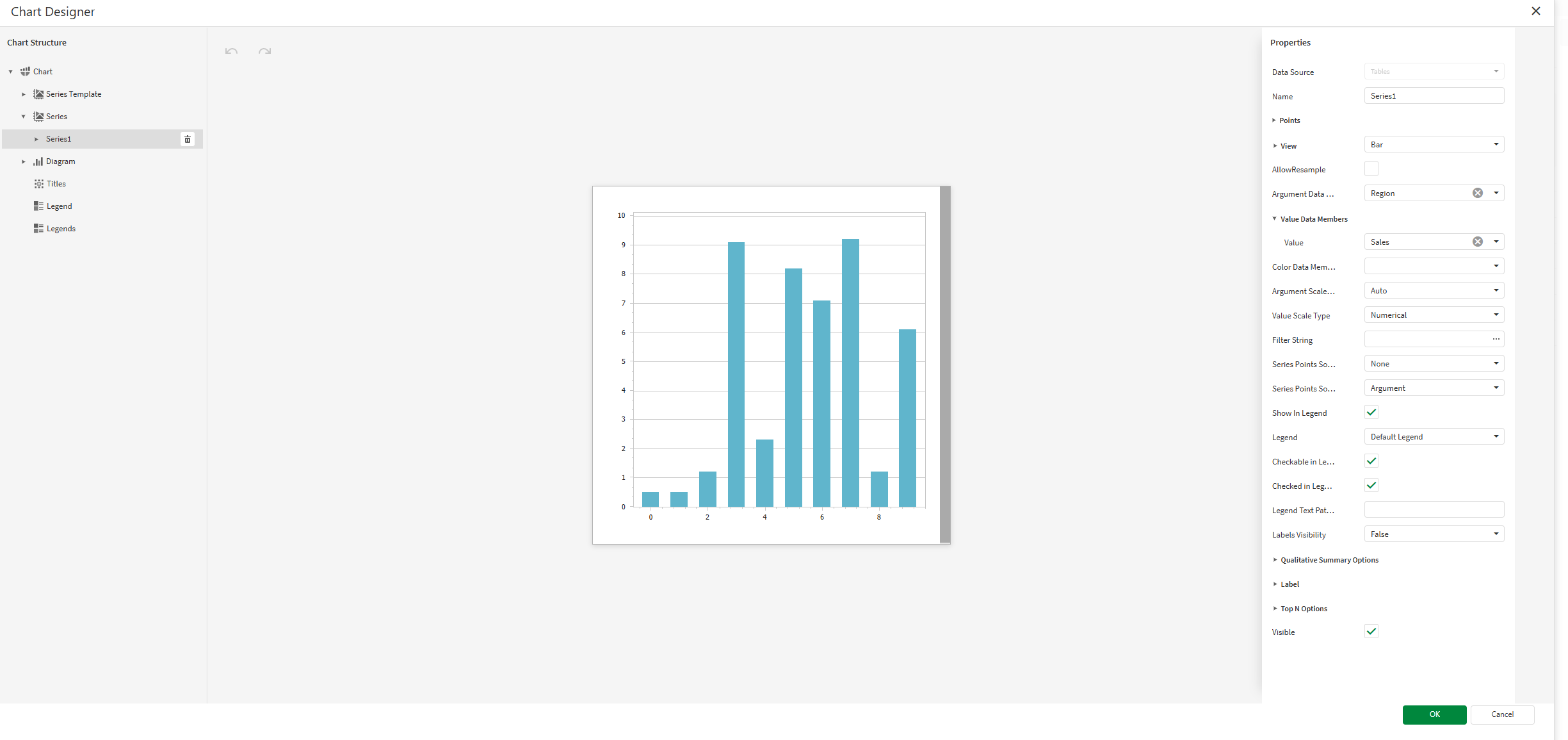
In the left panel in the Chart Designer, hover over Series and click the plus icon. In the menu, select Bar to create a bar chart series.
The Properties for the new series are shown on the right side.
-
For Argument Data Member, use the drop down menu to select Region.
팁 메모In this context, selecting the Argument Data Member is similar to selecting a dimension in Qlik Sense. -
Expand Value Data Members. For Value, select Sales.
-
In this case, we want to remove the labels and legend. Do both of the following:
-
In the Properties for the series, change the Labels Visibility setting to False.
-
In the Properties for the entire chart (select Chart in the left panel), expand Legend and set Visibility to False.
Chart Designer with the bar chart series configured to use Qlik Sense data sources
-
-
Add a title to the chart. In the left panel in the Chart Designer, hover over Titles and click the plus icon. Select a title position using the popup menu.
-
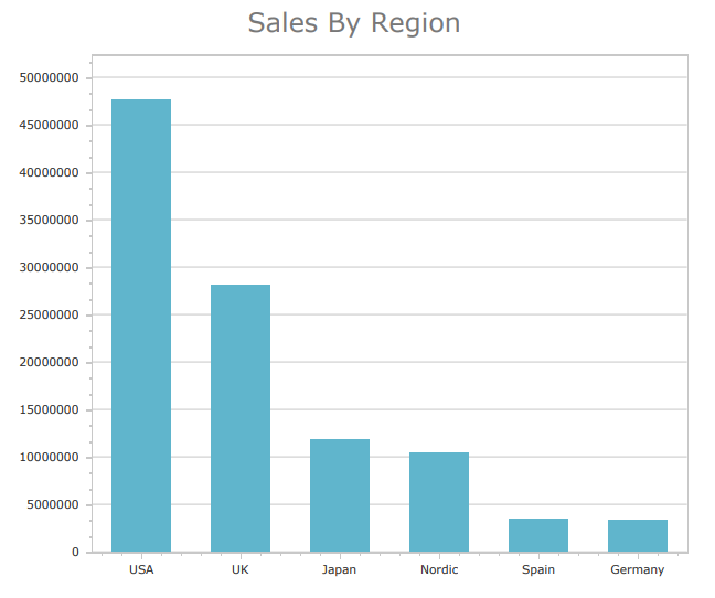
In the Properties for the title, enter Sales By Region for the Text property.
-
Click OK to exit the Chart Designer.
-
Increase the size of the chart and the Detail1 band.
-
In the top right corner, click Save template.
-
Click Preview report. Download the report and open it.
Chart preview
