
When to use it
The waterfall chart is suitable for illustrating how an initial value is affected by intermediate positive and negative values. One example of this is an income statement, when you want to show the positive and negative contributions of different accounts.
| Advantages | Disadvantages |
|---|---|
| The waterfall chart provides a quick understanding of the transition of a value. | The waterfall chart is not relevant for detailed analysis of the data as you can't make selections in the chart or expand the data. |
Example
This example is a simple income statement to illustrate what you can do with a waterfall chart. Normally, the statement would be more detailed with itemized accounts, and use subtotals to group the accounts.
Dataset
In this example, we'll use a simple table with year-by-year sales (Sales), expenses (Expenses), and taxes (Taxes).
| Year | Sales | Expenses | Taxes |
|---|---|---|---|
| 2010 | 1300240 | 934500 | 245000 |
| 2011 | 1432800 | 955200 | 255000 |
| 2012 | 1456700 | 1050450 | 275000 |
| 2013 | 1654000 | 1100245 | 355000 |
| 2014 | 1620000 | 1255400 | 395000 |
| 2015 | 1897530 | 1278000 | 400500 |
| 2016 | 1953250 | 1324500 | 425000 |
| 2017 | 1987650 | 1250500 | 455000 |
Copy this data table and paste it into an Excel worksheet, then you can load the Excel worksheet into your example app.
Visualization
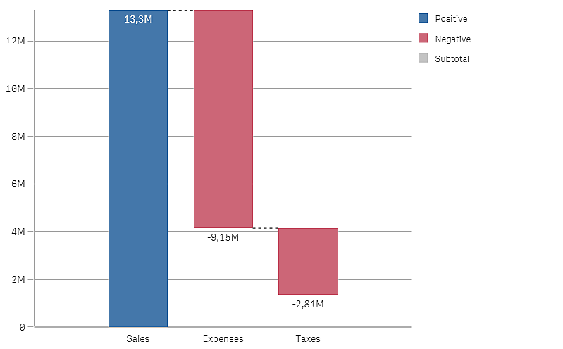
Start by adding a waterfall chart to a sheet in your example app. Then you can add the following measures to the waterfall chart:
-
Sum(Sales)
Use Add as Measure operation as this should give a positive contribution.
Set the label to Sales.
-
Sum(Expenses)
Use Subtract as Measure operation as this should give a negative contribution.
Set the label to Expenses.
-
Sum(Taxes)
Use Subtract as Measure operation as this should give a negative contribution.
Set the label to Taxes.
The chart should now look like this.
Next, we want to add subtotals to show the gross income (sales - expenses) and the net income (gross income - taxes).
You can calculate and add subtotal bars automatically by checking the Subtotals checkbox for the measure just before where you want the subtotal bar.
-
Gross income
Open the Expenses measure and check the Subtotals checkbox.
Set Subtotal label to Gross income.
-
Net income
Open the Taxes measure and check the Subtotals checkbox.
Set Subtotal label to Net income.
The visualization should now look like this.
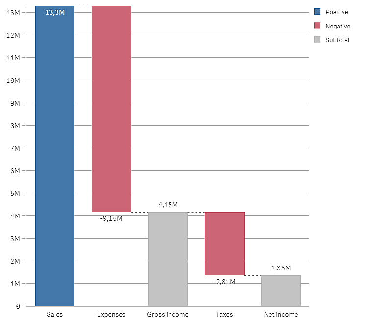
Discovery
You can now see the gross income, before taxes, and the net income after taxes are deducted.