
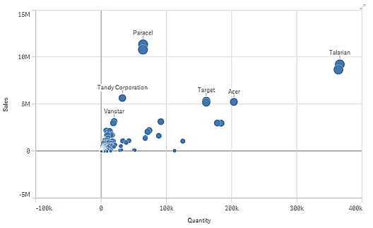
The scatter plot presents pairs of values from two or three measures. This is useful when you want to show data where each instance has two numbers, for example, the relationship between Sales and Quantity per Customer. In the scatter plot below, a third measure (Cost) is used to generate the bubble size.
Number of dimensions and measures
In a scatter plot you need one dimension and at least two measures. You can have maximum one dimension and three measures, where the third measure is visualized as bubble size.
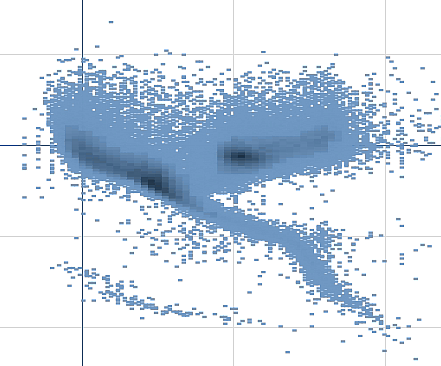
Large data sets in scatter plots
If you have a scatter plot with large amounts of data (more than 1000 data points) Qlik Sense uses an algorithm to create an overview of the data, as shown in the scatter plot below. However, if you zoom or make selections so that the number of displayed data points is reduced to less than 1000 data points, the data will be shown as individual bubbles. This switch between compressed view and bubble view is done automatically. The density of the data points is reflected by color.
Zooming and panning
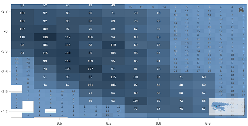
In a scatter plot, you can zoom and pan around in your data. The interaction differs depending on what device you are using. If you are zooming in you can see where in the data set you are located by looking at the mini chart in the bottom right corner. If you zoom in on large data sets you will be able to see the data shown as boxes with values inside. The values represent the number of points in each box. If you zoom in so that there are <1000 data points, you will instead see the data points represented by bubbles.
Zooming and panning is not possible when you have made a selection in the compressed data view.
You can change the compression resolution in the visual exploration menu or in the properties panel.
Touch device interaction
On a touch device you pinch to zoom and swipe to pan. Points that are outside the visible range are visualized as small dots along the axis lines or shown as being outside the selected area in a mini chart.
With a three-finger tap you reset the zoom. You can also reset the zoom by tapping ü, which appears in the top right corner when you start zooming.
Computer (mouse) interaction
With a computer you use the mouse to zoom and pan in the visualization. Use the scroll wheel to zoom in and out. The zooming is made on the area where the pointer is. Points that are outside the visible range are visualized as small dots along the axis lines.
You reset the zoom by clicking the scroll wheel or by clicking ü, which appears in the top right corner when you start zooming. You pan around in the chart by dragging. You also have the option of using the navigation tool that is available in the visual exploration menu. Right-click in the scatter plot and select Open exploration menu. Under Presentation you can turn on Navigation to open the tool.