
The Appearance section in the properties panel offers several options to set and modify the appearance of a visualization. Many of the settings have Auto options that support an optimal presentation of the visualization, taking into account the number of dimensions and measures and the type of data used. Normally, you do not need to change these settings, unless you have a special reason for doing so, for example, when space is very limited.
Appearance can be affected by the sorting of the dimensions and measures.
See: Change the sorting of a visualization
General
Show titles: On by default in all visualizations except filter panes and text & image visualizations. Filter panes have the name of each dimension, and in most cases do not need any additional title. The text & image visualization includes an editing toolbar with many options to format the text, and therefore the title field can be used for other purposes.
Title, Subtitle, and Footnote: Apart from the obvious use of title, subtitle, and footnote as text fields, you can use these fields to also display an expression, which provides additional information that complements the measure in the visualization. You could, for example, show the totals in the title field, so that the totals of the selected values are always available.
Example:
In the following image, the total sales are calculated and used in the title. When a selection is made, the total sales are updated accordingly.
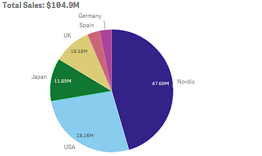
The following string was used to add the Total Sales expression to the field Title:
='Total Sales: $'& Round(Sum(Sales)/1000000, 0.1) & 'M'.
Because the title field is primarily a text field, it is necessary to start the string with an equals sign (=), to signify that the strings contains an expression.
Because 'Total Sales: $' is a text string when it is used in an expression, the string must be surrounded by single quotation marks.
& is used to concatenate the string and the expression.
Round(Sum(Sales)/1000000, 0.1) is the expression. The aggregation Sum(Sales) is divided by 1000000 and the function Round (x,0.1) reduces the number of decimals to one.
& 'M', finally, concatenates the expression with the unit M for million.
For the title there are three options for adding an expression:
- Directly in the title field of a visualization. Start the string with an equals sign (=).
- Directly in the box Title under Appearance in the properties panel. Start the string with an equals sign (=).
- Through the expression editor in the box Title. Click to open the expression editor. No equals sign is needed.
For the subtitle and footnote only the last two options are available.
Presentation
Many of the presentation settings only apply to a certain visualization.
| Bar chart |
Set the bars to be displayed grouped or stacked, vertically or horizontally. |
| Gauge |
Set the gauge to be displayed as a radial or a bar. You can set range limits and use segments with limits. |
| Line chart |
Set the line chart to be displayed as a line or an area. |
| Pie chart |
Set the pie chart to be displayed as a pie or a donut. |
| Scatter plot |
Set the size of the bubbles in a scatter plot. |
| Table |
Set the totals to be displayed at the top, bottom, or not at all. |
| Treemap |
Set the headers, labels, overlay labels, and leaf values. Select to show the data values. |
Example:
A bar chart with two dimensions is by default presented with the bars grouped.
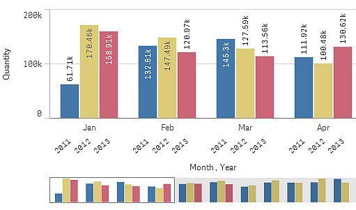
Let us assume that you want to compare the total monthly quantity for these years. Then it would be a good idea to switch to a stacked bar chart.
In the properties panel, under Appearance > Presentation there is an option Stacked.
With stacked bars it is easier to compare the quantity between different months.
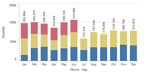
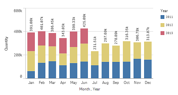
Now it is quite easy to compare the quantities per month, but the years are no longer visible. You can add a legend to display the years.
In the properties panel, under Colors and legend there is a Show legend button.
Show legend is set to Auto, which means that the legend is displayed when there is enough space. In the properties panel, you can also set where to display the legend and whether to display the legend title.
Colors and legend
In the following treemap, the margin values are presented per month and year. The months are sorted by margin value, descending, top down, left to right. By default, the coloring is by dimension with 12 colors, one for each month. The Auto option sets a sensible coloring for the visualization given the input data. In most cases the automatic setting does not need to be changed. However tempting it may be to "add some color" to a visualization, it is important remember that different colors should only be used when they serve a purpose.
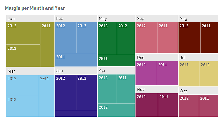
Let us assume that you still want to change coloring to display the differences in the margin values. In that case you need to change from the automatic coloring to coloring by measure.
In the properties panel, under Appearance > Colors, there is a Colors button. After clicking that button you can select the option By measure.
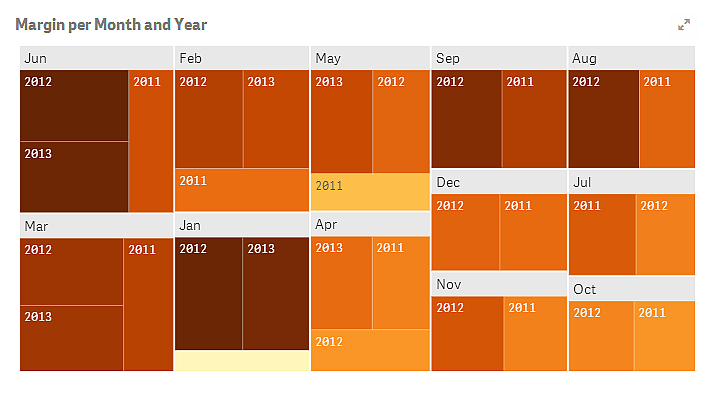
The margin values are now colored by size, the darker the color, the higher the value. If you also want to differentiate between values with the same color, you can display each margin value. Under Presentation, there is an option Show values to show each margin value.
X-axis and Y-axis
For both the y-axis and the y-axis, you have options for deciding what combination of labels and title to display, as well as their orientation and position. Sometimes it may feel unnecessary to have labels and/or title, because the visualization is self-explanatory and then it would be good to be able to hide them. Furthermore, when you create a visualization that is very small, for example, three by three squares, the labels are automatically hidden.
Range: The measure axis (usually the y-axis) has an option to set the range of the axis. By default, the range is adjusted according to the highest positive or the lowest negative measure value, but if, for example, a single measure value is much larger than all the other values, you may want to set a range that is suitable for the lower values. In the properties panel, under Appearance > Y-axis <measure name>, there is a button for Range, which is set to Auto. Click the button to switch to Custom. Now you can set the range for Max, Min, or both. In a bar chart, the bars that are out of the range are cut diagonally to indicate that they are out range. In a line chart, only the parts that are within the range are visible.