
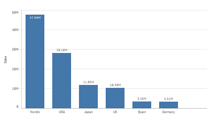
The bar chart is suitable for comparing multiple values. The dimension axis shows the category items that are compared, and the measure axis shows the value for each category item. In the image, the dimension values are different regions: Nordic, USA, Japan, UK, Spain, and Germany. Each region represents a dimension value, and has a corresponding bar. The bar height corresponds to the measure value (sales) for the different regions.
You can make more complex comparisons of data by using grouped or stacked bars. With grouped bars, you can easily compare two or more items in the same categorical group. Stacked bars combine bars of different groups on top of each other and the total height of the resulting bar represents the combined result.
The bar chart can be displayed horizontally or vertically.
Number of dimensions and measures
In a bar chart you need at least one dimension and one measure. The following table shows the maximum limits.
| When using | Max limit |
|---|---|
| 1 dimension | 15 measures |
| 2 dimensions | 1 measure |
| 1 measure | 2 dimensions |
| 2 -15 measures | 1 dimension |
Scrolling and mini chart
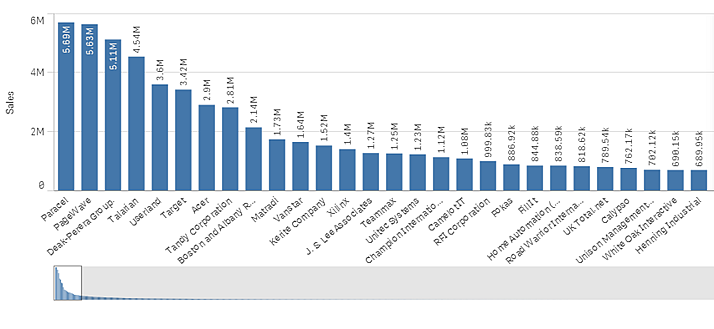
When the number of dimension values exceeds the width of the visualization, a mini chart with a scroll bar is displayed. You can scroll by using the scroll bar in the mini chart, or, depending on your device, by using the scroll wheel or by swiping with two fingers. When a large number of values are used, the mini chart no longer displays all the values. Instead, a condensed version of the mini chart (with the items in gray) displays an overview of the values, but the very low and the very high values are still visible.
Out of range
In the properties panel, under Appearance, you can set a limit for the measure axis range. Without a limit, the range is automatically set to include the highest positive and lowest negative value, but if you set a limit you may have values that exceed that limit. A bar that exceeds the limit will be cut diagonally to show that it is out of range.
When a bar cannot be displayed, due to the range limits, an arrow indicates the direction of the value.
When a reference line is out of range, an arrow is displayed together with the number of reference lines that are out of range.