
Description
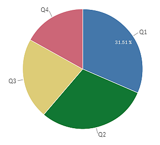
In the pie chart, the dimensions form sectors of the measure value.
You can include one measure and one dimension in a pie chart.
Default settings for a pie chart
The following settings are used by default in a pie chart:
- The top 10 sectors are presented in descending order, clockwise.
- Colors are presented by dimension.
- Value labels are presented in percent.
When to use it
The primary use of a pie chart is to compare a certain sector to the total. The pie chart is particularly useful when there are only two sectors, for example yes/no or queued/finished.
Advantages
The pie chart provides an instant understanding of proportions when few sectors are used as dimensions. When you use 10 sectors, or less, the pie chart keeps its visual efficiency.
Disadvantages
It is often hard to compare the results of two pie charts with each other, and therefore you should not do it.
It may be difficult to compare different sectors of a pie chart, especially a chart with many sectors.
The pie chart takes up a lot of space in relation to the values it visualizes.