
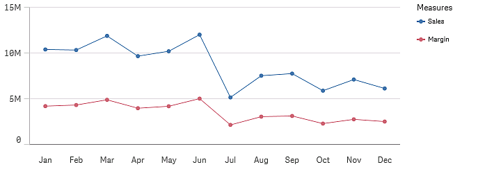
Line chart that shows trends for the measures sales and margin on a monthly basis
Description
You can include one dimension and several measures in a line chart.
Data can be presented in different ways in a line chart: as lines, as an area, or as a stacked area, when you have more than one measure.
When to use it
The line chart is primarily suitable when you want to visualize trends and movements over time, where the dimension values are evenly spaced, such as months, quarters, or fiscal years.
Advantages
The line chart is easy to understand and gives an instant perception of trends.
Disadvantages
Using more than a few lines in a line chart makes the line chart cluttered and hard to interpret. For this reason, avoid using more than two or three measures.