
Description
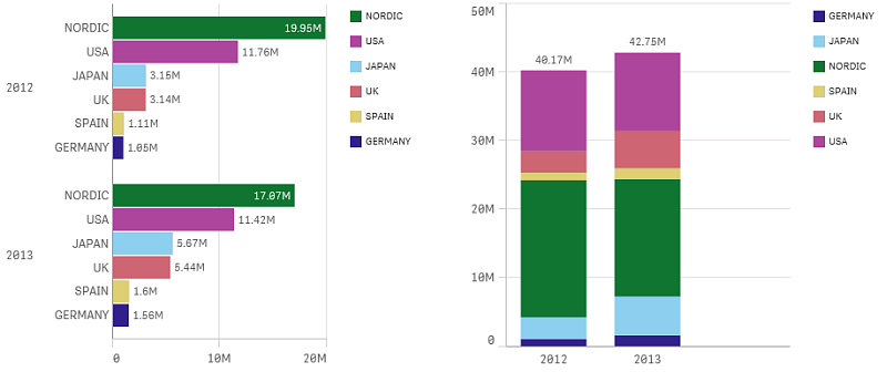
You can include two dimensions and one measure, or one dimension and multiple measures in a bar chart. Each bar corresponds to a dimension, and the values of the measures determine the height/length of the bars.
When to use it
Grouping and stacking bars makes it easy to visualize grouped data. The bar chart is also useful when you want to compare values side by side, for example sales compared to forecast for different years, and when the measures (in this case sales and forecast) are calculated using the same unit.
Advantages
The bar chart is easy to read and understand. You get a good overview of values when using bar charts.
Disadvantages
The bar chart does not work so well with many dimension values due to the limitation of the axis length. If the dimensions do not fit, you can scroll using the scroll bar, but then you might not get the full picture.