The pivot table presents dimensions and measures as rows and columns in a table. In a pivot table you can analyze data by multiple measures and in multiple dimensions at the same time. You can rearrange the measures and dimensions to get different views of the data. The activity of moving measures and dimensions interchangeably between rows and columns is known as “pivoting”.
When to use it
The pivot table is particularly useful when you want to include several dimensions or measures in a single table, and then want to reorganize them to see different subtotals.
Advantages
The pivot table is very powerful when you want to analyze multiple dimensions and measures at once, and then reorganize them to get a different perspective on your data. Another advantage is that you can expand the rows you are interested in while keeping the rows in the rest of the table collapsed.
Disadvantages
The pivot table may seem a bit complicated, and does not give insights at a glance.
Creating a pivot table
You can create a new pivot table on the sheet you are editing.
Do the following:
- From the assets panel, drag an empty pivot table to the sheet.
- Click Add dimension and select a dimension or a field.
- Click Add measure and select a measure or create a measure from a field.
When you have created the pivot table, you may want to adjust its appearance and other settings in the properties panel.
Pivoting
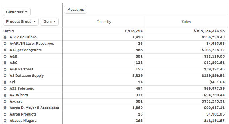
When you want to rearrange your data to get a new view, you drag the items to the new place, either to a column or a row. In the following pivot table, the dimension Customer has been dragged to the position after Product Group and the dimension Item to the position before Product Group. As a consequence, the dimensions are now sorted by Item, primarily. Focus has shifted from Customer to Item. By expanding the dimensions you can find out the quantities and sales for each customer, but there is another way to achieve that goal.

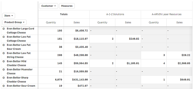
By moving the dimension Customer from rows to columns, you retain focus on the dimension Item, but you also get the distribution of items per customer. The move has made the pivot table more information dense.
Measure grouping
As you may have noticed, Quantity and Sales are not presented as separate measures in the top column row. Next to the dimension Customer, you find an item called Measures. When you use more than one measure, the measures are automatically grouped together forming a measure group, Measures, which as a whole can be added to the rows section or the columns section. The measure group is not editable in the table. You cannot split the measure item and use one measure as a row and another as a column, nor can you change the order in which the measures are presented. Changes to the Measures item are made in the properties panel.
Different ways of pivoting
Essentially, pivoting involves dragging the dimensions and measures from rows to columns and columns to rows, but you have two options for performing the pivoting.
- In the pivot table (both when editing and when analyzing).
- In the properties panel (only when editing).
Pivoting using the properties panel
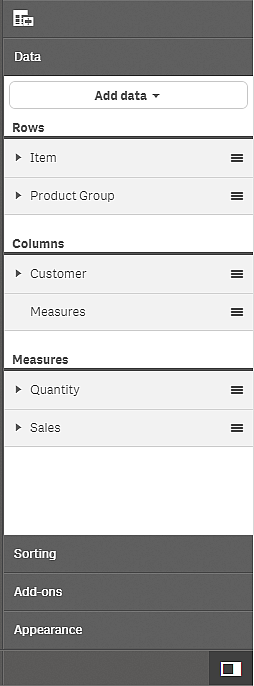
In the properties panel, you can add measures and dimensions to the pivot table, and also move the dimensions and measures to rows or columns. When you use more than one measure, the measures are grouped and a Measures item is created. You can change the internal order of the dimensions and measures, but when you have more than one measure, it is always the whole measure group that you move.
Global grouping
With global grouping you use a limited data set, and in that data set, you single out values that you want to focus on, for example, the best quarters, the top sales persons, or the worst selling products.
You can regard global grouping as a two-step procedure. First you apply a limitation to a data set, and then, in the resulting list, you apply the same limitation again to the inner dimension (that is, the dimension that is second in the sorting hierarchy), to only show results for the singled out inner dimension values.
Example:
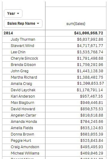
In the following pivot table, no limitation is applied. The values are sorted on Sales, descending. The list is long, the values for 2013 are not shown.
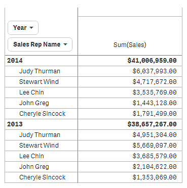
In the following pivot table, a limitation has been applied to the (inner) dimension Sales Rep Name, so that only the top five sales representatives for the years 2013 and 2014 are shown.
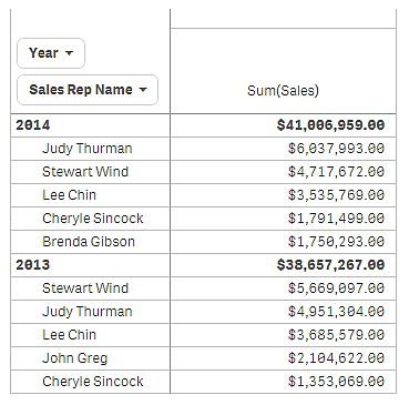
The next step is to select global grouping in the properties panel. The option Global grouping is only available when you have applied a limitation on the dimension.
When global grouping is selected, the limitation of the top five sales representatives is applied again, but this time regardless of the dimension Year. The five sales representatives with the highest sales (either in 2013 or 2014) are the only ones that will be presented in the final pivot table.
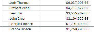
The following image shows the six highest results for 2014 and 2013. The top four results are from 2014, but the fifth (John Greg) is from 2013. Because five other sales representatives have higher sales than Brenda Gibson (who was number five in 2014), she is knocked out of the list.
The following image shows the pivot table with global grouping applied. The pivot table only contains the sales results for the top five sales representatives. Even though Brenda Gibson had a better result in 2014 than John Greg, his result for 2013 qualified him for the top five list.
