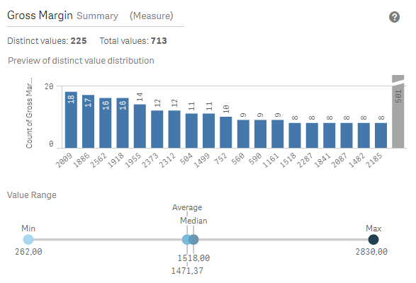
To examine your data for potential quality issues such as null or outlier before you load it into Qlik Sense, you view a summary of the data using the Summary data profiling card. In addition, the Summary card enables you to view different possible data interpretations, such as viewing the field's data as a dimension or measure.
You access the Summary card by editing a table in Data manager and selecting a table field. When a field is selected in the table editor, Qlik Sense examines the data type, metadata, and values present. The field is then categorized as either a dimension, measure, or temporal field, and an analysis is presented in the Summary card. Fields whose data can be categorized as either a dimension or measure can switch preview to display them as a dimension or measure. How a data field is categorized in the Summary card does not affect how you can use it in Qlik Sense visualizations, but it does determine what transformation options are available for the data field in other data profiling cards.

The Summary card provides the following information:
- Distinct values: The number of distinct values in the field.
- Total values: The number of values in the field.
- Preview of distinct value distribution: In fields with more than 20 distinct values, only the 20 distinct values with the highest count display. All other values are grouped into a single value on the chart. If all values are distinct, no bar chart will display.
- Value Range: (Measure and Temporal only) For a measure field, the Value Range is a chart showing the Min, Median, Average, and Max values for the field. For a temporal field, the Value Range is the time period covered by the field's data.
- Null values: The number of null values in the data. This visualization only displays if there are null values in the field.
- Mixed values: The number of text value in a field that contains both text and numeric values. This visualization only displays if there are mixed values in the field.
Depending on how a field is categorized in the Summary card, it can be modified in other data profiling cards. Fields set as measures can have grouped values created from the field using the Bucket card. For more information, see Grouping measure data into ranges.
Fields set as dimensions can have:
- Distinct values replaced with other value using the Replace card.
For more information, see Replacing field values in a table. - Distinct values set as null values using the Set nulls card.
For more information, see Setting field values as null in a table. - A custom order applied to the values using the Order card.
For more information, see Customizing the order of dimension values. - Field data split into new table fields using the Split card.
For more information, see Splitting a field in a table.
Accessing the Summary card
Do the following:
- In Data manager, select a table and click @.
- Select a table field.
The Summary card appears.
Changing the data category of a field
Qlik Sense permits changing the data category of a field, provided the data in the field can be categorized in multiple categories.
Do the following:
- In the Summary card, click S and select a different data category.
