Adding sparklines
A sparkline is a simple visualization, usually styled in the form of a line, that is helpful for analyzing trends for a single metric. You can add sparklines to your PixelPerfect report using the Sparkline object.
A sparkline generally consists of a field (equivalent to a dimension) and a value member (equivalent to a measure).

Sparkline

Requirements
The data you use for a sparkline has to be added as a table data binding. These data bindings are added under Tables in the Field List menu.
The source data for the sparkline should ideally contain a single dimension and a single measure. To use sparklines to visualize more complex, multi-dimensional data, it is recommended that you apply a level to the band where you add the sparkline. In this case, the level should be an additional dimension along which you want to cycle the generation of multiple filtered sparklines.
Creating sparklines
This is the recommended workflow for adding sparklines in your report.
請執行下列動作:
-
Open the
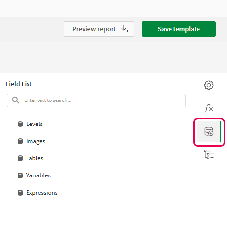
Field List menu available from the right-side panel in the designer.
-
Click the plus icon next to Tables.
-
From the available sheets, select the Qlik Sense chart you want to add as a table. Click the
icon next to it.
The data binding is added.
-
From the toolbox panel on the left side of the designer, drag a Sparkline onto the design surface.
-
Click the gear icon that appears next to the sparkline. In the pop-up menu, for Data Member, select the table data binding you created earlier.
-
Open the
Properties menu from the right side of the designer, and expand Data.
-
For Value Member, select the variable metric you want to visualize (for example, sales).
Refreshing source data for data bindings
隨著時間的推移,來源圖表的設定可能會發生變更,需要您在 PixelPerfect 報告範本中採取動作。您可以在定義走勢圖的資料繫結中重新整理來源應用程式資料。這在下列情況下十分實用:
-
自從建立資料繫結以來,維度和量值已新增至來源圖表或從來源圖表中移除。
-
自從建立資料繫結以來,已在來源圖表中變更維度和量值的定義。
重新整理資料繫結來源可讓您在 欄位清單功能表中保留相同的物件,而無需在圖表設定變更時建立新的物件。
請執行下列動作:
-
開啟設計工具右側面板中提供的
欄位清單功能表。
-
按兩下表格以便展開。
-
將游標暫留在要重新整理的項目上。
-
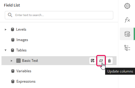
按一下重新整理 (更新欄) 圖示。
重新整理欄位清單功能表中的表格資料繫結

-
根據您的使用情況繼續進行範本開發。這可能涉及重新設定現有內容或新增內容。重新整理資料繫結後,新增的圖表欄現在可以從
欄位清單功能表中使用。
Example - Sparklines with a level
請參閱此處的範例應用程式來源:範例材料 - 應用程式內報告。將應用程式和資料檔案上傳到空間,然後重新載入應用程式。您已準備好完成該範例。
We will create sparklines with monthly sales by region.
Part 1: Add data bindings
請執行下列動作:
-
Create a new PixelPerfect template.
-
Open the
Field List menu available from the right-side panel in the designer.
Field List menu in the PixelPerfect designer

-
Click the plus icon next to Levels.
-
Expand Fields, and click the
icon next to Region.
The data binding is added.
-
You are brought back to the main
Field List menu. Click the plus icon next to Tables.
-
Expand the Sales Table sheet, and click the
icon next to the Regional Sales over Time chart.
The data binding is added.
Part 2: Add DetailReport band and connect it with data banding
You need to create a DetailReport band to use a level.
請執行下列動作:
-
Right-click the Detail1 band, and then click Insert Band > DetailReport.
-
To bind the DetailReport1 band to the level, select the band and then open the
Properties menu. Under Detail Report Tasks > Data Member, select the Region level.
Part 3: Add a label and sparkline
請執行下列動作:
-
Open the
Field List menu, and double-click Levels to expand it.
-
For Region, expand the level object and drag the Region field within it onto the DetailReport1 band.
Position the label at the top of the band, centered horizontally.
-
From the toolbox panel on the left side of the designer, drag a Sparkline onto the DetailReport1 band, below the Region label.
-
Resize the sparkline so that it occupies all horizontal space on the band, and its shape is a narrow rectangle.
-
Resize the DetailReport1 band so there is a small space at the bottom of the sparkline.
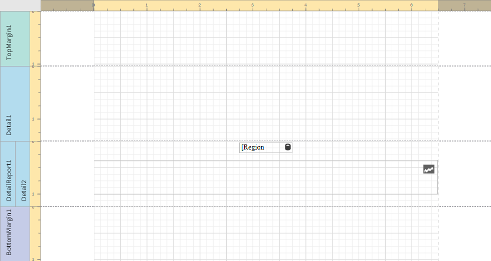
Region label and empty sparkline added to template

-
Select the sparkline and then open the
Properties menu.
-
Expand Appearance > View.
-
Check Highlight Max Point and Highlight Min Point.
-
For Color, expand the drop down menu. Paste the following hex code in the # field: 0d00ff. Click OK.
-
For Max Point Color, expand the drop down menu. Paste the following hex code in the # field: 0dff00. Click OK.
-
For Min Point Color, expand the drop down menu. Paste the following hex code in the # field: ff0000. Click OK.
-
In the top right corner, click Save template.
-
Click Preview report. Download the report and open it.
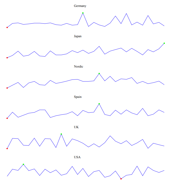
Report preview with sparklines

