Creating time-aware charts using continuous scale
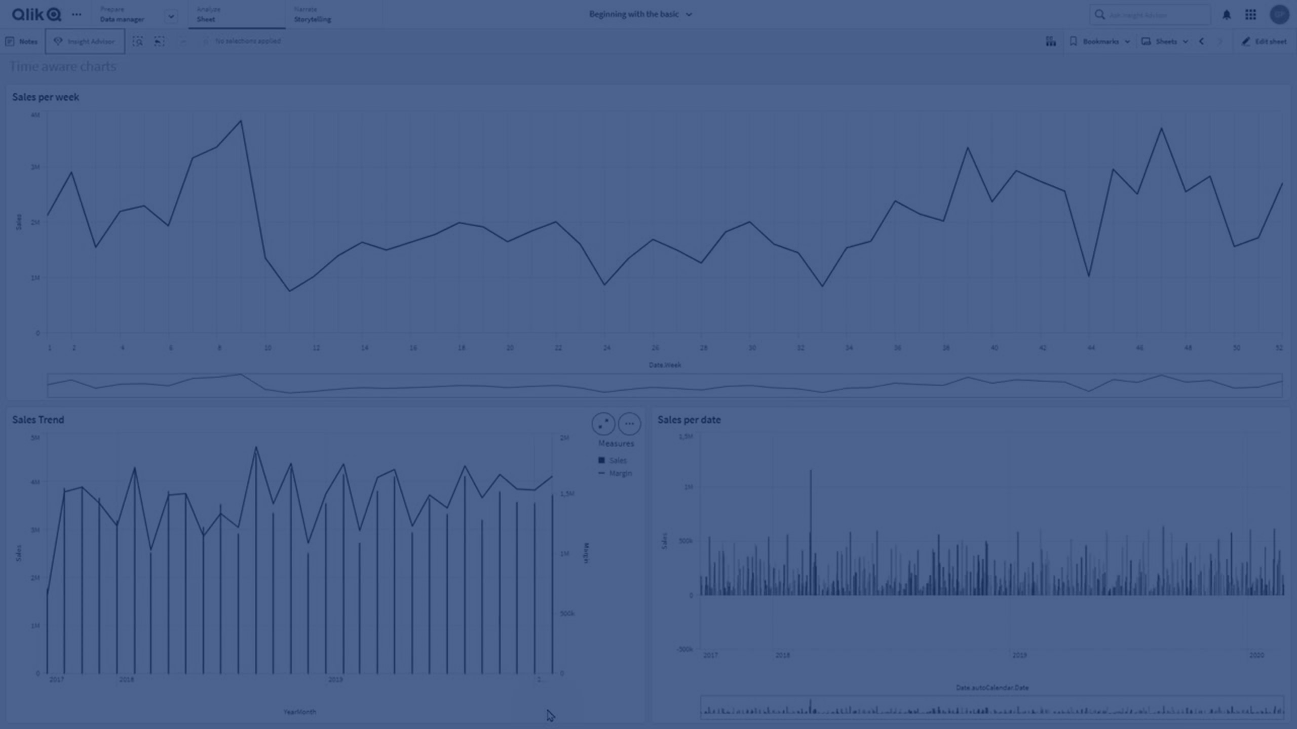
In this tutorial, you’ll learn how to create and work with time-aware charts in Qlik Sense. By enabling continuous scaling on the X-axis, you can display time-based data on a true timeline for a more accurate view of trends.
You’ll discover how to:
- Enable continuous scale for charts
- Understand how data points and axis labels adjust
- Use continuous scaling with date and timestamp fields
- Zoom in on time spans and capture snapshots
- Apply continuous scale to line charts, bar charts, and combo charts
This guide is ideal for analysts and developers working with time-series data in Qlik Sense.
⏰ 00:08 – Introduction to Time Aware Charts
📊 00:17 – Continuous Scaling Explained
🗓️ 00:40 – When to Use Continuous Scale (Date & Timestamp Fields)
⚙️ 00:55 – Enabling Continuous Scale in Chart Properties
📐 01:16 – How Charts Adjust with Continuous Scale
🔍 01:23 – Navigating & Zooming in Time Aware Charts
📸 01:31 – Taking Snapshots of Data Views
📈 01:36 – Chart Types That Support Continuous Scale
🏁 01:42 – Conclusion