
You can monitor visualizations in the Qlik Cloud Analytics hub and in Qlik Sense Mobile SaaS, enabling you to view charts without opening any apps.
You can select a visualization and add it to your personal space in the hub. You can add visualizations from both sheets and from Insight Advisor. Visualizations you add this way can be found in Your charts on the Home section of the hub or in Catalog: filter on Charts. Any selections applied to the visualization are kept when it is added to the hub. The monitored visualization updates every time the source app reloads.
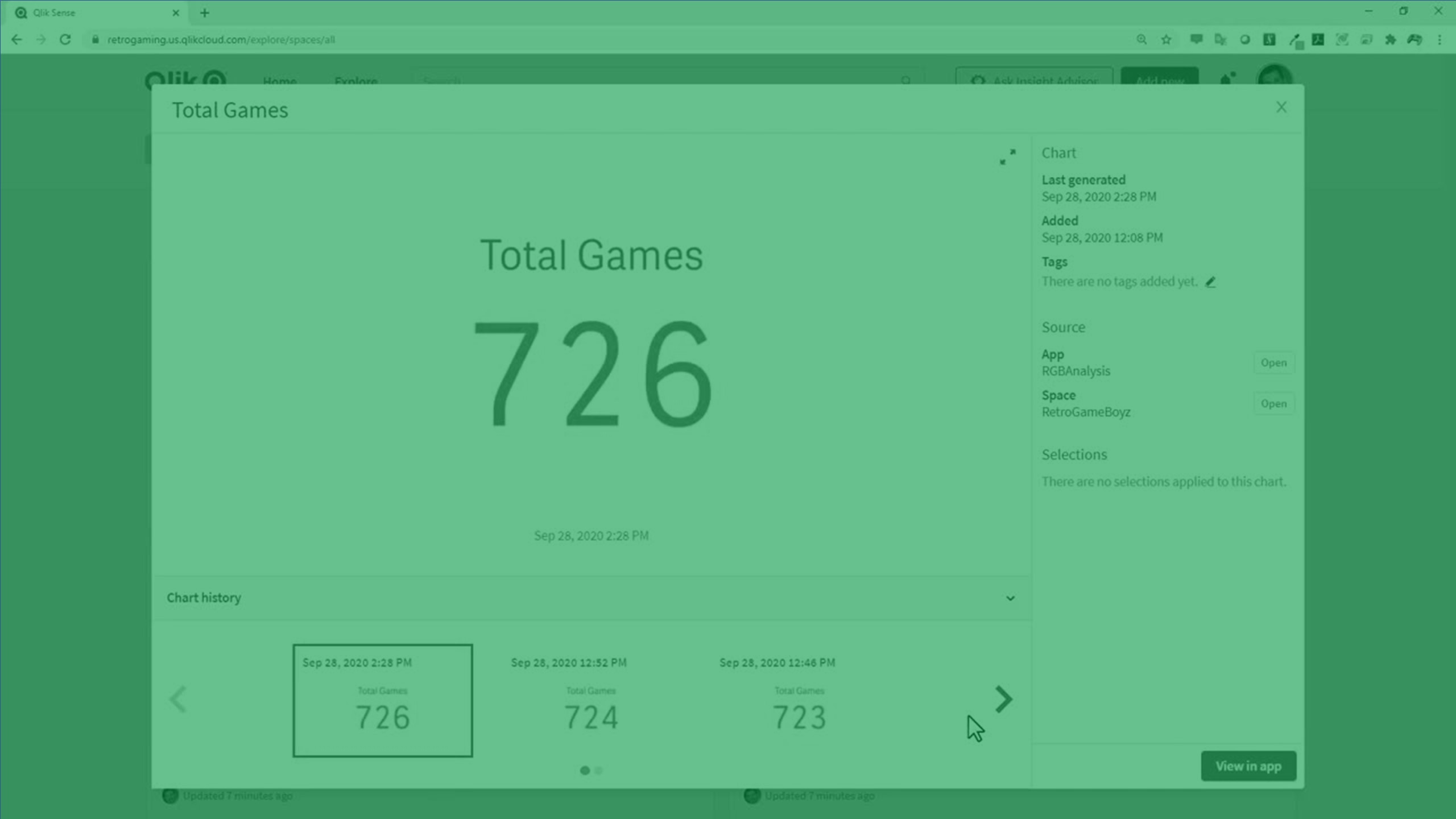
Visualization in the hub

When you open a chart in the hub, the chart shows the latest version of the chart from the last reload of data in the source app. You can view the chart, the chart details, and the history.
If you have added a visualization from an app to which you no longer have access, the last version of the visualization you had access to will display.
You cannot make selections in the chart, but you can view the chart in the source app by clicking View in app. For example, you may want to apply bookmarks or see how the chart changes based on new selections. View in app opens the source app to the visualization with selections applied. For charts generated in Insight Advisor, View in app opens Insight Advisor in Sheet. You can optionally view additional charts from the same Insight Advisor search or analysis.
You can view the last time the chart was reloaded, when the chart was created, tags, and the source app and space. You can open the source app or space. Selections displays the selections that were applied to the chart when you added it to the hub.
Chart history contains previous versions of the chart. You can select previous versions to view. You can view historical charts side by side by clicking 2 on another historical chart. You can click 1 on a chart to display a historical chart to the left of the current chart. Every time the app data reloads, another version is added to History. You can view the previous 10 chart versions.
You can edit the chart title by clicking the title. You can edit tags by clicking ![]() .
.
Monitoring visualizations in the hub
Do the following:
- Right-click a visualization and select Monitor in hub.
-
Optionally, select Store sheet view state to lock the zoom and scroll position in the monitored chart.
Information noteAs data changes, this option may make data points appear out of view.
- Optionally, edit the name of the visualization.
- Optionally, add tags to the visualization.
- Click Monitor.
Removing visualizations from the hub
Do the following:
- In the hub, on a visualization, click
 and select Delete.
 - Click Delete.
Limitations
Monitoring visualizations has the following limitations:
- The following visualizations cannot be monitored:
- Button
Container
Information noteIndividual charts in containers can be monitored.
- Filter pane
- Word cloud chart extension
- Multi-KPI extension
- Trellis container extension
- Dashboard bundle extensions
- Custom extensions
- You can view data in tooltips when hover over values in the chart for the following charts:
- Bar chart
- Bullet chart
- Combo chart
- Funnel chart extension
- Histogram
- KPI
- Line chart
- Mekko chart
Org chart
- Pie chart
- Sankey chart extension
- Scatter plot
- Waterfall chart
- Right-to-left setting is not supported in monitored charts.
- Selections from dynamic bookmarks are not supported in monitored charts. The selections in the monitored visualization will be the selections that were applied in the visualization when it was added to the hub.
- Previous or next selections from set analysis expressions are not supported in monitored charts.
- Variable values in monitored charts are set and are not updated if they change in the source app.
- Charts within custom tooltips will not be included in the tooltip when you are monitoring a visualization.
- Monitored visualizations using cyclic dimensions cannot cycle dimensions in the hub.
-
If you apply a shadow to a chart in the app, the shadow is not shown when you monitor the chart in the hub.
The following technical limitations apply when monitoring visualizations in the hub. These limits are checked when you click Monitor in hub. If these limits are exceeded, you will see an error message. If this issue occurs, contact a user with Can edit permission in the app.
The specific limitations are listed below:
-
Maximum number of fields in the selections: 125
-
Maximum number of field values in the selections: 150,000 total field values across one or many fields
-
Maximum number of alternate states: 125
-
Maximum number of patches: 100
Patches are properties or styling applied in the app. For example: Adding a sort to a table column.
-
Maximum number of variables: 1,100
-
Maximum image size: 4,000 x 4,000 pixels
-
Minimum image size: 5 x 5 pixels for charts and 20 x 20 pixels for sheets