Adding sparklines
A sparkline is a simple visualization, usually styled in the form of a line, that is helpful for analyzing trends for a single metric. You can add sparklines to your PixelPerfect report using the Sparkline object.
A sparkline generally consists of a field (equivalent to a dimension) and a value member (equivalent to a measure).

Sparkline

Requirements
The data you use for a sparkline has to be added as a table data binding. These data bindings are added under Tables in the Field List menu.
The source data for the sparkline should ideally contain a single dimension and a single measure. To use sparklines to visualize more complex, multi-dimensional data, it is recommended that you apply a level to the band where you add the sparkline. In this case, the level should be an additional dimension along which you want to cycle the generation of multiple filtered sparklines.
Creating sparklines
This is the recommended workflow for adding sparklines in your report.
执行以下操作:
-
Open the
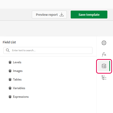
Field List menu available from the right-side panel in the designer.
-
Click the plus icon next to Tables.
-
From the available sheets, select the Qlik Sense chart you want to add as a table. Click the
icon next to it.
The data binding is added.
-
From the toolbox panel on the left side of the designer, drag a Sparkline onto the design surface.
-
Click the gear icon that appears next to the sparkline. In the pop-up menu, for Data Member, select the table data binding you created earlier.
-
Open the
Properties menu from the right side of the designer, and expand Data.
-
For Value Member, select the variable metric you want to visualize (for example, sales).
Refreshing source data for data bindings
随着时间的推移,源图表的配置可能会发生变化,需要在 PixelPerfect 报告模板中采取行动。您可以在定义迷你图的数据绑定中刷新源应用程序数据。这在以下情况下很有用:
-
自创建数据绑定以来,维度和度量已添加到源图表或从源图表中删除。
-
自创建数据绑定以来,源图表中的维度和度量的定义已更改。
刷新数据绑定源允许您在 字段列表菜单中保留相同的对象,而无需在图表配置更改时创建新的对象。
执行以下操作:
-
打开设计器右侧面板中可用的
字段列表菜单。
-
双击表格将其展开。
-
将光标悬停在要刷新的项目上。
-
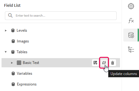
单击刷新(更新列)图标。
刷新 字段列表菜单中的表格数据绑定

-
根据您的用例继续进行模板开发。这可能涉及重新配置现有内容或添加新内容。刷新数据绑定后,新添加的图表列现在可以从
字段列表菜单中使用。
Example - Sparklines with a level
请参阅此处的应用程序源示例:示例材料 - 应用程序中报告。上传应用程序和数据文件到空间,然后重新加载应用程序。即可完成示例。
We will create sparklines with monthly sales by region.
Part 1: Add data bindings
执行以下操作:
-
Create a new PixelPerfect template.
-
Open the
Field List menu available from the right-side panel in the designer.
Field List menu in the PixelPerfect designer

-
Click the plus icon next to Levels.
-
Expand Fields, and click the
icon next to Region.
The data binding is added.
-
You are brought back to the main
Field List menu. Click the plus icon next to Tables.
-
Expand the Sales Table sheet, and click the
icon next to the Regional Sales over Time chart.
The data binding is added.
Part 2: Add DetailReport band and connect it with data banding
You need to create a DetailReport band to use a level.
执行以下操作:
-
Right-click the Detail1 band, and then click Insert Band > DetailReport.
-
To bind the DetailReport1 band to the level, select the band and then open the
Properties menu. Under Detail Report Tasks > Data Member, select the Region level.
Part 3: Add a label and sparkline
执行以下操作:
-
Open the
Field List menu, and double-click Levels to expand it.
-
For Region, expand the level object and drag the Region field within it onto the DetailReport1 band.
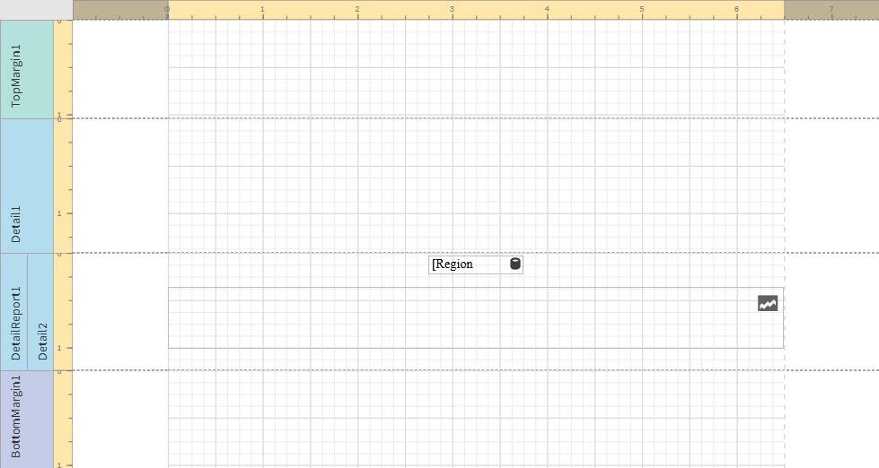
Position the label at the top of the band, centered horizontally.
-
From the toolbox panel on the left side of the designer, drag a Sparkline onto the DetailReport1 band, below the Region label.
-
Resize the sparkline so that it occupies all horizontal space on the band, and its shape is a narrow rectangle.
-
Resize the DetailReport1 band so there is a small space at the bottom of the sparkline.
Region label and empty sparkline added to template

-
Select the sparkline and then open the
Properties menu.
-
Expand Appearance > View.
-
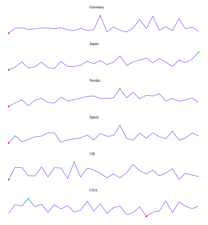
Check Highlight Max Point and Highlight Min Point.
-
For Color, expand the drop down menu. Paste the following hex code in the # field: 0d00ff. Click OK.
-
For Max Point Color, expand the drop down menu. Paste the following hex code in the # field: 0dff00. Click OK.
-
For Min Point Color, expand the drop down menu. Paste the following hex code in the # field: ff0000. Click OK.
-
In the top right corner, click Save template.
-
Click Preview report. Download the report and open it.
Report preview with sparklines

