
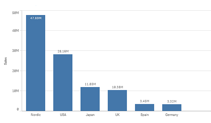
The bar chart is suitable for comparing multiple values. The dimension axis shows the category items that are compared, and the measure axis shows the value for each category item.
In the image, the dimension values are different regions: Nordic, USA, Japan, UK, Spain, and Germany. Each region represents a dimension value, and has a corresponding bar. The bar height corresponds to the measure value (sales) for the different regions.
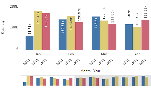
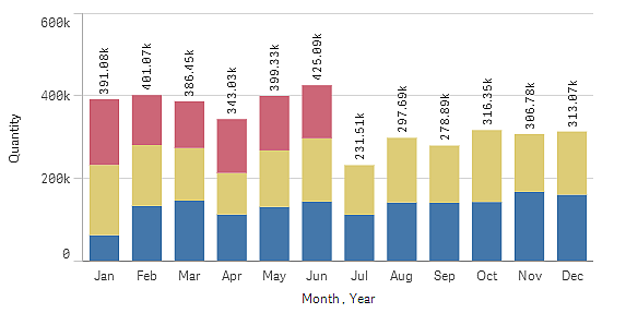
You can make more complex comparisons of data by using grouped or stacked bars. This requires using two dimensions and one measure. The two example charts use the same two dimensions and the same measure:
Grouped bars: With grouped bars, you can easily compare two or more items in the same categorical group.
Stacked bars: With stacked bars it is easier to compare the total quantity between different months. Stacked bars combine bars of different groups on top of each other and the total height of the resulting bar represents the combined result.
The bar chart can be displayed horizontally or vertically, as in the example below:

When to use it
Grouping and stacking bars makes it easy to visualize grouped data. The bar chart is also useful when you want to compare values side by side, for example sales compared to forecast for different years, and when the measures (in this case sales and forecast) are calculated using the same unit.
Advantages: The bar chart is easy to read and understand. You get a good overview of values when using bar charts.
Disadvantages: The bar chart does not work so well with many dimension values due to the limitation of the axis length. If the dimensions do not fit, you can scroll using the scroll bar, but then you might not get the full picture.
Creating a bar chart
You can create a simple bar chart on the sheet you are editing.
Do the following:
- From the assets panel, drag an empty bar chart to the sheet.
- Click Add dimension and select a dimension or a field.
- Click Add measure and select a measure or create a measure from a field.
In a bar chart you need at least one measure.
You can include up to two dimensions and one measure, or one dimension and up to 15 measures in a bar chart. Each bar corresponds to a dimension, and the values of the measures determine the height or length of the bars.
You can also create a bar chart with no dimension and up to 15 measures. In this case, one bar is displayed for every measure. The value of the measure determines the height or length of a bar.
| Dimensions | Measures | Result |
|---|---|---|
| 1 dimension | 1 measure | A simple bar chart with one bar for each dimension value. |
| 2 dimensions | 1 measure | A grouped or a stacked bar chart with one bar for each value of the two dimensions. |
| No dimension | up to 15 measures | A simple bar chart with one bar for each measure. |
| 1 dimension | up to 15 measures | A grouped or a stacked bar chart with one bar for each value of each measure.. |
When you have created the bar chart, you may want to adjust its appearance and other settings in the properties panel.
For more information, see Changing the appearance of a visualization.
Display limitations
Displaying large numbers of dimension values
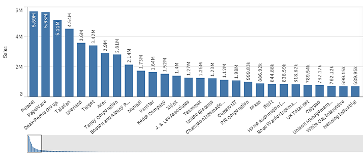
When the number of dimension values exceeds the width of the visualization, a mini chart with a scroll bar is displayed. You can scroll by using the scroll bar in the mini chart, or, depending on your device, by using the scroll wheel or by swiping with two fingers. When a large number of values are used, the mini chart no longer displays all the values. Instead, a condensed version of the mini chart (with the items in gray) displays an overview of the values, but the very low and the very high values are still visible.
Displaying out of range values
In the properties panel, under Appearance, you can set a limit for the measure axis range. Without a limit, the range is automatically set to include the highest positive and lowest negative value, but if you set a limit you may have values that exceed that limit. A bar that exceeds the limit will be cut diagonally to show that it is out of range.
When a reference line is out of range, an arrow is displayed together with the number of reference lines that are out of range.
Displaying large amounts of data in a stacked bar chart
When displaying large amounts of data in a stacked bar chart, there may be cases when not each dimension value within a bar is displayed with correct color and size. These remaining values will instead be displayed as a gray, striped area. The size and total value of the bar will still be correct, but not all dimension values in the bar will be explicit.

To remove the gray areas, you can either make a selection or use dimension limits in the properties panel.
The approximate limit for how many stacked bars that can be displayed without gray areas is 5000 bars, assuming that each bar consists of 10 inner dimension values and one dimension value and one measure value for the whole bar.
The initial data load is 500 dimension values or dimension stacks. (The value 500 refers to the outer dimension values, not each dimension value in a stack.) When you have scrolled past those 500 values, an incremental load is performed, where values are instead loaded based on the current view or scroll position.
Displaying large amounts of data in a bar chart with continuous scale
If the chart uses a continuous scale, a maximum of 2000 data points are displayed. Above that number, data points are neither displayed, nor included in selections made in the chart. Additionally, only twelve dimension values are displayed for the second dimension in a chart with two dimensions and continuous scale.
To avoid displaying limited data sets, you can either make a selection or use dimension limits in the properties panel.