
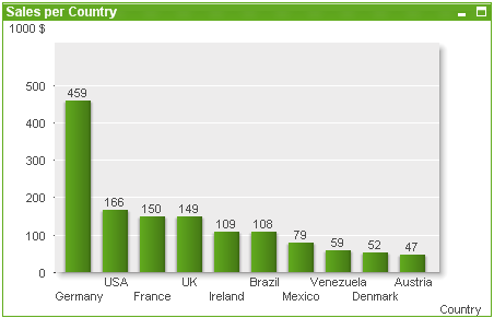
The bar chart is the most basic chart type.
Charts are graphical representations of numerical data. It is possible to switch between different representations of an existing chart, by changing the Chart Type in the Chart Properties: General page.
The quickest way to create a new bar chart is to select Quick Chart wizard from the Tools menu.
By right-clicking the object, the Bar Chart: Object Menu will be displayed. It can also be accessed from the Object menu, when the bar chart is the active object.
See also:
A new chart can be created by clicking on the Create Chart tool in the toolbar, by a right-click on an empty sheet area and selecting New Sheet Object, Chart from Object menu or by selecting New Sheet Object, Chart from Layout menu. This will open a sequence of chart property pages.
In the page that appears first, name and type of graph and title (optional) is set, clicking the Next button opens the second page etc. As soon as sufficient information has been entered the Next and/or Finish buttons are enabled and the user can proceed to the next page in the sequence or finish it.
Once the chart is displayed on the sheet it can be modified by right clicking the graph and selecting Properties or by activating the graph (click on caption area) and selecting Properties in the Object menu.
See also:
Right-click on a chart and a float menu appears. This menu can also be found under Object menu when the chart is active.
The menu contains the following commands:
| Command | Description |
|---|---|
| Properties... | Opens the Properties dialog where the parameters defining the chart can be set. |
| Notes |
Allows creating and sharing notes about the current object. |
| Detach | The chart title is appended with the text “(Detached)” and the chart is no longer updated with selections made in the document (though selections may actually still be made from the chart). The command is available only if the chart is attached. By making a copy of a chart and detaching it, you may make direct comparisons between the copy and the original. |
| Attach | Attaches a detached chart. The chart becomes dynamically linked to the data. The command is available only if the chart is detached. |
| Set Reference | By choosing this option you set a chart reference, i.e. a fixed plot of the chart with the current selections. When further selections are made in the document the reference plot remains, dimmed in the background. Chart axes etc will be adjusted to always include the maximum of the background data set and the current data set. The current data set is always plotted on top of the reference plot, i.e. some portions of the reference plot may be obscured by the current data set plot. The way the background is dimmed can be controlled via the Reference Mode setting on the Chart Properties: General page. The display of reference chart plots is only possible in some chart types, e.g. bar charts, line charts, combo charts, radar charts, scatter charts, grid charts and gauge charts with needles. It is not possible to set a reference for a chart that contains a drill-down or a cyclic group. The reference will be lost when closing the document or when reloading data. The maximum number of objects that can be included when using the Set Reference option is 500. |
| Clear Reference | This command is replaced with the Set Reference command when a reference is set. By choosing it the previously set reference will be cleared and the chart will revert to normal plot mode. |
| Clone | Makes an identical copy of the chart. If a detached chart is cloned the clone will be attached. |
| Order |
This cascade menu is only available when the Design Grid command of the View menu is activated or when the Always Show Design Menu Items under User Preferences: Design is checked. It contains four commands to set the layout layer of the sheet objects. Valid layer numbers are -128 to 127.
|
| Clear All Selections | Clears all selections in the dimensions and expressions of the chart. |
| Print... | Opens the Print dialog where print settings can be specified. |
| Print as PDF... |
Opens the Print dialog with the Microsoft Print to PDF printer pre-selected. After pressing the Print button you will be prompted for a file name for the PDF output file. This command is only available if a PDF printer is available on the system. |
| Send Values to Excel | Exports the underlying data (the straight table equivalent of the chart) to Microsoft Excel, which is automatically launched if not already running. The table will appear in a new Excel worksheet. For this functionality to work Microsoft Excel 2007 or later must be installed on the computer. |
| Export... | Opens a dialog for saving an image of the chart to file. The image can be saved as png, jpg, bmp or gif. |
| Copy to Clipboard | This cascade menu contains the various copy
options for the sheet object. Values Copies the values to the clipboard in the form of a table. Image Copies an image of the chart object to the clipboard. The image will include or exclude the sheet object caption and border depending on the settings in the User Preferences: Export page. Object Copies the entire sheet object to the clipboard for pasting elsewhere in the layout or in another document opened within the current instance of QlikView. |
| Linked Objects | Opens a menu with the following commands for linked objects. Adjust Position of Linked Objects: All linked objects on all sheets are adjusted to the same position and size as the one/ones highlighted. Unlink This Object/Unlink Objects: This destroys the link between the objects, making them different objects with different object IDs. |
| Minimize | Iconizes the object. Clicking on the  icon in the object caption (if shown) produces
the same result. This
command is available only if minimizing is allowed in the object's Properties dialog on the Caption page. icon in the object caption (if shown) produces
the same result. This
command is available only if minimizing is allowed in the object's Properties dialog on the Caption page. |
| Maximize | Enlarges the object to fill the sheet. Clicking on the  icon in the object caption (if shown) produces the same result. This command is available
only if maximizing is allowed in the object's Properties
dialog on the Caption page. icon in the object caption (if shown) produces the same result. This command is available
only if maximizing is allowed in the object's Properties
dialog on the Caption page. |
| Restore | Restores a minimized or maximized object to its previous size and
location. Double-clicking the icon of a minimized object or clicking the  icon in the object caption (if shown) of a maximized object produces
the same result. This command is available only for minimized or
maximized objects. icon in the object caption (if shown) of a maximized object produces
the same result. This command is available only for minimized or
maximized objects. |
| Help | Opens QlikView help. |
| Remove | Removes the sheet object from the sheet. |
On the General page you can set such properties as titles and chart type. It is the first page in the Quick Chart Wizard and in the Chart Properties dialog.
| Property | Description |
|---|---|
| Window Title |
The title to be displayed in the window header. The title can also be defined as a calculated formula for dynamic update of the label text. Click the ... button to open the Edit Expression dialog for easier editing of long formulas. |
| Show Title in Chart |
By default, the label of the first expression defined is set as chart title. Clear the check box if no chart title should be displayed. To display the original title, simply mark the check box. The title can also be defined as a calculated formula for dynamic update of the label text. Click the ... button to open the Edit Expression dialog for easier editing of long formulas. The chart title is not displayed in pivot tables or straight tables. |
| Title Settings | Define advanced settings for the chart title by clicking the Title Settings button. |
| Print Settings |
Clicking the Print Settings button takes you to the Print Settings dialog where it is possible to define margins and header/footer format. The Print Settings dialog holds two pages, Print Layout and Print Header/Footer. |
| Alternate State |
Choose one of the available states in the list. The following Alternate States are always available.
|
| Object ID |
This is used for macro purposes. Every sheet object is assigned a unique ID. We recommend that you use alphanumeric characters only in the ID. Linked objects share the same object ID. You may edit this ID number later on. For charts, the ID starts with CH01. |
| Detached | If enabled, the chart will be detached, that is, it will no longer be dynamically updated when selections are made. |
| Read Only | If enabled, the chart will be read only, that is, selections cannot be made by clicking or painting with the mouse in the chart. |
| Calculation Condition | Typing an expression in this text box sets a condition that needs to be fulfilled for the chart to be displayed. If the condition is not fulfilled, the text "Calculation condition unfulfilled" will be displayed in the chart. The value may be entered as a calculated formula. Click on the ... button to open the Edit Expression dialog. |
| Chart Type | The Chart Type group is where you select the basic layout of the chart. For more information on each chart type, see Chart types. |
| Fast Type Change |
In this group you can enable an icon in the chart from which the user can change chart type without going through the chart properties dialog.
|
| Reset User Sizing | By pressing this button, all user sizing of legend, title etc. in graphical charts will be reset. Docking of individual items will not be affected. |
| Reset User Docking | By pressing this button, all user docking of legend, title etc. in graphical charts will be reset. |
| Error Messages |
Opens the Custom Error Messages dialog. |
| Reference Mode | Settings for how the reference background should be plotted when using the Set Reference option from the chart's context menu. This setting is only meaningful for some charts. |
See also:
Sizing and moving chart components
Selections in charts and tables
The Chart Properties: Dimensions page is reached by right-clicking a chart and selecting Properties or by selecting Properties from the Object menu when the chart is active.
When you create a chart, you should first ask yourself two questions:
- What do you want to look at? What should the sizes of the bars in the bar chart correspond to? The answer might be the "sum of sales", or something similar. This is set on the Expressions tab.
- What do you want to group it by? Which field values do you want to use as labels for the bars in the bar chart? The answer might be "per country", or something similar. This is set on the Dimensions tab.
A chart can display one or more dimensions. The upper limit depends on the actual chart type, the complexity of the data and the available memory. Pie, line and scatter charts can display a maximum of two dimensions, bar, block and grid charts three. Radar and funnel charts can only display a single dimension, and gauge charts use no dimensions at all. Further dimensions are ignored.
A chart dimension gets its values from a field which is specified on the Chart Properties: Dimensions page. Instead of being a single field a dimension can also consist of a group of fields (see Edit Groups below).
A dimension can be a single field, a group or an expression (calculated dimension). It can also be a synthetically created dimension
Move fields back and forth by selecting (click, Ctrl-click) and using the Add> or <Remove buttons, or by double-clicking your selections directly.
Chart dimensions may also be calculated from an expression.
| Property | Description |
|---|---|
| Available Fields/Groups |
Lists all fields/field groups that are available for use as dimensions (i.e. along the x-axis in a typical bar chart). Field groups will be preceded by a vertical arrow for drill-down groups or a curved arrow for cyclic groups. Groups are defined in the Document Properties: Groups page. Select the items to be used/removed by clicking them. Use the Add > or the < Remove button to move them to the desired column. The number of dimensions that can be displayed varies with different chart types. All fields which appear in more than one internal table will be preceded with a key symbol. Pie charts, line charts and scatter charts cannot display more than two dimensions. In bar charts, up to three dimensions can be shown. |
| Show System Fields | Checking this option will display the system fields in the Available Fields/Groups column. |
| Show Fields from Table |
From here, you control what fields/groups appear in the Available Fields/Groups list. The drop-down list displays the alternative All Tables by default. The alternative All Tables (Qualified) shows the fields qualified by the name of the table(s) they occur in. This means that key (connecting) fields will be listed more than once. (This alternative is only used for viewing purposes and has nothing to do with Qualify fields in the load script.) It is also possible to view the fields of one table at a time. Note that available groups are always listed. |
| Edit Groups... | This button takes you directly to the Document Properties: Groups page, where field groups to be used as dimensions can be defined. |
| Animate... | Opens the Animation dialog, by which you can make use of the chart's first dimension for animation. Animation is only available for bitmap charts excluding pie charts. Some functional limitations apply when using animations. |
| Trellis... | Opens the Trellis Settings dialog where you can create an array of charts based on the first dimension. Any type of bitmap chart can be made into a trellis display. |
| Used Dimensions |
This list contains the dimensions currently selected to be used as dimensions in the chart. The number of dimensions that can be used varies with the type of chart. Superfluous dimensions for any given type will be disregarded. When used in tables, the dimension data cells can be dynamically formatted by means of attribute expressions. Whenever an attribute expression is entered for a dimension, its icon will turn from gray scale to color, or as in the case of Text Format, from gray to black. These settings will have precedence over chart settings. Click on the "+" expansion icon in front of any dimension to display the placeholders or the dimension's attribute expression.
With the Promote and Demote buttons, dimensions in the Used dimensions list can be sorted. |
| Add calculated dimension... |
Adds a new dimension and opens it for editing in the Edit Expression dialog. A chart dimension is often in a single field, but can also be dynamically calculated. A calculated dimension consists of an expression involving one or more fields. All standard functions may be used. Aggregation functions may not be used, but the Aggr function can be included for achieving nested aggregation. |
| Edit... | Opens the dimension for editing in the Edit Expression dialog. See Add calculated dimension... above for details on calculated dimensions. |
| Settings for Selected Dimension |
In this group you find settings for individual dimensions. Enable Conditional: Marking this check box hides or shows the dimension dynamically, depending on the value of a condition expression entered, by clicking the ... button in the edit box below. Suppress When Value Is NULL: If this check box is enabled, the selected dimension in the Used Dimensions above will not be displayed in the chart if its value is NULL. Show All Values: Enable this check box to show all the dimension values regardless of the selection. As the expression value is zero for excluded dimension values, the option Suppress Zero-Values in the Presentation page must be deselected for Show All Values to work. Show All Values does not apply if you use an expression as dimension. Show Legend: When Show Legend is checked, the "names" of field values are shown along the x-axis. Label: With the Label option checked, the name of the field is shown. Labels can be edited in the text box below. A label can also be defined as a calculated label expression for dynamic update of the label text. Click on the ... button to open the Edit Expression dialog for easier editing of long formulas. For more information, see Expression syntax for calculated formulas Advanced...: This button opens the Advanced Field Settings dialog which offers settings for image representation of field values and special text search options. For more information, see Advanced Field Settings Comment: A commentary field where the selected dimension can be described. The comment may be entered as a calculated formula. Click on the ... button to open the Edit Expression dialog. Page Breaks: This setting only applies
to the employment of page breaks in the printout from a pivot table or straight table. Three
modes are available, with the following effects:
|
| Setting | Description |
|---|---|
| Animate First Dimension | By marking this check box you indicate that
the chart's first dimension should be used for chart animation. Animation
is only available for bitmap charts excluding pie charts. Some functionality
limitations apply when using animation. For example, it is not possible
to make painted or clicked selections in an animated chart. Trend lines
will not be drawn in animated charts. Animation will only be possible
when there are more than one possible values in the animation dimension. When a chart is animated an Animation Bar will appear at the bottom of the chart plot area. The Animation bar features a Play button, which starts the animation. When the animation is running the Play button is replaced by a Pause button. It is possible to stop or start the animation whenever you like using these controls. A Progress Bar shows the progress of the animation. It is possible to animate manually by pointing at the progress bar handle with the mouse, press down the left mouse button and drag to any position. Manual animation normally skips interpolated frames (see Frames per Second setting below) and moves only between actual values in the animation dimension. By pressing the Ctrl-key on the keyboard while dragging, it is possible to drag over interpolated frames. Above the progress bar the value of the animation dimension for the current frame (in case of interpolated frames the previous actual animation dimension value) will be shown.  |
| Time Between Values (ms) |
Sets the time in milliseconds between each value in the animation dimension. This value may be given as a calculated formula. |
| Frames per Second |
Sets the number of frames per second. QlikView will interpolate plotting between the actual values of the animation dimension. The value must be an integer between 1 and 30. This value may be given as a calculated formula. |
| Autoplay | Enable this check box if an animation is to start automatically whenever a selection is made in the document. |
| Loop | Enable this option if you want the animation to play repeatedly until stopped with the Pause button in the Animation Bar. |
| Play Once | Enable this option if you want the animation to run only once from beginning
to end, whenever it is started. Return to First Frame Enable this option if you want the animation to return to the first frame after completion. |
| Show Animation Dimension Value | By enabling this check box, the
value of the data will be shown in the chart during the animation. Alignment Sets the alignment of the displayed value. Horizontal Aligns the value to the right, center or left. Vertical Aligns the value at the top, center or bottom. Font... Sets the font color for the displayed value. |
| Setting | Description |
|---|---|
| Enable Trellis Chart | Enable this check box to create an array of charts based on the chart's first dimension. |
| Enable Secondary Trellis Dimension | Enable this check box to include the second dimension in the trellis chart. If a secondary dimension is used, the first dimension values will be displayed as columns in the trellis matrix, whereas the second dimension values will be displayed as rows in the trellis matrix. |
| Number of Columns | Choose Auto to let QlikView decide how many columns to display or choose Fixed to set the number yourself. |
| Number of Rows | Choose Auto to let QlikView set the number of rows to display or choose Fixed to set the number yourself |
Dimension limits can be set for chart types, except for gauge charts and pivot tables.
The Dimension Limits tab controls the number of dimension values you can see in a given chart.
Before getting to that, it is important to describe the effect that the three options in the dropdown produce. The dropdown contains three values: First, Largest and Smallest. These values control the way the calculation engines sorts the values it returns to the charting engine. It is mandatory to have one of these options selected, if the dimension is to be restricted. The sorting only occurs for the first expression, except in pivot tables when the primary sort may override the first dimension sort.
This property page is used for defining dimension limits. Each dimension in the chart is configured separately.
Limits
Restrict which values are displayed using the first expression
These properties are used to determine how many dimension values are displayed in the chart, according to settings made below.
Show only
Select this option if you want to show the First, Largest or Smallest x number of values. If this option is set to 5, there will be five values displayed. If the dimension has Show Others enabled, the Others segment will take up one of the five display slots. The First option will return the rows based on the options selected on the Sort tab of the property dialog. If the chart is a Straight Table, the rows will be returned based on the primary sort at the time. In other words, a user can change the values display by double-clicking on any column header and making that column the primary sort.The Largest option returns the rows in descending order based on the first expression in the chart. When used in a Straight Table, the dimension values shown will remain consistent while interactively sorting the expressions. The dimensions values will (may) change when the order of the expressions is changed.The Smallest option returns the rows in ascending order based on the first expression in the chart. When used in a Straight Table, the dimension values shown will remain consistent while interactively sorting the expressions. The dimensions values will (may) change when the order of the expressions is changed.Enter the number of values to display. The value may be entered as a calculated formula. Click on the ... button to open the Edit Expression dialog.
Show only values that are:
Select this option to display all dimensions values that meet the specified condition for this option. Select to display values based on a percentage of the total, or on an exact amount. The relative to the total option enables a relative mode which is similar to the Relative option on the Expressions tab of the property dialog. The value may be entered as a calculated formula. Click on the ... button to open the Edit Expression dialog.
Show only values that accumulate to:
When this option is selected,all rows up to the current row are accumulated, and the result is compared to the value set in the option. The relative to the total option enables a relative mode which is similar to the Relative option on the Expressions tab of the property dialog, and compares the accumulated values (based on first, largest or smallest values) to the overall total. The value may be entered as a calculated formula. Click on the ... button to open the Edit Expression dialog. Select Include Boundary Values to include the dimension value that contains the comparison value.
Expression syntax for calculated formulas
Options
Show Others
Enabling this option will produce an Others segment in the chart. All dimension values that do not meet the comparison criteria for the display restrictions will be grouped into the Others segment. If there are dimensions after the selected dimension, Collapse Inner Dimensions will control whether individual values for the subsequent / inner dimensions display on the chart. In the Label field, enter the name you wish to display in the chart. If no text is entered, the label will be automatically set to the expression text.
The value may be entered as a calculated formula. Click on the ... button to open the Edit Expression dialog.
Show Total
The chart will display a total for the selected dimension when this option is enabled. This total behaves differently than the expression total, which is still configured on the Expressions tab of the property dialog. Label: Enter the name you wish to display in the chart. If no text is entered, the label will be automatically set to the expression text. The value may be entered as a calculated formula. Click on the ... button to open the Edit Expression dialog.
Global Grouping Mode
The option only applies to inner dimensions. When this option is enabled the restrictions will be calculated on the selected dimension only. All previous dimensions will be ignored. If this is disabled, the restrictions are calculated based on all preceding dimensions.
Expression Totals Compared to Dimension Totals
Dimension Totals are generated by the calculation engine, and are then returned to the charting engine as separate rows (or dimension values). This will have an impact on the Others rows. The difference between using Expression Totals and Dimension Totals can be seen below.
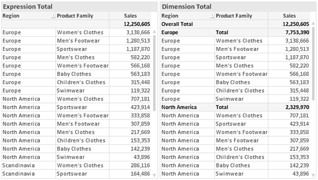
When Dimension Totals is used, it is possible to have sub-totals within a straight table.
To reach the Chart Properties: Expressions tab, right-click on a chart or table and select Properties from the Object menu.
When creating a chart, two questions should be asked:
- What should the size of the bars etc. illustrate? These are the Expression(s) ( e.g. sum of NetSales).
- How should the data be grouped? These are the Dimension(s) ( e.g. per Country).
Expression List
The expression list in the top-left pane is a complete tree
control with numerous control options.
In front of each expression (or expression group) an expansion icon (a box with a ' + ' ) is shown. Clicking the icon opens up underlying sub-expressions or attribute expressions. The icon is simultaneously replaced by a collapse icon ( ' - ' ). Certain plot options utilize sub-expressions, i.e. a set of two or more expressions that together define the plot symbol (e.g. Stock or Box Plot described below).
Expression data can also be dynamically formatted by means of attribute expressions. Click
on the expansion icon in front of any expression to display the placeholders
for the dimension’s attribute expressions. These are:
Background Color
Edit the default Background Color expression to create the attribute expression for calculating the plot color of the data point. The calculated color will have precedence over the default QlikView color selection and must be a valid color representation, which is achieved by using the color functions. If the result of the expression is not a valid color representation, the program will default to black. An auxiliary expression for Text Color can be created using the same method.
Text Color
An auxiliary expression
for Text Color can be created
using the same method as for the background color (see above).
Text Format
Edit the Text Format expression to enter an attribute expression for calculating the font style of text associated with the data point (For tables: text in the table cell for each dimension cell. The calculated text format will have precedence over table style defined in the Chart Properties: Style.
The expression
used as text format expression should return a string containing a '<B>'
for bold text, '<I>' for italic text and/or '<U>' for underlined
text. Note that = is necessary before the string.
Pie Popout
Click on the Pie Popout
in order to enter an attribute expression for calculating whether the pie slice
associated with the data point should be drawn in an extracted "popout"
position. This type of attribute expression only has effect on pie charts.
Bar Offset
Click on Bar Offset
in order to enter an attribute expression for calculating an offset for the bar
or bar segment associated with the data point. The offset can be positive or
negative and will move the bar or segment accordingly. This is useful e.g. when
making so called waterfall charts. This type of attribute expression only has
effect on bar charts.
Line Style
Click on Line Style in order to enter an attribute expression for calculating the line style for the line or line segment associated with the data point. This type of attribute expression only has effect on line, combo and radar charts. The relative width of the line can be controlled by including a tag <Wn> where n is a multiplying factor to be applied on the default line width of the chart. The number n must be a real number between 0.5 and 8.
Example: <W2.5>
The style of the line can be controlled by including a tag <Sn>
where n is an integer between
1 and 4 indicating the style to be used (1=continuous, 2= dashed, 3=dotted,
4=dashed/dotted). Example: <S3>. The <Wn> and <Sn> tags can be freely combined,
but only the first occurrence of each counts. The tags must be enclosed by single quotations.
Show Value
Click on Show Value in order to enter an attribute expression for calculating whether the data point plot should be complemented with a "value on data point" value, even if Values on Data Points has not been selected for the main expression. If Values on Data Points is selected for the main expression the attribute expression will be disregarded. This type of attribute expression only has effect on bar, line, pie, funnel and combo charts.
Add
New expressions and sub-expressions, are created by means of the Add button. The option is also available in the context menu that appears when right-clicking in the list of expressions.
Delete
The Delete button lets you remove previously created expressions from the list. The option is also available in the context menu that appears when right-clicking on an expression in the list of expressions.
Copy
The Copy option is only available in the context menu that appears when right-clicking on an expression or a sub/attribute expression in the list of expressions. When using this command on a main expression, all data and settings associated with the expression (including label) will be copied to the clipboard as a piece of xml.
The expression may then be pasted back into the same chart or into any other QlikView chart in the same or another document. If you use the command on an attribute expression, only the attribute expression definition will be copied. An attribute expression may then be pasted onto any main expression in the same or another chart.
Export...
The Export... option is only available in the context menu that appears when right-clicking on an expression in the list of expressions. When using this command on a main expression, all data and settings associated with the expression (including label) may be exported to an xml file.
The expression may then be imported back into the same chart or into any other QlikView chart in the same or another document. The command opens the Export Expression as dialog from which you can choose the destination of the export file. The file will receive the extension Ex.xml.
Paste
The Paste option is only available in the context menu that appears when right-clicking on an expression or sub/attribute expressions in the list of expressions. If a main expression has previously been copied to the clipboard, you may paste it into the blank area in the list of expressions, creating a new expression identical to the copied one. If an attribute expression has been copied, you may paste it onto a main expression.
Import
The Import option is only available in the context menu that appears when right-clicking in the blank area in the list of expressions. The command opens a dialog where you can browse to previously exported expression. The imported expression will appear as a new expression in the chart.
Promote/Demote
If several expressions are displayed, they can be sorted by means of the Promote and Demote buttons. This affects the order in which columns etc. are displayed in the chart.
Group
The Group button can be used for merging expressions into one or more cyclic groups, provided that two or more expressions are available. In the QlikView layout, you can cycle through the expressions belonging to one group by clicking the cycle icon that is displayed in the chart (= Cycle Group). Right-click the same cycle icon to get a pop-up list of the expressions belonging to the group that are currently unused, for direct selection.
Ungroup
Selecting an expression belonging to a group and clicking Ungroup, extracts the expression from the group. If only one expression remains in the cycle group after extraction, that last expression is also extracted and the group is removed.
Enable
Disabling this check box will set the expression to be omitted from the chart.
Relative
Enabling this check box will set the chart to show the result in percent instead of absolute numbers. This option is not available for pivot tables.
Invisible
Enabling this check box prevents the plotting of this expression while retaining the space allocated for it.
Conditional
Enabling this checkbox allows you to define a condition, based on the current selection, that determines if the expression should be displayed or not. If the condition evaluates to TRUE or NULL the expression is displayed, if the condition evaluates to FALSE the expression is not displayed.
Label
In front of the expression label one or several icons are used for indicating the chart type used and/or the Display Options selected for the expression (see below).
Definition
Shows the composition of the selected expression. It is possible to edit the expression directly in this box. By clicking the ... button the full Edit Expression dialog is opened.
Comment
This is a commentary field where the creator of the expression can describe the purpose and function of the expression.
Display Options
This group is used for modifying the way that data points are plotted or what will be entered in the expression cells of chart tables. Note that some options are only available for certain chart types, some options cannot be combined and some options will utilize one or more additional expressions in order to create complex plots.
Bar
Shows the values of the selected expression as bars. This option is only available for bar and combo charts.
Symbol
Shows the values of the selected expression as symbols. This option is only available for line and combo charts. Choose between several different symbols in the drop-down menu.
Line
Shows the values of the selected expression as a line. This option is only available for line and combo charts. Choose between Normal, Smooth and three different Plateau lines in the drop-down menu.
Stock
Mark this check box to plot the expression as a stock marker. The expression will be preceded by its own icon in the Expressions list and appear as an empty placeholder with four sub expressions.
The first sub expression will be used for plotting a high point of the stock marker. The second sub expression will be used for a low point. These two sub expressions must contain valid definitions in order for the stock marker to be drawn.
The third sub expression is optional but is otherwise used for a close point of the stock marker. The forth sub expression is also optional but is otherwise used for an open point of the stock marker.
New empty sub expressions will be created automatically when Stock check box is marked for the expression. When Stock check box has been selected for an expression you cannot select Bar, Line, Symbol, Box Plot or Has Error Bars check boxes for the same expression. Stock check box cannot be selected for an expression if any of those options are already selected for the expression. This option is only available for combo charts.
Box Plot
Mark this check box to plot the expression as a box plot, often used for the display of statistical data. The expression will be preceded by its own icon in the Expressions list and appear as an empty placeholder with five sub expressions.
The first sub expression will be used for plotting a box top point of the box plot. The second sub expression will be used for a box bottom point. These two expressions must contain valid definitions in order for the box plot to be drawn.
The third to fifth sub expressions are optional. If used, those sub expression define a median, an upper whisker, and a lower whisker.
A common extension to a Box Plot is so called outliners for extreme values. These can be achieved by plotting separate expressions as symbol. New empty sub expressions will be created automatically when Box Plot is marked for the main expression. When Box Plot has been selected for an expression you cannot select Bar, Line, Symbol, Stock or Has Error Bars check boxes for the same expression. Box Plot cannot be selected for an expression if any of those options are already selected for the expression. This option is only available for combo charts.
Has Error Bars
Mark this check box to utilize one or two expressions following the selected expression as auxiliary expressions for error bars plotted on top of the main expression’s data points. If Symmetric is selected only one auxiliary expression will be used and plotted symmetrically around the data point. If Asymmetric is selected two auxiliary expressions will be used and plotted above and below the data point respectively.
The error bar expressions should return positive numbers. The auxiliary expressions utilized for error bars are preceded by their own icons (symmetric), (asymmetric high) or (asymmetric low) in the Expressions list and cannot be utilized for anything else in the chart. If there are no expressions already defined after the selected expression, new dummy auxiliary expressions will be created automatically. This option is only available for bar, line and combo charts.
Values on Data Point
Mark this check box to have the result of an expression plotted as text on top of the data points. This option is only available for bar, line, combo and pie charts. When used for pie charts, the value will be shown next to the pie slices.
Text on Axis
Mark this check box to have the result of an expression plotted as text at each x-axis value, the axis and the axis labels. This option is only available for bar, line and combo charts.
Text as Pop-up
Mark this check box to have the result of an expression shown in the pop-up balloon messages appearing when hovering over a data point in a chart in the layout. This option can be used with or without any of the other display options. It is thus possible to have an expression that does not appear in the chart itself but only in hover pop-ups.
Representation
This option is only available
for straight tables and pivot tables.
Text
The expression values are always interpreted and displayed as text.
Image
With this option QlikView will attempt to interpret each expression
value as a reference to an image. The reference may be a path to an image
file on disk (e.g. C:\Mypic.jpg) or inside the QlikView document itself (e.g.
qmem://<Name>/<Peter>). If QlikView cannot interpret an expression
value as a valid image reference, the value itself will be displayed,
unless the Hide Text When Image Missing
box is checked.
Circular Gauge, Linear Gauge, Traffic Light Gauge, LED Gauge
With either gauge option, the gauge chart will be inscribed in the available table cell as an image. The layout of the gauge can be modified in the
Chart Properties: Presentation dialog that is reached from the Gauge
Settings button.
Mini Chart
With this option QlikView will display the expression values in a bar or line chart. The chart will be inscribed in the available table cell. The visual settings for the chart can be modified via the Mini Chart Settings button. This option is only available for straight tables.
Link
Select this option to enter an expression in the Definition field that will create a clickable link in the table cell. The expression should return a text that can be interpreted as DisplayText<url>LinkText. The DisplayText will be displayed in the table cell and LinkText will be the link that is opened in a new browser window.
If a link is defined, the value in the table cell will be underlined. If no link is defined the value will not be underlined. Note that it is not possible to make selections in a cell with Link as display mode. By clicking the ... button the full Edit Expression dialog is opened.
Examples:
=Name & '<url>' & Link
=Name & '<url>www.qlikview.com'
where Name and
Link are table fields loaded in the script.
Image Formatting
Only available when the Image option has been selected above. This option is only available
for straight tables and pivot tables. This setting describes how QlikView formats the image to fit in the cell. There are four alternatives:
- No Stretch: If this option is selected, the image will be shown as is, without any stretching. This may cause parts of the picture to be invisible or only part of the cell to be filled.
- Fill: If this option is selected, the image will be stretched to fit the cell without keeping the aspect ratio of the image.
- Keep Aspect: If this option is selected, the image will be stretched as far as possible to fill the cell while keeping the aspect ratio.
- Fill with Aspect: If this option is selected, the image will be stretched to fill the cell in both directions while keeping the aspect ratio. This typically results in cropping of the image in one direction.
Accumulation
By choosing between the settings in this group, you decide whether the values in the chart should be accumulated or not. In an accumulated chart, each y-value is added to the y-value of the following x-value. In an accumulated bar chart showing the sum of sales per year, e.g. the value of the year 1996 is added to that of the year 1997.
If your
chart contains several expressions, select the expression which values to be accumulated in the
Expressions list. Accumulation
is not available for pivot tables.
No Accumulation
If this option is selected, the y-values of the selected chart expression will not be accumulated.
Full Accumulation
If this option is selected, each y-value will accumulate all previous y-values of the expression. See above under Accumulation. Full accumulation does not work for multiple dimensions containing Null or 0 values.
Accumulate n Steps Back
By entering a number in the box, you set the number of y-values in the expression to be accumulated. See above under Accumulation.
Total Mode
This group is enabled for the selected expression for Straight Table chart objects only. There are three possible
settings:
- No Totals: Totals are not calculated for the selected expression.
- Expression Total: The total of the expression evaluated on the next level. For example, if an expression generates the average monthly salary for a number of employees, the Expression Total will generate the total average of all the salaries.
- F(x) of Rows: If this option is selected, the individual values of each data point (each bar in a bar chart, each row in a straight table etc.) for the selected expression will be aggregated using the aggregation function selected from the drop-down list (typically summed up).
Bar Border Width
Specifies the width of the border line around bars plotted by this expression in bar and combo charts. The value can be specified in mm, cm, inches (", inch), pixels (px, pxl, pixel), points (pt, pts, point) or docunits (du, docunit).
Expressions as Legend
When several expressions are used, this option displays a legend showing the expressions and their corresponding colors next to the chart.
Trendlines
In selected QlikView charts expression plots can be complemented or replaced by statistical trend lines.
Trend lines can only be displayed
in scatter charts, line charts and in bar/combo charts with
maximally one dimension and one expression shown as bars. For
other types of charts, the settings in the Trendlines group are unavailable
and have no effect. In scatter charts the data points are treated
as if y=f(x). For bar, line and combo charts it is allowed to deselect
all options under Display Options and still add trend lines, which will
then be plotted without the underlying data points. Trend lines in
bar, line and combo charts may be extrapolated by specifying a forecast
and/or backcast interval (Axes page). The extrapolated lines
will be dotted. Trend lines in charts with a discrete x-axis will be
shown as lines with symbols. On a continuous axis only the line will
be shown.
- Average: The average is plotted as a straight line.
- Linear: A linear regression line is plotted.
- Polynomial of 2nd degree: A polynomial trend line of the second degree is plotted.
- Polynomial of 3rd degree: A polynomial trend line of the third degree is plotted.
- Polynomial of 4th degree: A polynomial trend line of the fourth degree is plotted.
- Exponential: An exponential trend line is plotted.
- Show Equation: If this check box is marked for a specific expression, the expression’s trend lines will be complemented by the trendline equation expressed as text in the chart.
- Show R2:If this check box is marked for a specific expression, the expression’s trend lines will be complemented by the coefficient of determination expressed as text in the chart.
Linear regression in table charts
The Chart Properties: Sort page is reached by a right-click on a chart and selecting Properties from the Object menu.
This is where you decide the sort order of the chart dimension(s) from a number of available sort orders.
The Chart Properties: Sort page for straight tables holds slightly different options.
The Dimensions list contains the chart's dimensions. To assign a sort order, mark a dimension and choose one or more sort orders on the right side.
| Option | Description | |
|---|---|---|
| Y-value | Dimension values will be sorted by the numeric value of the y-axis. This option is not available for calculated dimensions. | |
| State | Dimension values will be sorted according to their logical state, i.e. selected values before optional values, before excluded values. | |
| Expression | Dimension values will be sorted according to the expression that is entered into the text edit box below this sort option. | |
| Frequency | Dimension values will be sorted according to the number of occurrences in the table. | |
| Numeric Value | Dimension values will be sorted according to their numeric value. | |
| Text | Dimension values will be sorted according to their alphabetical order. | |
| Load Order | Dimension values will be sorted according to their initial load order. |
There is a hierarchy in the group from top to bottom so that when conflicting sort orders are selected, the first one encountered will take precedence. The selected sort order can be reversed by switching between Ascending and Descending or A -> Z and Z -> A.
By clicking the Default button, dimension values will be set to the default defined in the Document Properties: Sort dialog.
The check box Override Group Sort Order is only available when a group dimension is selected in the Dimensions list. Normally the sort order of a group dimension is determined for each field in a group via the group properties. By enabling this option you can override any such settings on group level and apply a single sort order for the dimension, regardless of which field is active in the group.
On this page you can determine a basic style for the chart. Not all the listed features are available for every chart type.
- Look: Choose one of the available styles. This may in some instances affect not only the appearance of the chart but also its functionality.
- Orientation: Set the orientation of the chart, vertical or horizontal.
- Subtype: The mode is set in this group, either Grouped or Stacked
mode for bars (Overlayed or Stacked for Radar charts. This setting
is only functional when the chart displays two dimensions or one dimension
and more than one expression. Negative values in stacked bars are stacked
separately downwards below the x-axis. For bar charts, when using continuous axes scaling, stacked layout is the only allowed layout.
For the presentation of bar charts with multiple dimensions and expressions the following principles apply:- A maximum of two dimensions can be shown on the x-axis.
- A third dimension can be shown with multicolored stacked bars.
- Only table charts can display more than three dimensions.
- When two or more expressions are enabled, the two first dimensions are shown on the x-axis and the expression with multicolored stacked bars.
- When two or more expressions are enabled and the subgroup is set to stacked, all expressions within one stack will be calculated according to one axis (by default the left). This will be the case even if you set one expression to be calculated according to the left axis and one to be calculated according to the right axis.
The following list shows how subtypes are presented with multiple dimensions and expressions:
- One dimension
- 1 expression: single bar
- 2+ expressions: expressions are grouped or stacked
- Two dimensions
- 1 expression: Dimensions are grouped or stacked
- 2+ expressions: Dimensions are grouped
- Three dimensions
- 1 expression: 1st and 2nd dimensions are grouped, 3rd dimension is stacked
- 2+ expressions: 1st and 2nd dimensions are grouped, expressions are stacked
- Four dimensions
- 1 expression: 1st and 2nd dimensions are grouped, 3rd dimension is stacked
- 2+ expressions: 1st and 2nd dimensions are grouped, expressions are stacked
- 3D View: The settings in this group define the angle from which the chart is viewed in 3D modes.
- Top Angle: Defines the vertical angle of the 3D view. The value must be an integer between 5 and 45.
- Side Angle: Defines the side angle of the 3D view. The value must be an integer between 5 and 45.
- Plot Color Style: This control can be used to impose a color style on all plot colors in the chart. When a style
is selected in the drop-down list all colors under Color
Map on the Colors page
will be changed to the selected style. The change is instantaneous and
the setting itself will not be saved until the next time you enter this
page of the dialog. The actual base colors in the color map are unaffected.
The Plot Color Style is not available
for all chart looks. The following options are available:
- Solid Color: Sets all colors in the color map to solid colors.
- Dark Gradient: Sets all colors in the color map to a color gradient going towards black.
- Light Gradient: Sets all colors in the color map to a color gradient going towards a darker tone.
- Glossy: Gives a glossy look to all bars.
- Plot Area Background Style: This control can be used to change the appearance
of the plot area background. This setting is only available for charts
with a plot area. The following options are available:
- Frame: A frame is drawn around the plot area.
- Shadow: This option gives a shadow effect on the plot area background.
- Minimal: This setting removes the plot area background.
- Preview: Offers a preview of the basic visual properties of the chart.
This tab is used collectively for bar charts, line charts, combo charts, radar charts and mekko charts.
The Bar Settings group contains various display options for bars that are used in bar charts and combo charts.
| Setting | Description |
|---|---|
| Bar Distance (-6 - 8) | Sets the distance between the bars in the cluster. A negative number results in overlapping bars. Values between -6 and 8 are allowed. |
| Cluster Distance (0 - 8) | Denotes the distance between grouped values in a clustered bar chart. Values between 0 and 8 are allowed. |
| Allow Thin Bars | For charts with a non-continuous x-axis, QlikView will only display as many data points as can be accommodated in the plot area available. Remaining data points are truncated from the chart. Bars are by default drawn with a minimum width of four pixels, to make them clearly distinguishable. Check this option to allow compression of bars to a width of 1 pixel. |
| Show All Bars | For charts with a non-continuous x-axis, QlikView will only display as many data points as can be accommodated in the plot area available. Remaining data points are truncated from the chart. Check this option to force the drawing of all data points. Bars can be compressed (as for Allow Thin Bars) and some may also be partially obscured by others. |
In the Values on Data Points group you can set display options for values on data points, provided that this option has been selected for one or more chart expressions under Display Options in Chart Properties: Expressions page.
| Setting | Description |
|---|---|
| Max Values Shown | In this box you can specify an upper limit for the number of data points to show values for in the chart. If no limit is specified, values will be shown for all data points, which may affect the readability of the chart. |
| Vertical | Shows the values vertically. |
| Plot Values Inside Segments | Marking this check box will plot values on data points inside the segments instead of on top of them. |
| Still Show Total on Top | Marking this check box will additionally show the total value on top of each bar for stacked bar charts and mekko charts. This option is only available if you have selected Plot Values Inside Segments. |
In the Error Bars group display options for any error bars used in the chart is determined
| Option | Description |
|---|---|
| Width | Specifies the width of error bars. |
| Thickness | Specifies the thickness of error bars. |
| Color | Sets a color for error bars. |
In the Line/Symbol Settings group display options for lines and data point symbols that are used in line charts and combo charts are determined. It is also possible to determine the width of trendlines.
| Setting | Description |
|---|---|
| Line Width | Determines the width of the line, if a line representation is specified. The value can be specified in mm, cm, inches (", inch), pixels (px, pxl, pixel), points (pt, pts, point) or docunits (du, docunit). |
| Symbol Size | Determines the size of symbols, if a symbol representation is specified. |
| Trendline Width | This setting determines the width of trendlines. |
| Use Full Symbol Set | This alternative makes more symbol representation available (rings, triangles etc.) |
| Setting | Description |
|---|---|
| Semi-transparent | Check this option if you want filled lines to be drawn semi-transparent. |
| Pop-up Labels | Check this option to display the corresponding dimension value in a pop-up window when the mouse pointer touches a value. |
| Highlight | With this option checked, symbols and/or lines are highlighted when the mouse pointer hovers over them. Where a legend is included in the chart, the highlighting applies here as well, making it possible to single out one of several overlapping values. |
| Suppress Zero-Values | This check box eliminates
dimensions that are empty or contain only zeros. This option is selected by
default. Zero on Bars This option is only applicable when Suppress Zero-Values is deselected. If the check box is marked and Values on Data Points is selected for the chart expression under Display Options in Chart Properties: Expressions, zero values will appear as text above the data points. In other cases zero values will be suppressed. |
| Suppress Missing | If this check box is marked, all combinations of the dimension fields associated with only null values in all fields in all expressions will be disregarded in the calculation. This option is selected by default. Turning it off can be useful only in special cases, e.g. if you want to count null values in a chart. |
In the Legend group you can control the display of dimension data labels in the chart. Mark the check box to display data labels. Data labels are shown only for the current top level of the chart.
| Setting | Description |
|---|---|
| Show Legend |
Check this alternative to include a legend in the chart (checked by default). It is possible to change the legend by clicking the Settings... button. If the chart is dimensionless, but has several expressions, unmarking this check box will show the expressions on the axis instead. |
| Limit Legend (Characters) | Enable this check box to limit the length of the dimension value strings that are displayed on axes and in the chart legend. Truncated values will be followed by ... in the chart. |
In the Chart Scrolling group you can make settings for scrolling in the chart.
| Setting | Description |
|---|---|
| Enable X-Axis Scrollbar | Enable this check box to show a scroll control in place of the X-axis. The scroll bar can be used to scroll the selection of the X-axis values that are displayed. The number of values shown at any one time will be the number set under When Number of Items Exceeds. |
| Reversed | Checking the box displays the values in reversed order. |
In the Reference Lines group you can define reference (grid) lines intersecting the chart plot area from a given point on a continuous x-axis or a y-axis. Existing reference lines are listed in the window.
| Option | Description |
|---|---|
| Add | Opens the Reference Lines dialog where you can create a new reference line in the chart. |
| Edit | Highlight an existing reference line in the list and click this button to edit its properties in the Reference Lines dialog. |
| Delete | Highlight an existing reference line in the list and click this button to delete it from the list. |
The Text in Chart group is used for adding free-floating text to the chart.
| Option | Description |
|---|---|
| Add | Opens the Chart Text dialog, where you can create a new chart text. |
| Edit | Highlight an existing text in the list and click this button to edit its properties in the Chart Text dialog. |
| Delete | Highlight an existing text in the list and click this button to delete it from the list. |
Free-floating texts appear at the top left position in the chart, but can be repositioned when the chart is in the layout edit mode.
Sizing and moving chart components
The layout of the chart legend is controlled by the various settings of this dialog.
| Setting | Description |
|---|---|
| Legend Style | Sets the basic style for the legend. Choose between several styles. |
| Background Color | Sets the color of the legend background. The color can be defined as a solid color or as a gradient via the color area dialog that opens when clicking the button. |
| Vertical Alignment | Specifies how the legend is positioned in relation to the plot area, when it needs less vertical space than the plot area. |
| Font | Opens the standard font dialog where a font for the legend can be specified. |
| Line Spacing | Specifies the distance between items in the legend. |
| Reverse Order | Reverses the sort order of the legend. |
| Multiline | Sets the options for multi line legend items: Wrap Text Wraps the text of the legend items in two or more lines. Cell Height (Lines) If the Wrap Text option is enabled, this setting specifies how many lines that should be used for each item. |
The Reference Lines dialog may vary slightly in appearance depending on the kind of chart that is used. A reference line is a line intersecting the chart plot area from a given point on one or both axes. It may be used, for example, to indicate a certain level or percentiles of chart data. The reference line is only drawn if it falls within the current range of the axis from which it origins.
| Setting | Description |
|---|---|
| Label | Enter a label to be drawn next to the reference line. The default value used is the expression. The label may be defined as a calculated expression. |
| Show Label in Chart | Enable this setting if the label should appear next to the reference line. |
| Location |
Sets from which axis the reference line should originate: |
| Definition | Sets the value at which the reference line should be drawn. The value be either a fixed Percentile (enter a value between 1 and 100 in the edit box) of the current chart data or an arbitrary numeric Expression. |
| Line Formatting | Defines the layout of the reference line: Weight Specifies the weight of the reference line. The value can be specified in mm, cm, inches (", inch), pixels (px, pxl, pixel), points (pt, pts, point) or docunits (du, docunit). Color Sets the color for the reference line. Style Specifies the style for the reference line, for example, continuous, dashed or dotted. |
| Show | Specifies the condition for displaying the reference line. Always The reference line will always be displayed. Conditional The reference line will be displayed or hidden depending on a conditional expression which will be evaluated each time the chart is to be drawn. The reference line will only be hidden when the expression returns FALSE. |
| Option | Description |
|---|---|
| Text |
Enter a text that should be displayed in the chart. The text entered can also be defined as a calculated formula for dynamic update. Click the ... button to open the Edit Expression dialog for easier editing of long formulas or for typing multi line text. |
| Font | Opens the standard font dialog where a font for the text can be specified. |
| On Top | Forces the text to the foreground when the chart is drawn. |
| Background |
Defines the background of the text. |
| Angle (degrees) | Specifies the angle for the text. 0 to 360 degrees is allowed, the default value is 0. |
| Alignment | Sets the horizontal alignment of the text within its background. |
The dialog is opened from the Chart Properties dialog of bar charts, line charts, combo charts and radar charts.
In this dialog the appearance of the axes and the expressions, represented by the y-axes of the chart, can be set. One or two y-axes scales may be defined. In case the x-axis represents numeric values it may be set to continuous (see below).
The contents of the dialog:
Expression Axes
| Setting | Description |
|---|---|
| Expressions | The available expressions displayed here are defined in the Chart Properties: Expressions dialog. |
Set a separate Axis Color and Width for the y-axis as well as a separate Font for the scale numbering, by clicking the appropriate options.
| Setting | Description |
|---|---|
| Log Scale | A logarithmic scale can be used, provided that all data points in the chart have positive values (>0). |
| Forced 0 | The x-axis will cross at y = 0. This option is not available when a logarithmic axis is used. |
|
Hide Axis |
Hides the axis for the selected expression. |
| Truncate Label | The text is truncated if it cannot be displayed in full at the top of the bar. The setting is checked by default. |
| Show Grid / Show Minor Grid | The scale ticks of the y-axis that will be used for showing horizontal (y-axes Position is set to Left and/or Right) and vertical (y-axes Position is set to Top and/or Bottom) grid lines. |
| Scale | Static Min
The scale of the y-axis will not change with document state. Check this alternative to set a fixed minimum value for the y-axis in the edit box. Static Max Check this alternative to set a fixed maximum value for the y-axis. Static Step Check this alternative to set a fixed interval between scale ticks for the y-axis. |
Values entered in the Scale group may be specified as a calculated formula. Click the ... button to open the Edit Expression dialog for easier editing of long formulas.
Expression syntax for calculated formulas
| Setting | Description |
|---|---|
| Position | When two expressions are available, you may select different positions for them so that one is displayed to the Left (Bottom) and the other is displayed to the Right (Top). In this way the y-axes will display different scales for the expressions. |
| Split Axis | Splitting the y-axis into two parts creates the impression of two charts sharing a common x-axis. The Primary n % setting defines the percentage of the available axis length that will be used for the primary part of the axis. |
Dimension Axis
| Setting | Description |
|---|---|
| Primary Dimension Labels | Set the display of labels for main dimension as either horizontal, diagonal or vertical text. |
| Secondary Dimension Labels | Display labels for secondary dimension as either horizontal, diagonal or vertical text. |
| Continuous | Scale axes as continuous numeric (linear). When using continuous axes scaling, stacked layout is the only allowed bar chart layout. |
| Forced 0 | The y-axis will cross at x = 0. |
| Hide Axis | The x-axis will not be shown. |
| Show Grid | The tick marks of the x-axis will be extended into grid lines. The Grid layout can be modified via the Grid Style and Grid Color settings (See end of page). |
| Show Minor Grid | This alternative enables a subdivision of the grid. |
| Stagger Labels | When there is not enough room for displaying the labels of all x-axis values, labels will be staggered. When this option is deselected, fewer labels may be displayed. This setting only affects horizontal labels. Labels are normally staggered from left to right. If you mark the check box Reverse Stagger, the stagger will be reversed to right to left. |
Set a separate Axis Color and Width for the x-axis as well as a separate Font for the scale numbering, by clicking the appropriate alternatives.
| Setting | Description |
|---|---|
| Scale | Static Min
The scale of the x-axis will not change with document state. Check this alternative to set a fixed minimum value for the x-axis in the edit box. Static Max Check this alternative to set a fixed maximum value for the x-axis. Static Step Check this alternative to set a fixed interval between scale ticks for the x-axis. |
Values entered in the Scale group may be specified as a calculated formula. Click the ... button to open the Edit Expression dialog for easier editing of long formulas.
Expression syntax for calculated formulas
| Setting | Description |
|---|---|
| Backcast | This function operates on trend lines. Enter into the text edit box how far back you would like to estimate the trend line. The backcast portion of trend lines is displayed as dotted. |
| Forecast | Enter into the text edit box how far you wish to predict the trend line. The forecast portion of trend lines is displayed as dotted. |
| Setting | Description |
|---|---|
| Grid Style | With Show Grid checked, you can choose from the available grid styles in the drop-down list. |
| Grid Color | This alternative lets you pick a color for the grid. |
| Synchronize Zero Level for Expression-Axes | When two y-axes are displayed, this setting is used for synchronizing the zero level of them. |
The Chart Properties: Colors page is opened by right-clicking a chart window and choosing the Properties command from the Object menu.
In the Data Appearance group it is possible to assign up to 18 different colors to the dimension field values of charts.
| Setting | Description |
|---|---|
| Colors 1 - 18 | Colors can be defined as solid colors or color gradients. To customize
a color, click its button to open the Color Area dialog. The Get Default Colors button resets the color map to the default settings of QlikView. The Undo Color Changes button returns the color settings that applied upon entry to this dialog. The Advanced... button opens the Advanced Color Map dialog where color maps can be set and retrieved on sheet, document, user and QlikView default level. |
| Multicolored | Unchecking this option results in all bars having the same color. |
| Persistent Colors | Checking this option locks the color map so that each value has a color permanently assigned to it. |
| Repeat Last Color | Checking this option assigns the 18th color in the color map to any value after the 18th value. If unchecked, colors are just repeated in succession from 1 to 18. |
| Use Patterns Instead of Colors | When
Printing
The chart will be printed in black and white, with bar areas hatched. If unchecked, a monochrome printer will use gray scaling instead. On Screen Displays the chart with hatched bar areas. |
In the Frame Background group color settings are made for the plot area background and the background of the area surrounding the plot area.
| Setting | Description |
|---|---|
| Color |
The chart will be plotted with a colored background. Different colors can be set for the plot area and the surrounding area. Clicking either button opens the Color Area dialog. Tip noteThe Background
Color setting can be combined with the Image and/or Plot Area Only options below.
|
| Background | The color used for the background around the plot area or, in the case of some charts, for the entire chart background. The color can be defined as a solid color or a gradient via the Color Area dialog that opens when clicking the button. The default color is white. |
| Plot Area | The color used for the plot area of the chart. The color can be defined as a solid color or a gradient via the Color Area dialog that opens when clicking the button. The default color is light gray. This setting is unavailable for pie charts, block charts, funnel charts and radar charts. |
| Image | Select this alternative and click the Image
button to open the Select Image
dialog, where it is possible to import a background picture. Limit the imported picture to the Plot Area Only by checking this alternative. |
| Dynamic Image | Enter a calculated expression to show dynamic background images that change with the selection. Available for bar, line, combo, scatter and grid charts. |
| Transparency | Sets the degree of transparency of the chart background. At 0% the background will be completely opaque with the color defined under Background Color above. At 100% the background will be completely transparent. |
In the Plot Area Border group you can assign Width and Color for the rectangle surrounding the plot area.
See also:
In the Advanced Color Map dialog, color settings for several different levels can be retrieved, set or cleared.
| Setting | Description |
|---|---|
| Current Color Map | When the dialog is opened, the color map of the current chart is displayed. Change the color map by clicking individual colors or by pressing the Retrieve button for Sheet Default, Document Default, User Default or QlikView Default. |
| Sheet Default | Sets, retrieves or clears the default color map for the current sheet. Press Retrieve to retrieve the current sheet default color map (the option is only available if a sheet default is available). Press Update to apply the current color map as sheet default. Press Remove to clear the default for the current sheet (the option is only available if a sheet default is available). |
| Document Default | Sets, retrieves or clears the default color map for the current document. Press Retrieve to retrieve the current document default color map (the option is only available if a document default is available). Press Update to apply the current color map as document default. Press Remove to clear the default for the current document (the option is only available if a document default is available). |
| User Default | Sets, retrieves or clears the default color map for the current user. Press Retrieve to retrieve the current user default color map (the option is only available if a user default is available). Press Update to apply the current color map as user default. Press Remove to clear the default for the current user (the option is only available if a user default is available). |
| QlikView Default | Press Retrieve to retrieve the QlikView default color map. This default cannot be changed. |
This property page applies to the active chart and contains the following controls for formatting values:
| Format | Description |
|---|---|
| Expression Default | Shows numeric values using the number format provided by the expression. |
| Number | Shows numeric values with the number of digits set in the Precision spinner box. |
| Integer | Shows numeric values as integers. |
| Fixed to | Shows numeric values as decimal values with the number of decimal digits set in the Decimals spinner box. |
| Money | Shows numeric values in the format shown in the Preview text box. The default format is the Windows Currency setting. |
| Date | Shows values that can be interpreted as dates in the format set in the Format Pattern edit box. An example of this format is shown in the Preview text box. |
| Time | Shows values that can be interpreted as time in the format set in the Format Pattern edit box. An example of this format is shown in the Preview text box. |
| Timestamp | Shows values that can be interpreted as date + time in the format set in the Format Pattern edit box. An example of this format is shown in the Preview text box. |
| Interval | Shows time as sequential time increment (e.g. format = mm shows the value as the number of minutes since calendar start ( 1899:12:30:24:00). |
The Show in Percent (%) button operates on the following formats: Number, Integer and Fixed to.
Decimal and Thousand separators can be set in the edit boxes of the Separators group.
In the Symbol edit boxes symbols for unit, 1000, 1000 000 and 1000 000 000 can be entered.
The ISO button sets the time, date and timestamp formatting to ISO standard.
The System button sets the formatting to system settings.
Font
Here the Font, Font style and Size of the font to be used can be set.
The font can be set for any single object (Object Properties: Font), or all objects in a document (Apply to Objects on Document Properties: Font).
Further, the default document fonts for new objects can be set on Document Properties: Font. There are two default fonts:
- The first default font (List Boxes, Charts, etc) is used for most objects, including list boxes and charts.
- The second default font (Text Objects and Buttons) is used for buttons and text boxes, which are objects that usually need a larger font.
Finally, the default fonts for new documents can be set on User Preferences: Font.
For charts, buttons and text objects (except search objects) a font Color can also be specified. The color may Fixed or it can be dynamically Calculated from an expression. The expression must be a valid color representation, which is created using the color functions. If the result of the expression is not a valid color representation, the font color will default to black.
Additional settings are:
- Drop Shadow: If this option is checked a drop shadow will be added to the text.
- Underline: If this option is checked the text will be underlined.
A sample of the selected font is shown in the preview pane.
Layout
A Layout setting will apply to the current object only, if it is made
from the Object Properties
page.
A Layout setting will apply to all objects of the specified type(s) in
the document, if it is made from the Document
Properties page.
Use Borders
Enable this setting in order to use a border around the sheet object. Specify the type of border by selecting it in the drop-down menu.
- Shadow Intensity: The Shadow Intensity drop-down menu makes it possible to set the intensity of the shadow that surrounds the sheet objects. There is also the choice of No Shadow.
- Border Style: The following predefined border types are available:
- Solid: A solid unicolored border.
- Depressed: Border giving the impression of depressing the sheet object from the background.
- Raised: Border giving the impression of raising the sheet object from the background.
- Walled: Border giving the impression of a wall around the sheet object.
- Border Width: This option is available for all border types. The width can be specified in mm, cm, inches (", inch), pixels (px, pxl, pixel), points (pt, pts, point) or docunits (du, docunit).
- Color: Click this button to open a dialog in which an appropriate base color can be chosen from the color palette for all border types.
- Rainbow: Creates a rainbow colored border for all border types. The rainbow will start with the selected base color on top of the sheet object.
When Simplified is the chosen Styling Mode in Document Properties: General, there is no choice of border type, there is only the Shadow Intensity drop-down menu and the Border Width setting.
Rounded Corners
In the Rounded Corners group the general shape of the sheet object is defined. These settings allow for drawing of sheet objects ranging from perfectly circular/elliptical via super elliptical to rectangular. Rounded Corners is only available if you have selected Advanced Styling Mode in Document Properties: General.
- Rounded Corners: Checking this option makes the alternatives for rounded corner shapes possible.
- Corners: Corners for which the check box remains unmarked will be drawn rectangular instead.
- Squareness: A variable number between 2 and 100 where 100 defines a rectangle with perfectly square corners and 2 corresponds to a perfect ellipse (a circle for a 1:1 aspect ratio). A squareness between 2 and 5 is usually optimal for achieving rounded corners.
- Corner Radius: This setting determines the radius of the corners in fixed distance (Fixed) or in percent of the total quadrant (Relative (%)). This setting lets you control the extent to which the corners will be affected by the underlying general shape set under Squareness. The distance can be specified in mm, cm, inches (", inch), pixels (px, pxl, pixel), points (pt, pts, point) or docunits (du, docunit).
Layer
In the Layer group an object can be defined as residing in one of three layers:
- Bottom: A sheet object with the Bottom layer property can never obscure sheet objects in the Normal and Top layers. It can only be placed on top of other sheet objects in the Bottom layer.
- Normal: When created, sheet objects reside in the Normal (middle) layer. A sheet object in the Normal layer can never be obscured by sheet objects in the Bottom layer and can never obscure sheet objects in the Top layer.
- Top: A sheet object in the Top layer can never be obscured by sheet objects in the Normal and Bottom layers. Only other sheet objects in the Top layer can be placed on top of it.
- Custom: The Top, Normal and Bottom layers correspond to internally numbered layers 1, 0 and -1 respectively. In fact all values between -128 and 127 are accepted. Choose this option to enter a value of your choice.
Theme Maker...
Opens the Theme Maker wizard where you can create a layout theme.
Apply Theme ...
You can apply a layout theme to the object, sheet or document.
Show
In the Show group it is possible to specify a condition under which the sheet object is displayed:
- Always: The sheet object will always be displayed.
- Conditional: The sheet object will be shown or hidden depending
on a conditional function which will be evaluated continuously depending on e.g.
selections etc. The sheet object will only be hidden when the condition
returns FALSE.
Users with Admin privileges for the document can override all show conditions by selecting Show All Sheets and Sheet Objects in Document Properties: Security. This functionality can be toggled by pressing Ctrl+Shift+S.
Options
In the Options group, it is possible to disallow moving and resizing of the sheet object. The settings in this group are only relevant if the corresponding check boxes are enabled in Document Properties: Layout and Sheet Properties: Security.
- Allow Move/Size: If this option has been deselected it will be impossible to move or resize the sheet object.
- Allow Copy/Clone: If this option has been deselected it will be impossible to make a copy of the sheet object.
- Allow Info: When the info function is in use an info icon will be displayed in the window caption
whenever a field value has information associated to it. If you don't
want the info icon to be displayed in the caption, you can uncheck this
option.
Info - Size to Data: Normally the borders around all table sheet objects in QlikView will shrink when selections cause the size of the table to be less than allocated size for the sheet object. By deselecting this check box this automatic adjustment of size will be turned off leaving any surplus space blank.
Scrollbars
Various controls for changing the scrollbar layout are located in the Scrollbars group:
- Preserve Scroll Position: With this setting enabled, QlikView will try to preserve the scroll position of tables and charts with a scroll bar when a selection is made in another object. The setting must be enabled in User Preferences: Objects as well. The scroll position is not preserved when you close the document.
- Scroll Buttons: Sets the scroll button color. Select a color by clicking the button. Note that medium gray tones often render the best results for scroll bars. Either color can be defined as a solid color or a gradient via the Color Area dialog that opens when you click the appropriate button.
- Scroll Background: Sets the scrollbar background color. Select a color by clicking the button.
- Scrollbar Width: This control affects both the width and the relative size of the scrollbar symbols.
- Scroll Style: Sets the scroll bar style. Select a style in the drop-down control.
The Classic scroll bar style corresponds
to QlikView 4/5 scroll bars. The Standard
scroll bar style gives a more modern look. The third style is Light,
which is a thinner, lighter bar.
The Styling Mode must be set to Advanced for the scroll bar style to be visible. This setting can be found on the General tab by opening the Settings drop-down menu and selecting Document Properties.
- Apply To...: Opens the Caption and Border Properties dialog where you can set where to apply the properties that have been set on the Layout page.
A Caption setting will apply to the current object only, if it is made
from the Object Properties
page.
A Caption setting will apply to all objects of the specified type(s) in
the document, if it is made from the Document
Properties page.
On the Caption page, specify layout options that are completely different from the general layout of the object.
- Show Caption: When this option has been checked a caption will be drawn at the top of the sheet object. List boxes and other "box objects" will have the option switched on by default whereas buttons, text objects and line/arrow objects will not.
- Title Text: In the text box you can enter a title to be shown in the caption of the sheet object. Use the Font... button to change the caption font.
Set the colors of the caption in its different states. The settings for Active Colors and Inactive Colors can be made separately from each other.
Click the Background Color or Text Color button to open the Color Area dialog. The Background Color can be defined as a solid or a gradient color on the Color Area dialog. Text Color can be defined a Fixed or a Calculated color using color functions.
- Wrap Text: If this option is checked, the caption will be displayed in two or more rows.
- Caption Height (Lines): Set the number of caption lines in this edit box.
The precise size and position of the QlikView object can be determined and adjusted by the size/position settings for the Normal or Minimized QlikView sheet object. These settings are measured in pixels:
- X-pos: Sets the horizontal position of the left side of sheet object in relation to the sheet's left edge.
- Y-pos: Sets the vertical position of the top side of sheet object in relation to the sheet's upper edge.
- Width: Sets the width of the QlikView sheet object.
- Height: Sets the height of the QlikView sheet object.
The orientation of the caption label can be altered with the Caption Alignment options:
- Horizontal: The label can be horizontally aligned: Left, Centered or Right within the caption area.
- Vertical: The label can be vertically aligned: Top, Centered or Bottom within the caption area.
Special Icons
Many of the object menu commands of the sheet objects can be configured as caption icons. Select commands to be shown as caption icons by marking the check box to the left of each command in the list.
- Allow Minimize: When this option has been checked a minimize icon will be displayed in the window caption of the sheet object, providing that the object is minimizable. Furthermore, this will make it possible to minimize the object by double-clicking the caption.
- Auto Minimize: This option becomes available when Allow Minimize is checked. When Auto Minimize is checked for several sheet objects on the same sheet, all but one will be automatically minimized at any time. This is useful e.g. for alternately displaying several graphs in the same sheet area.
- Allow Maximize: When this option has been checked a maximize icon will be displayed in the window caption of the sheet object, providing that the object is maximizable. Furthermore, this will make it possible to maximizing the object by double-clicking the caption. If both Allow Minimize and Allow Maximize are checked, double-clicking will effect minimizing of the object.
- Help Text: Here you may enter a help text to be displayed in a pop-up window. The
help text may be specified as a calculated formula. This option is not available at document level. Click the ...
button to open the Edit Expression
dialog for easier editing of long formulas.
Expression syntax for calculated formulasEnter e.g. a description of the sheet object. A help icon will be added to the window caption of the object. When the mouse pointer is over the icon, the text will be displayed in a pop-up window.