
Creating Excel charts
You can add a native Excel chart to your reports. The same chart does not need to exist in the original document or app.
What you will do
You will:
- Add a QlikView table to the template as a level.
- You will add level fields and create an Excel chart.
This tutorial uses QlikView data that can be found on Sample files. You can also use your own Qlik Sense or QlikView data.
Creating a new Excel report
Do the following:
- Select Reports in the Qlik NPrinting main menu, and then click Create report.
- Enter a Title for the report. .
- Select Excel from the Type drop-down list.
- Select an app from the App drop-down list.
- Click Create to create the report.
- Click Edit template to open the Template Editor.
Adding a table as a level
Do the following:
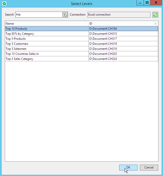
- Right-click the Levels node, and select Add levels.
-
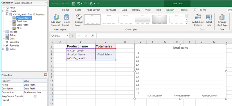
Select a chart. For example: Top 10 Products. Click OK.
-
Under Levels, click the CH184_Level - Top 10 Products node and drag it onto three empty vertically-aligned cells.
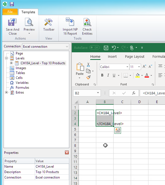
- Click the + next to the CH184_Level - Top 10 Products node to expand it.
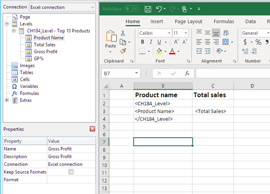
- Click on Total Sales. In the Properties pane, clear Keep Source Formats.
- Hold Shift and click on the ProductName and Total Sales fields. Drag them onto the empty row between the two level tags.
- Click on the cell containing <Total Sales>. Use the Excel ribbon to format this cell as currency.
-
In the row above the opening <CH184_Level> tag, type in heading titles.
Format these headings using the Excel ribbon.
Creating the Excel chart
Do the following:
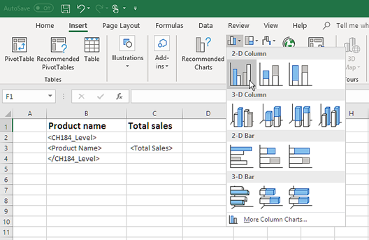
- On the Excel ribbon, click Insert.
-
Click the Insert Column Charts icon, and then select 2-D Column chart.
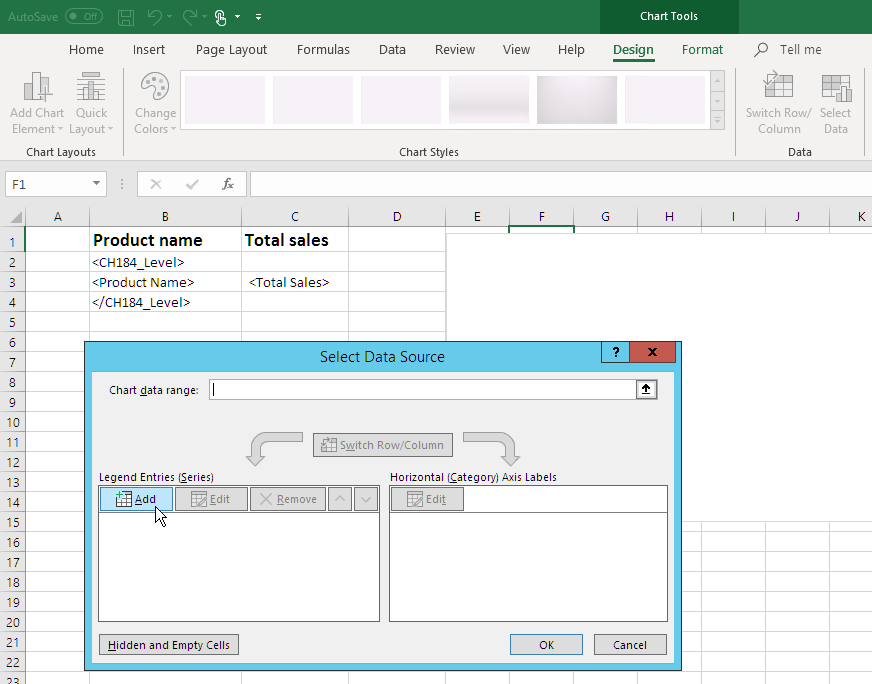
- Click the Design tab, and click the Select Data icon.
-
In the Legend Entries (Series) pane, click the Add button.
-
Click the arrow icon to the right of Series name field.
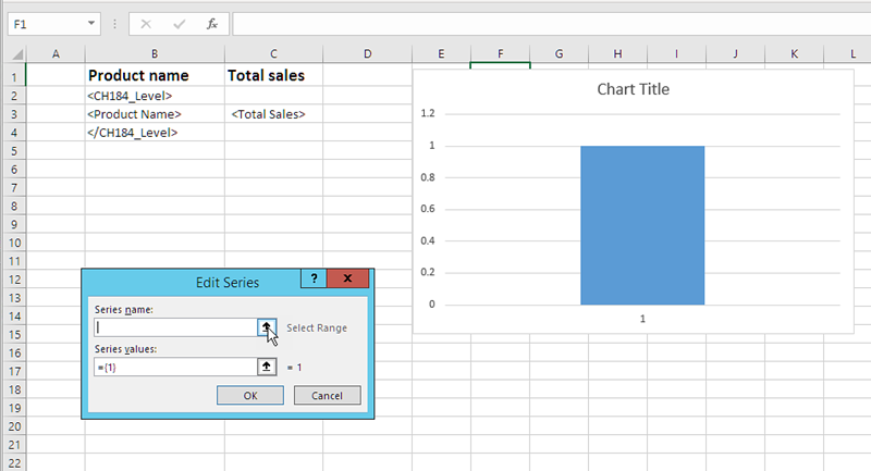
- Select the cell with the Total Sales heading.
-
Confirm by clicking on the arrow icon at the right of the Edit Series field.
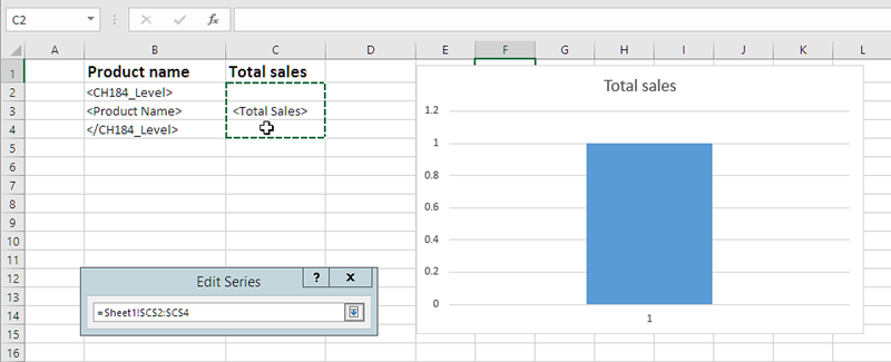
- Click the arrow icon to the right of Series values.
- Select the Total Sales range by including the cells in the rows containing:
- the level opening and closing the tags
- the cell containing the <Total Sales> tag.
-
Confirm the selection by clicking on the arrow icon to the right of the Edit Series field.
- Click OK.
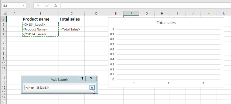
- In the Horizontal (Category) Axis Labels pane, click Edit.
- Select the Product Name range by including the cells in the rows containing:
- the level opening and closing the tags
- the cell containing the <ProductName> tag.
-
Confirm the selection by clicking on the icon at the right end of the Axis label range field, and then click OK.
-
Click OK. You will see a table, and an empty chart.
Previewing the report
Do the following:
-
Click Preview.
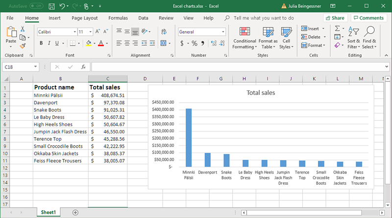
Excel launches and displays your report.
-
You will have a report with a table and a chart.
- Click Save and Close to save the template, and close the Template Editor.